 Ring Logo PNG
The Ring logo helped the American company become popular, though it first gained fame for its smart doorbells. The emblem depicted on its products has become associated with high-tech security systems.
Ring began with a missed-doorbell problem. In 2011, Jamie Siminoff founded Edison Jr. in his garage as a small incubator for testing product ideas. In 2012, after repeatedly missing visitors while working, he created DoorBot. This Wi-Fi video doorbell let users see and speak with someone at the door through a smartphone.
By 2013, DoorBot was making about $1 million in annual sales, but the company needed capital. On November 15, 2013, Siminoff appeared on Shark Tank, asking for $700,000 for 10% of the company. He left without a deal after rejecting Kevin O’Leary’s offer, yet the exposure worked. In December 2013, DoorBot raised $1 million in seed funding, followed by $4.5 million in July 2014.
In October 2014, DoorBot was relaunched as Ring. The new version added better video, motion alerts, and paid cloud storage, turning the product into a home-security platform rather than a single gadget. Investors later included Shaquille O’Neal and Richard Branson. By CES in January 2015, smart doorbells were becoming crowded, with rivals such as Nest Labs, owned by Google, also active in connected home devices.
In February 2018, Amazon announced the acquisition of Ring in a deal estimated at more than $1 billion. The purchase fit Amazon’s delivery and smart-home plans, including package monitoring and theft prevention. Siminoff led Ring inside Amazon until May 2023, then later ran Latch. In April 2025, he returned to Amazon as vice president overseeing Ring and other smart-home products, with a new focus on artificial intelligence.
Meaning and History
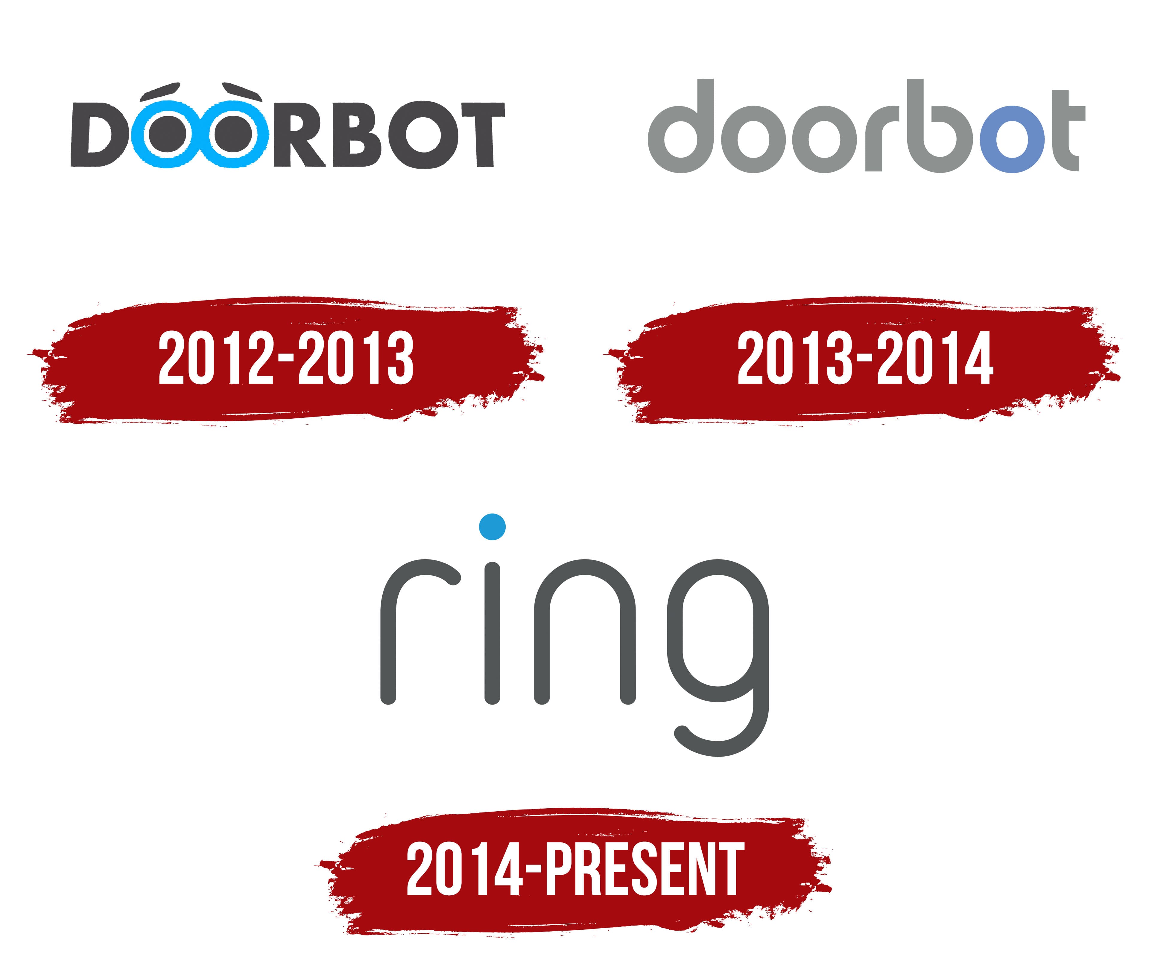
The company Ring was previously known as Doorbot, as it initially produced only smart doorbells. The main feature of these devices was a built-in video camera that enabled real-time surveillance. This was reflected in the brand’s logo, where two eyes, disguised as the letters “O,” looked out. Jamie Siminoff renamed his startup when he realized he would not be limited to just one product type. Thus, Doorbot became Ring and changed its emblem, which is now associated with reliable security systems. Hamet Watt from Upfront Ventures proposed the brand’s current trade name. It formed the basis of the new wordmark, inspired by the shape of video intercoms.
What is a Ring?
Ring is a manufacturer of security systems that can be connected via the Internet. Its most famous product is the video doorbell, a doorbell with a built-in camera, speaker, microphone, and motion sensor. These devices were developed by Jamie Siminoff in 2013. In 2015, the Santa Monica-based company released its first wireless surveillance camera, and in 2018, a security alarm. Early in 2018, Ring was acquired by the e-commerce giant Amazon.
2012 – 2013
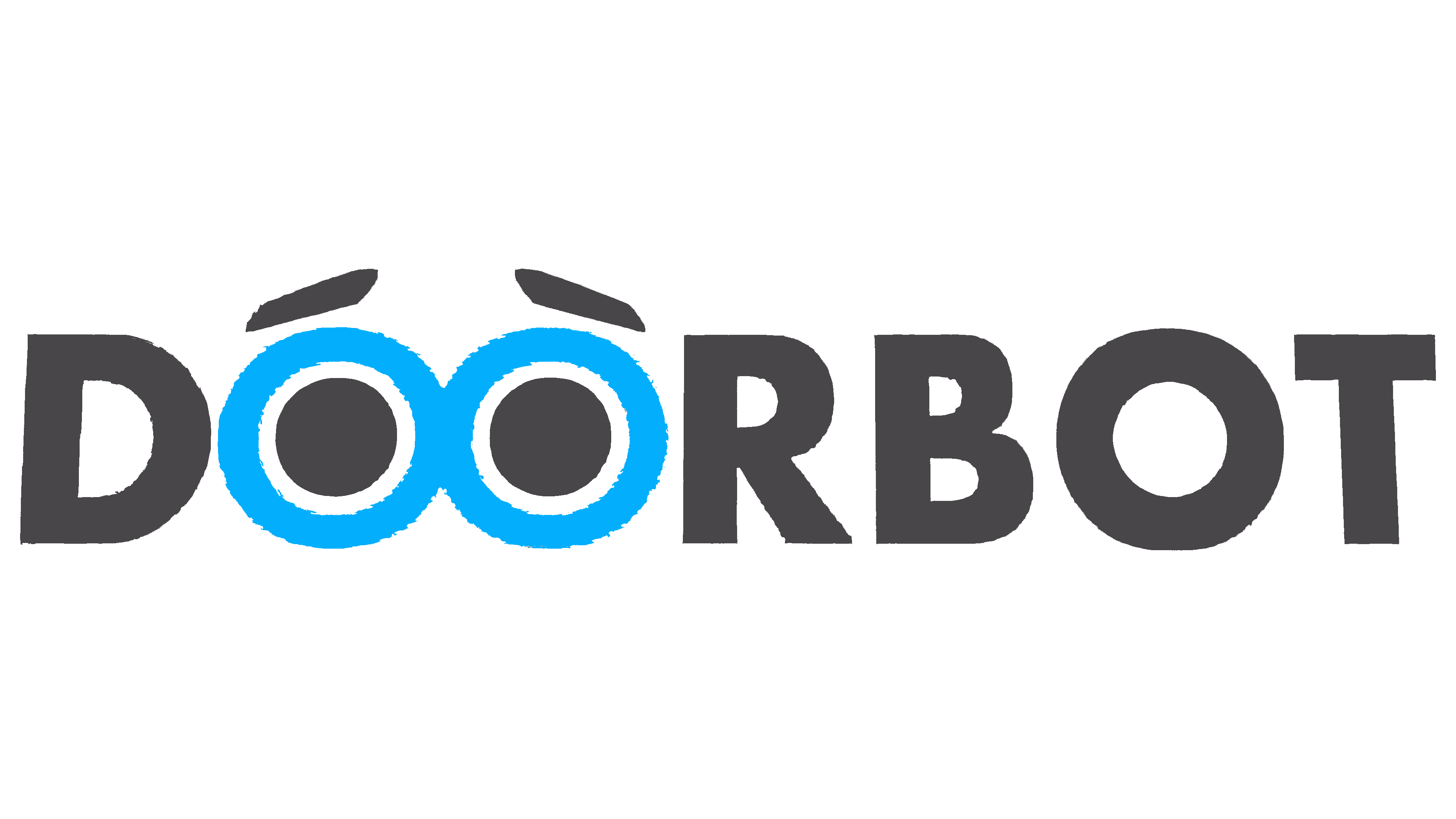
In the early 2010s, Jamie Siminoff invented the Ring Wi-Fi-connected doorbell in his garage. It was named Doorbot, which was positioned as a smart system capable of talking to visitors and recognizing their body language. The brand’s logo featured an inscription where the doubled “OO” was stylized as wide-open eyes. This gave the device individuality and emphasized its main function: “watching” those who arrive.
The designers made the eyes’ expression very sad by adding huge black pupils and lowered eyebrows. They wanted to evoke associations with the sad robot from the popular animated film WALL-E. The two blue “O”s stood out against the other black letters, which used a bold sans-serif font.
2013 – 2014

In 2013, Doorbot was officially registered and received a new logo. The style of the inscription changed: the brand name was converted to lowercase and repainted in light gray. Only the letter “o,” between “b” and “t,” turned pale blue with a violet hue. The designers created a unique geometric font with a round shape for the wordmark. Its distinctive features were shortened strokes in “r” and “t,” and an open inner letter space in “b.”
2014 – today
Jamie Siminoff successfully promoted his startup on Shark Tank, which significantly increased sales. To demonstrate the company’s advancement to a new level, the owner renamed it Ring. This name is included in the dark gray logo, where the only blue element is a large round dot above the “i.” The rectangular letters with rounded corners mirror the shape of the devices produced by the American manufacturer.
Font and Colors
The 2014 emblem utilizes a unique set of glyphs. They are thin and vertically elongated, resembling a combination of simple curved lines. The smooth bends convey a sense of stability and reliability, positive associations for a company specializing in security systems. The dark gray color also symbolizes calmness and steadiness. A small blue accent connects all Ring logos, showing the company’s commitment to innovation.