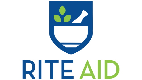
The designers have developed the Rite Aid logo, reflecting all aspects of a natural product.The pharmaceutical symbols that make up the Rite Aid logo reflect the concept of the brand. It is based on health protection, and the logo alludes to the natural composition and guaranteed safety of medicines sold in the retailer’s stores. Care, responsibility, reliability, quality – the designers tried to reflect all the important aspects.
Rite Aid: Brand overview
| Founded: | September 12, 1962 |
| Founder: | Alex Grass |
| Headquarters: | Philadelphia, Pennsylvania, United States[ |
| Website: | riteaid.com |
Pharmacy retailer Rite Aid positions itself as a healthy lifestyle guru because its strategy is focused not only on traditional medicine but also on alternative methods of treatment and prevention of diseases. Its stores offer a wide range of goods, which, in addition to medicines, includes nutritional supplements, cosmetics, and even semi-finished products. And we are talking exclusively about natural products.
One of the largest drugstore chains in the United States was once a modest store called Thrift D Discount Center. This establishment opened in 1962. Subsequently, new outlets joined it, which in 1968 formed the public company Rite Aid. Its development has been very active, mainly through acquiring other retailers. As a result of intensive expansion, after 30 years, it already had almost 3,800 pharmacies.
Rite Aid Corporation became famous for its original marketing approach. This is noticeable even in the target audience. Unlike CVS Pharmacy and Walgreens, it’s not targeting older people with chronic illnesses but working millennials and women with families. This approach affects the goods and services of pharmacies. For example, in modern retail outlets, cosmetics departments are provided in addition to shelves with medicines.
Meaning and History
All aspects of the company’s development and strategy are reflected in its identity. The latest rebranding by Rite Aid was aimed at attracting the attention of younger customers. We are talking about those consumers who follow a healthy lifestyle, use natural care products and eat right. Therefore, the logo adopted in 2020 is not associated with traditional pharmaceuticals but with alternative medicine. The new design has nothing to do with the red and blue billboards representing the pharmacy chain after 1966.
What is Rite Aid?
Rite Aid is a corporation that specializes in the retail sale of medicines and health care products. She owns a network of pharmacies of the same name, which includes about 2.5 thousand institutions (as of 2021). It received its current name in 1968; before that, it was known as the Thrift D Discount Center.
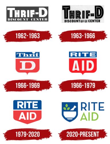
1962 – 1963
In the 1960s, American businessman Alexander Grass noticed that too few retail stores in Pennsylvania sold cosmetics and medicines at low prices. He decided to make up for this omission and opened his outlet, calling it Thrift D Discount Center. The logo could recognize the new brand with the corresponding inscription.
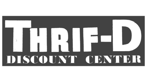
The word “THRIFT” and the letter “D” occupied the top line, separated by a rectangular hyphen. The designers used a bold grotesque with broad strokes for this part of the name. The phrase “DISCOUNT CENTER” has been shrunk and placed at the bottom. His font looked completely different: glyphs consisted of lines of contrasting thickness with decorative serifs at the ends. The background for the text was a black rectangle.
1963 – 1966
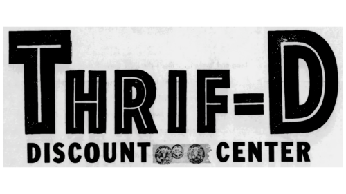
In 1963, another version of the logo appeared, where the base was white, and the inscription became black, except for thin light stripes inside the letters in the first line. These lines followed the shape of the corresponding glyphs. The same dash was drawn in the middle of the hyphen, which made it look like an equal sign.
The font has also changed: the designers stretched the first half of the name vertically and used a similar bold grotesque for the phrase “DISCOUNT CENTER.” Between the last words, they depicted three round seals with birds – apparently signs confirming the quality of the company’s goods and services.
1966 – 1969
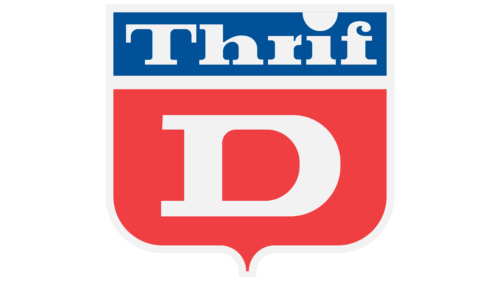
In the second half of the 1960s, the pharmacy chain adopted a logo as a classic square shield with a pointed base. It consisted of a smaller red shield over, which was a blue rectangle. These two elements were stacked together and separated by a light gray stripe. The outer outline was also light grey. In the upper fragment was the inscription “Thrift” with a huge dot above the “i.” And the entire lower part was occupied by the letter “D.” The company’s name used a bold font with large rectangular serifs.
1966 – 1979
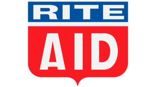
When the American drugstore chain was renamed Rite Aid, a sign appeared on the shield. The designers split the phrase into two lines, converted all the letters to uppercase, and replaced the antiqua with a bold grotesque. Remarkably, the word “RITE” was slightly flattened, while “AID” was stretched vertically. This version of the logo began to be used on merchandise and signage as early as 1966.
1979 – 2020
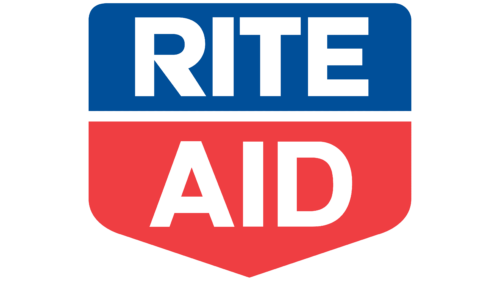
After the redesign, all light gray elements became white, and the rectangular shield acquired a sharp base and rounded edges. At the same time, the inner corners at the junction of the two fragments of the shield remained straight. The font was unified: the developers of the logo made sure that the letters of both lines matched in width and height. But most of all, the “R” has changed, which received a new shape, removing the graceful curve.
2020 – today
Pharmacy retailer Rite Aid rebranded in November 2020 to showcase traditional healing and alternative medicine. It changed the concept because natural cosmetics without chemicals and other innovations designed for modern women appeared in the network stores.
The logo was upgraded as part of the Rite Aid RxEvolution strategy aimed at promoting a healthy lifestyle. The initial idea came up with the New York-based Burns Group, and Sway Creative Labs directly developed the design. They created hundreds of different variations and tested them in focus groups before arriving at the final result.
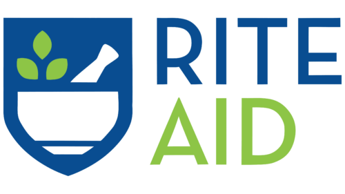
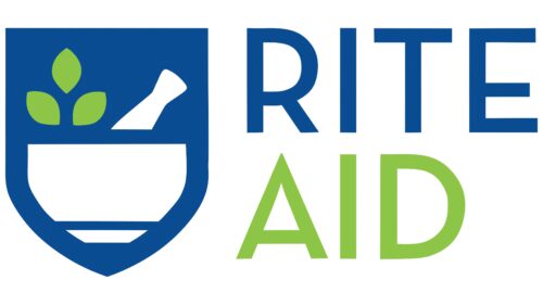
The shield is now much smaller and stretched vertically. Moreover, it is no longer divided into two separate fragments but is completely blue. At least that part of it where there are no drawings. The lower half of the shield depicts a white stupa with a pallet. Above it is the visible part of the pestle. The artists did not forget about the most important thing – about a hint of a healthy lifestyle, which is not possible without natural components. To emphasize this idea, they placed three small green leaves on the left side.
The company’s name is now outside the shield and on the right. The designers made the word “RITE” blue, while the word “AID” was green. The font for both lines is the same: a geometric grotesque with the same thickness of strokes.
Font and Colors
The new emblem embodies a combination of traditional and alternative medicine. The mortar and pestle symbolize the work of pharmacists, who used to have to prepare medicinal powders by hand. The leaves are the epitome of alternative therapies and demonstrate the company’s commitment to selling natural cosmetics. The shield, in turn, personifies the desire to protect and protect the population.
The font used for the name of the pharmacy chain only seems simple. In fact, he has some interesting details. For example, the middle stroke of the letter “E” is not only shortened but also shifted down. The same goes for the “A” bar. The top of the “R” glyph is the same shape as the “D.”
Blue is a traditional color for many medical organizations. Green symbolizes naturalness. White is the symbol of purity. Together they reflect the new concept of Rite Aid.
Rite Aid color codes
| Yellow Green | Hex color: | #8dc546 |
|---|---|---|
| RGB: | 141 197 70 | |
| CMYK: | 28 0 64 23 | |
| Pantone: | PMS 7488 C |
| US Air Force Academy Blue | Hex color: | #094d91 |
|---|---|---|
| RGB: | 9 77 145 | |
| CMYK: | 94 47 0 43 | |
| Pantone: | PMS 2945 C |
