


![]() Riverdale Logo PNG
Riverdale Logo PNG
The mundane Riverdale logo doesn’t fit the show’s tense and chilling plot. It is like a beautiful screen behind which criminal events are hidden. However, since the TV project was conceived as a comedy, such a contrast fits perfectly into the concept. At the same time, the emblem, with its urban design, fits perfectly with the story of a provincial town’s life.
Riverdale began long before the TV series. Its roots go back to Pep Comics #22, where Archie Comics introduced Archie Andrews and his friends in 1941. The fictional town of Riverdale became the setting for characters who later became part of American pop culture.
The modern series was developed by Roberto Aguirre-Sacasa, a playwright, screenwriter, and chief creative officer of Archie Comics. In 2013, Warner Bros. first developed the idea as a feature comedy film, but the concept later shifted toward television. Fox considered the project, then it moved to The CW in 2015, where Aguirre-Sacasa shaped it into a darker mix of teen drama, mystery, and horror.
Casting began in early 2016. KJ Apa was chosen as Archie Andrews, with Lili Reinhart as Betty Cooper, Camila Mendes as Veronica Lodge, and Cole Sprouse as Jughead Jones. Filming of the pilot started in March 2016 in Vancouver, Canada. The show used neon lighting, foggy streets, and nostalgic details to separate itself from the lighter tone of the original comics.
Riverdale premiered on The CW on January 26, 2017. The first season focused on the murder of Jason Blossom, setting the crime-driven structure for later seasons. Season 2 added organized crime and serial-killer plots, while Season 3 moved into cult and supernatural elements. Season 4 opened with a tribute to Luke Perry. Season 5 jumped seven years ahead, Season 6 introduced Rivervale, and the final seventh season premiered on March 29, 2023, taking the story back to the 1950s.
Meaning and History
![]()
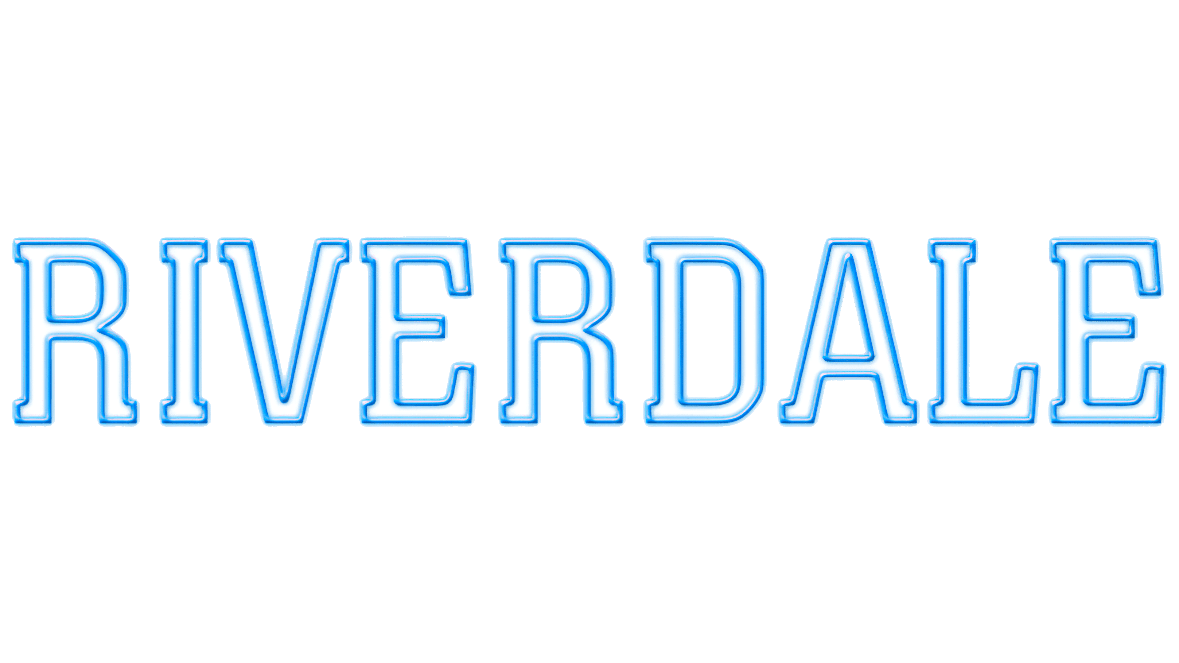
Despite Riverdale’s frightening storyline, the show’s logo looks quite mundane. Moreover, over the years, it has not changed: in 2017, a wordmark was created to identify the series, which is still used today. It has a simple structure because it contains nothing but the name of the television project. It is presented as a white inscription with blue lines drawn along the outline of each letter. These stripes are a non-uniform color: dark in the center and light and translucent along the edges. There is also a gradient. This design creates the effect of a holographic sign, as if the word “Riverdale” were formed by glowing LED strips.
The letters are recognizable. They are characterized by strokes of uneven thickness and well-defined rectangular serifs, which make the “A” look as if it is standing on a pedestal. Instead of rounding, “R” and “D” have vertical lines with cut corners at the top and bottom.
What is Riverdale?
It is a multi-part film in the genres of television drama, detective, mysticism, and crime fiction. Its plot unfolds in a small town, which only seems quiet and calm at first glance. All the main characters are teenagers with their problems. Their images were based on characters from Archie Comic Publications, Inc.
2017 – 2023
![]()
The “Riverdale” logo captures attention with its neon aesthetic, evoking the atmosphere of 1950s American diners despite the show’s dark, mysterious plot. At the core of the emblem is a simple yet powerful design: the show’s title rendered in a large, serif font reminiscent of vintage signs.
The bright blue color, akin to the glow of neon tubes, taps into a sense of nostalgia for a time when such signs were iconic beacons, lighting up the night and drawing people in. A three-dimensional gradient enhances this effect, creating the illusion that the letters glow in the dark. This stylistic choice ties directly into the mystery and tension that permeate the show: beneath the surface, simplicity lies something far deeper and more unsettling.
The font is bold, with sharply defined letters that convey a sense of stability, yet the serifs and uneven line thicknesses hint at hidden details and unexpected twists. The logo contrasts with a typical American town and the dark, enigmatic atmosphere that the series gradually unveils.
Font and Colors
The Riverdale logo looks like a neon sign because neon signs are a traditional feature of city streets. So the designers paid tribute to the city after which the series was named, where the events of all seven seasons took place. At the same time, the inscription, simple in form and light in color, contrasts with the serial film’s criminal plot.
It is most likely that the creators of the logo’s inscription “RIVERDALE” used the Colossalis BQ Regular font, an antique with traditional typography. This design by Italian designer Aldo Novarese, dating back to 1984, uses rectangular serifs that look bold and unconventional. Similar but not identical fonts include Centrum Medium by SoftMaker Software GmbH and Varsity by Broderbund Software.

In the main version of the wordmark, the letter outlines are blue with a gradient and translucent shadows. The interior of the glyphs is white, but this color may change depending on the visual context.