The Rivian logo is an example of technology, thoughtfulness, and harmony. The emblem represents a concern for the life of the planet. The mark looks into the future, working on the technologies that will be in demand for the next generations.
Rivian: Brand overview
| Founded: | June 2009 |
| Founder: | R. J. Scaringe |
| Headquarters: | Irvine, California, U.S. |
| Website: | rivian.com |
Meaning and History
What is Rivian?
Company for the production of electric vehicles and energy storage devices. It was the first in the world to start producing electric trucks. The main owners and investors are Amazon and Soros Fund—main products: R1T pickup truck, R1S SUV, and RCV-500 van.
Rivian still has a lot of room to develop its identity, as the company is relatively new. The main reason for the transformation of the mark already experienced was the expansion from the founder to the team and the emergence of the exact development direction. A feature is the use of various techniques in transferring the same information: the use of color, geometry, and inscriptions. The young company tried to make the identity as futuristic as possible, as Rivian’s main developments are for the Earth’s future inhabitants.
2009 – 2018
The first logo was most likely created after 2011 when the founder and sole employee of Mainstream Motors – Scaringe, renamed the company into Rivian and decided to move on to the practical production of electric cars.
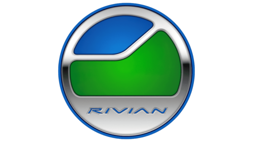
The emblem is a metal circle, the hollow part of which is filled with blue and green. A chrome band separates the colors. At the bottom is the name. A blue rim encircles the entire figure.
The shape of the circle speaks of harmony and integrity—the perfect appearance and filling, thoughtful details. Scaringe nurtured the business idea for almost ten years and developed the perfect plan. The inner circle with the trimmed edge represented the charging port of the electric car.
The name came from Indian River County in Florida, where Robert grew up. The area’s name is associated with the coastal lagoon, and the blue letters on the logo reinforce the feeling of water. The subtle curves resemble the image of a river on a map.
The logo has very bright, juicy colors. Blue in the upper part of the circle represents a clear sky and green – plants. With this choice, the company shows concern for the future of mankind. Scaringe is obsessed with reducing its carbon footprint. He rejected the car, the boiler, and the use of plastic and wished to preserve the beauty of his native land. So for the sign, Robert chose a schematic image of the river valley, the green area where he grew up.
The symbols show the absence of hazardous exhaust fumes in the brand’s cars, which benefits nature. The emblem promises that electric cars will blend in perfectly with their surroundings.
2018 – today
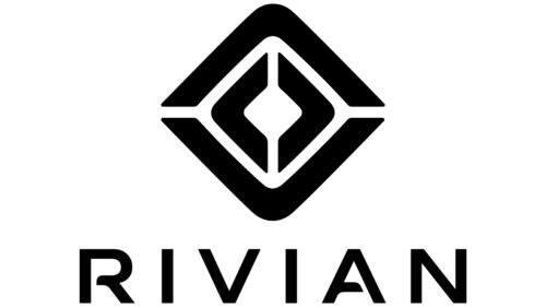
The 2018 logo has a completely different concept. It is represented by two rhombuses inscribed into each other, resembling a target in a shooting gallery and a compass.
The sign represents the company as purposeful and focused on achieving its goal. It was decided to produce 25,000 cars by 2022, and Rivian began moving toward the goal, starting by raising investment from Amazon and other contributors.
The double figure and white stripes running through the design convey the company’s idea of charging cars from each other. The lines resemble a maze, telling the story of electrical circuits moving toward a dream from level to level.
The sign has logic, geometry, and harmony. The colors and natural elements typical of the past were removed from it. With this, the company wanted to show the lack of influence on nature. By 2040, Rivian will be committed to achieving a zero carbon footprint. Only synthetic materials are used in car interiors, and batteries are suitable for extraction and complete recycling.
The brand’s name is rendered beneath the image and combined, the name and the picture show that Rivian is the best choice.
Font and Colors
The main colors of the modern mark are black and white. The contrast and consistent placement of elements indicate mathematical algorithms, stylish design, and technical perfection.
- White – the purity of the environment.
- Black – confident movement forward, strength, and reliability.
FM Bolyar font without Pro 700 with an upgraded A, in which they placed the same incomplete glyph as in the R. The lettering symbolizes openness, a willingness to accept and bring something new into the world.
Rivian color codes
| Selective Yellow | Hex color: | #ffb300 |
|---|---|---|
| RGB: | 255 179 0 | |
| CMYK: | 0 30 100 0 | |
| Pantone: | PMS 137 C |
| Black | Hex color: | #000000 |
|---|---|---|
| RGB: | 0 0 0 | |
| CMYK: | 0 0 0 100 | |
| Pantone: | PMS Process Black C |


