


![]() Roca Logo PNG
Roca Logo PNG
The world leader in producing sanitary ware is associated with water, which is abstracted in its identity. The Roca logo reflects the company’s philosophy that water is a valuable resource, and its use must be rational. The logo also symbolizes strength and reliability, qualities that underscore the products’ quality.
Roca was founded in 1917 in Gavà, near Barcelona, by brothers Martín, Matías, and José Roca Soler as Compañía Roca Radiadores. Spain was industrializing, and demand for cast-iron radiators for homes and factories was rising. The company first focused on casting and selling heating radiators, then added cast-iron boilers in 1925.
In 1929, Roca entered the bathroom equipment market by producing cast-iron bathtubs. The move reflected a shift in Spanish housing, where bathrooms were becoming part of middle-class homes. In 1936, despite the Spanish Civil War, the company began making sanitary porcelain, including toilets and washbasins. The change required new ceramic molding and firing technologies, laying the foundation for Roca’s future business.
In 1954, Roca added faucets, expanding its bathroom product range. In 1962, it opened a second porcelain factory in Alcalá de Henares near Madrid. During the 1970s and 1980s, the company strengthened its position in Spain and added ceramic tiles. International expansion began in the 1990s, with a UK office in 1993, followed by offices in Portugal, France, Germany, Italy, Morocco, Argentina, Brazil, and China.
In 1999, Roca bought Switzerland’s Keramik Holding Laufen, the world’s fourth-largest sanitary-porcelain producer and a premium rival to Villeroy & Boch. The deal doubled Roca’s production capacity and expanded its European and Latin American footprint. In the 2000s and 2010s, production opened in Russia, India, China, South Africa, and other markets. Revenue passed €1.57 billion in 2013. In 2023, Roca acquired bathroom-furniture makers Madeli and Alape.
Meaning and History
![]()
The Roca logo is quite consistent. So are the company’s products invariably high-quality.
For the visual identity, the brand name was chosen with an elegant two-part underline. The font is quite massive. It demonstrates the thickness of the ceramic parts. Indicates reliability and durability. Such a variant eliminates the possibility of chips and cracks. On a subconscious level, a bold font increases confidence in the company.
What is Roca?
Spanish manufacturer of sanitary ware for kitchens and baths, represented in 170 countries. It has 84 factories, employing 24 thousand people. The company’s turnover is about 2 billion euros.
The ends of the letters C and A are thinner than the other elements. They remind me of faucets. The A has a rounded bottom, similar to the curve of a bathtub or sink. The word lines are smooth and streamlined, like the edges of Roca products.
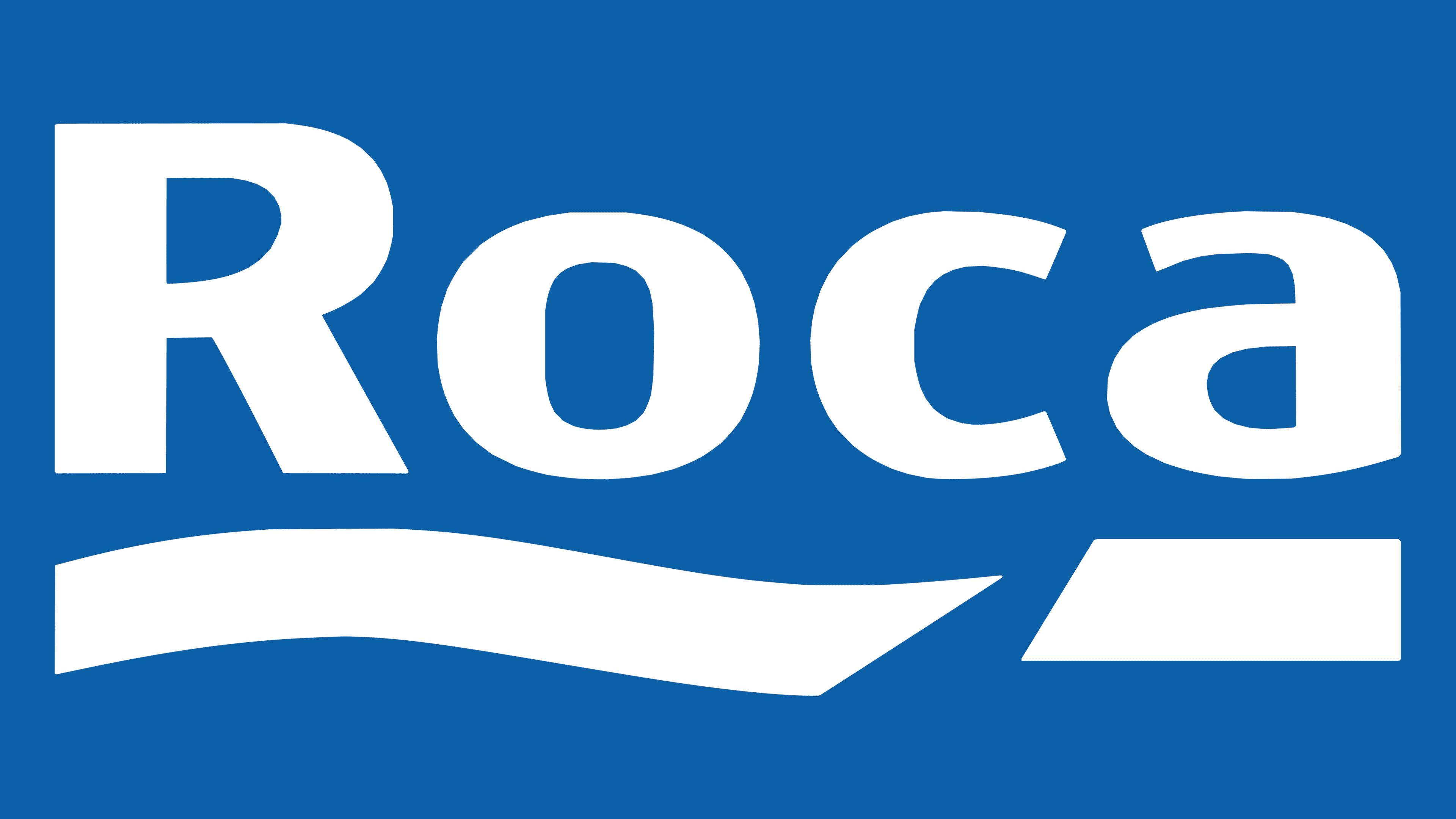
The brand name is the last name of the founding brothers. It is translated from Spanish as “stone.” For modern customers unfamiliar with the founding history, the word is another hint of product durability.
The first part of the inscription has a wavy underline that resembles a splash of water. It symbolizes bathing, washing, and swimming.
The line separates the three letters of the name, which form the word “rock.” It shows that plumbing production is the fate and destiny of the firm and the founding family. Their purpose was found in the creation of objects in contact with the water element.
The line has a sharp cut that divides it into two parts: wavy and straight. It shows the separation of the water element and its imprisonment in the company ceramics.
The straight, clear underlining of the letter A carries an extensive semantic meaning.
- Roca is the leader in its industry (one of the five world leaders), just as the letter A is first in the alphabet.
- The firm stands firmly and confidently on its feet.
- The company has very strict, inflexible principles. It adheres to its Roca Loves the Planet initiative. It does this by reducing emissions at its factories and seeking solutions for homes that are comfortable and save water and energy.
The combination of undulating and straight lines shows the variety of Roca products. Some are in contact with water, while others, like furniture, are not.
Font and Colors
Blue letters on a white background – the perfect combination for a sanitary logo.
- Blue is the symbol of water.
- White – ceramic, earthenware, porcelain. Hints at snow-white soft bathrobes and towels.
In general, shades symbolize cleanliness and water procedures.
The font of the inscription is Aeonis Pro Heavy.