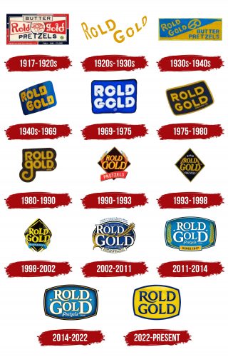
The Rold Gold logo has undergone numerous transformations and changes. As the company evolved and expanded its product range, the logos also changed, reflecting various themes and ideas. Despite these changes, the logos always provided customers with clear and precise information. Because of this, many generations have remembered not just the brand’s logo but also every flavor and every delicious pretzel.
Many children, now adults, fondly recall their favorite sweets. Among the list of treats that are desirable year-round are, of course, the products from the renowned Rold Gold brand. What made it so memorable? What made its pretzels the most popular product in America? The answer is simple: nothing but quality can sustain demand. And nothing but interesting and stylish logos can remind us of delicious products. From the first day of the company’s existence, its identity has deservedly been considered one of the most striking.
Rold Gold: Brand overview
In 1917, Rold Gold’s history began in Philadelphia, Pennsylvania. Louis Rold started the business by making pretzels in a tiny bakery. Combining the founder’s last name with “gold” highlighted the product’s superior quality and gave rise to “Rold Gold.”
The company made pretzels by hand using conventional baking techniques. The product’s distinct flavor and crisp texture quickly made it popular with the locals.
The enterprise expanded in the 1920s. The business started producing more and sending its goods to nearby states and towns. During this period, the firm began experimenting with other pretzel shapes, such as traditional knots and sticks.
Despite the Great Depression in the 1930s, the company kept growing. The business remained in operation because its goods, such as cheap snacks, were popular and reasonably priced.
The 1940s presented both fresh possibilities and obstacles for the brand. The brand became more well-known nationwide because the company provided pretzels to American soldiers in World War II.
The manufacturer updated its production and expanded output in the 1950s using new technologies. Meeting the increasing national needs required this important step.
The business grew substantially in the 1960s. In response to shifting consumer preferences, the firm started making additional pretzels, such as salted and cheese variations.
A major event in the company’s history occurred in 1974, when Frito-Lay, a major player in the snack industry, bought the company.
The enterprise expanded rapidly in the 1980s while being run by Frito-Lay. The company started running national marketing campaigns, which greatly raised its level of awareness across the nation.
The firm continued to develop new pretzel flavors and shapes throughout the 1990s. These products were released to meet the increased consumer desire for healthier snacks like low-fat pretzels.
Growing competition in the snack sector caused the company additional difficulties in the 2000s. In response, the business concentrated its marketing efforts on highlighting its heritage of excellence and history.
The brand adjusted to shifting consumer tastes throughout the 2010s. The company released several new flavors, including savory and spicy varieties, to appeal to a younger demographic.
The enterprise commemorated its 103rd anniversary in 2020, showcasing its extensive background and outstanding standards. The company celebrated by releasing a limited edition line of retro-style packaging that pays homage to various periods in its past.
For the firm, a major update occurred in 2021. The company responded to the increased consumer desire for healthy snacks by launching a new brand of pretzels made from whole-grain flour. This creative move assisted the company in drawing in a new, health-conscious consumer base.
The manufacturer made a significant advancement in sustainable development in 2022. The company declared that its whole product range would now come in recyclable packaging. A program to cut down on food waste during production was also started.
The enterprise had a year of expansion in 2023. The company aggressively increased its market share abroad, especially in Europe and Asia. Unique flavors were created specifically for certain markets to accommodate local consumer tastes.
Rold Gold Fusion is a cutting-edge product range that the firm unveiled in 2024. This series created inventive flavor combinations by combining beloved pretzels with other well-liked foods. For instance, chocolate-covered pretzels with peanut butter filling were introduced.
The company, which combines a heritage of quality with advancements in flavor and production, is still among the top pretzel brands in the US.
Meaning and History
What is Rold Gold?
It is a brand that specializes in pretzels. Owned by Frito-Lay, a division of PepsiCo, the company offers a variety of pretzels, including traditional pretzels, rods, and sticks. The brand is known for its crunchy snacks, which are often eaten on their own or with dips. It is popular among pretzel lovers for its consistent flavor and texture. Brand’s products are widely available in grocery stores and are a staple in many families.
1917 – 1920s
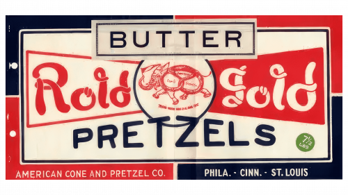
The first logo’s style and color scheme reflect past motifs. The associative series is designed to evoke memories, allowing for nostalgia about grandma’s pie or family evenings. The noticeable connection between the past and the present is manifested in every tone and line of the logo.
The manufacturer chose an interesting interpretation, presenting itself beautifully and unusually. The main idea of the marketing campaign was to showcase, be remembered, and allow customers to taste something special on the market. The logo used more than five shapes and frames, with noticeable contrasts in color distribution.
Such visualization attracted attention, prompting people to read the entire informational block. Among many logos of that time, this one stood out significantly. There was more text than anywhere else, focusing people’s attention on the products. Different fonts and sizes of thematic groups of letters highlighted important elements.
The main emphasis in the logo is on the phrase “Rold Gold,” the brand name, which is the key element. Each word is done in its shade. The second most significant word, “BUTTER,” indicates the product type. All letters are large and capitalized, ensuring the text is clear. The wide letter spacing guarantees the distinctness of the characters.
In the round frame, it is hard to miss the elephant, whose body is shaped like a pretzel, adding a lightness to the logo. The image and text create a beautiful visual impression. The logo features complex geometry: circles, squares, and irregular shapes. The bold and bright logo helped the company make a strong statement.
Three colors—blue, red, and white—emphasize the brand’s patriotism. According to the founders’ plans, the products would be distributed across America.
1920s – 1930s
There is no point in comparing the first logo with others, as each is unique and different from its predecessors.
In 1920, the approach to product presentation was completely changed. This shift occurred because the general public knew what the company produced and what treats could be found on store shelves. Therefore, all images, diverse texts, and geometric shapes were removed.
Now, a white background and bright yellow letters were used. The inscription was simple, clear, and noticeable. The English brand name “Rold Gold” was highlighted in yellow. Even within a single text phrase, there was a lot of dynamism. The vertical arrangement of the letters enhanced the logo’s visibility. Freedom and playfulness became noticeable elements. These feelings ultimately formed the overall impression of cheerfulness.
1930s – 1940s
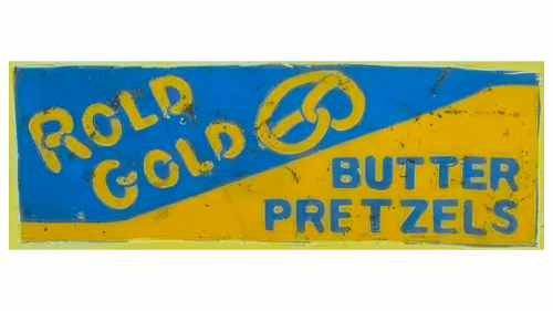
In the following years, yellow and blue were increasingly used to create logos. Designers saw a special appeal in this contrast. Introducing new information and a distinctive background separation enhances the tonality. Geometry, sharp angles, and conciseness are the foundations of the new identity of the “Rold Gold” brand.
The logo clearly shows that the company’s philosophy remains unchanged: their sweet products are loved by both children and adults. The pretzel is drawn in yellow on a blue background, serving as a unifying element that connects the brand name on the left with the product advantage “BUTTER PRETZELS.”
The diagonal line dividing the background symbolizes the passage of time: past and future. The company’s development continued with this logo for ten years until it was replaced by a new graphic logo, reflecting a new era.
1940s – 1969
The logo’s transformation over nearly twenty years reveals a return to simplicity with a touch of brightness. New forms for letters and textures are noticeable here.
The colors have a sheen, giving the logo a glamorous and lavish look. They shine and shimmer, evoking customers’ thoughts of unique flavors and luxurious products. Indeed, pretzels made with unique recipes quickly sell out from store shelves.
The unique aspect of the logo is that the letters possess not only dynamism but also a resemblance to treats. Their corners are not sharp, straight, or round but rounded like a sweet pretzel.
An unusual yellow swirl, reminiscent of the world’s most delicious bun, leaves a lasting impression. The logo can be called one of the most noticeable in the company’s development period. But it is not in the brand’s nature to rest on its laurels, as many interesting changes are yet to come.
1969 – 1975
Expressiveness, creativity, and uniqueness characterize the original 1960s. These three aspects are precisely reflected in the updated “Rold Gold” logo. The retro styling of the brand name proved to be very successful. Yellow tones are completely absent this time, and blue takes center stage. The background highlights the text, while the black frame captures customers’ attention and keeps them focused on the logo. Most interestingly, all the letters, like pretzels, have a rounded shape and curls at the corners.
1975 – 1980
In 1975, the yellow color reappeared in the logo. Fashion influences customer preferences; now, they see bright and warm products whenever they read the brand name.
Upon closer inspection, one can notice the dynamic movement of the letters. The yellow contrasting frame on the blue background emphasizes the text.
1980 – 1990
The focus is on the background, which is the first to draw attention to the logo. However, its impact lasts only a few seconds. Once you shift your gaze, you notice the perfectly smooth yellow letters of the brand name. They shine and create the impression of movement along an uneven line. This effect is enhanced by the elongated first letter of the second word, with slightly rounded elements. The logo has no drawings or additional text, emphasizing its simplicity.
1990 – 1993
Over time, people’s demands for various types of products increased. Naturalness, usefulness, and quality became key factors for making a purchase. This is why the logo featured wheat stalks. Their bright tone indicated that the product in the potential customer’s hands was made from ingredients grown in environmentally clean conditions. This element carried a symbolic meaning.
Regarding the tone, the familiar yellow and blue colors were present on the emblem. The red ribbon at the bottom symbolized an unforgettable taste.
1993 – 1998
The diamond shape, previously used to emphasize the importance of the inscription, was chosen this time to highlight the brand’s reliability. The dark background, with the sparkling yellow text written in an inclined italic font, indicated stability. The text was compact, with letters placed with minimal spacing. Wheat stalks, a familiar symbol, were integrated into a new style, enclosed in a shape not used before. This emphasized the quality and naturalness of each ingredient.
1998 – 2002
The new logo offers something interesting for every customer. The emblem’s multifaceted nature is symbolic. The product range is expanding, generating increasing interest. The focus is on dynamism. Modernity demands brightness and innovation.
All requests are reflected in a single logo, including letters, images, and elements. The yellow color remains, now with a starry sparkle. Black has become the rich background for the brand name. The wheat stalks remain sunny, conveying freshness, fullness, health, and the beauty of the fields. New text has been added below the brand name on a blue patterned ribbon. This creates the impression of white and blue clouds calmly drifting over the American fields of unharvested wheat.
2002 – 2011
The new logo’s numbers and letters are hard to count. It can be described as a true informational document. Such associations arise because the number of words on the emblem exceeds 20, and there are more than eight numbers. The time trends required the logo to provide all the product’s key features, brand information, and other important details.
Bilingualism is characteristic of the new identity, indicating significant market expansion and gaining the trust and affection of Canadian customers.
2011 – 2014
The new logo is honest, open, and straightforward. The producers succinctly and accurately convey that they always care about their consumers’ health. For instance, the two wheat stalks on the emblem symbolize the product’s eco-friendliness. The stars, which were not present before, are associated with the company’s and brand’s reliability.
The use of diverse text formats creates a striking effect. The visual perception of the logo directly depends on the colors, shades, and highlights, which now have precise placement.
The ribbon has transformed into a slightly elongated rectangle with the text “SINCE 1917”. The mirror image and symmetry look beautiful, symbolizing stability and reliability.
2014 – 2022
Like a new series of a favorite movie, the new logo for the “Rold Gold” brand is impressive. The brilliance and richness of the background colors and words make it very presentable and contemporary. Beautiful white letters stand out on a blue background. The minimal amount of information does not burden the perception. Everything is extremely simple yet striking. The design is contrasting and concise. Geometry of forms is used to create accents and shift them as desired.
2022 – today
Modern branding aims to use minimal details. This is because people are increasingly perceiving visual information. If you have a sweet tooth and have ever tried the delicious treats from “Rold Gold,” all you need to do is find the familiar brand logo and buy your favorite sweet. The mission of the designers was to choose recognizable and noticeable colors. They went back to the standards of the 1960s, transforming yellow into the background and blue into the main shade of the logo. There is now a shimmer and sparkle. The letters have become even, with a smooth surface and no flourishes. The logo has gained a magical, radiant, and festive quality.
