The Rolex logo represents a brand worthy of kings. The emblem demonstrates that the company’s watches are intended for VIPs from the upper echelons of society. The shades of the sign speak of nobility and the desire to exist for centuries.
Rolex: Brand overview
| Founded: | 1905 |
| Founder: | Hans Wilsdorf, Alfred Davis |
| Headquarters: | Geneva, Switzerland |
| Website: | rolex.com |
Meaning and History
The crown, which later became the world’s most recognizable logo, did not appear immediately but several years after the start of production. Its registration as a trademark occurred even later – in 1925. Over the years, the emblem has undergone three transformations, but each time, a royal attribute proudly took its place.
What is Rolex?
Rolex is a Swiss company with British roots specializing in the design, creation, and manufacture of elite wristwatches. It owns two brands: Rolex and Tudor. The company was founded in 1905 by businessmen Hans Wilsdorf and Alfred Davis, initially called Wilsdorf and Davis. The current name was adopted in 1919. The company’s headquarters are located in Geneva, Switzerland.
1905 – 1965
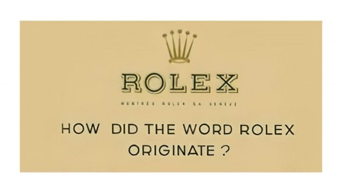
The debut emblem set the leading style and vector for subsequent versions, closely intersecting. It consists of two key parts: a graphic with a crown and text with several phrases. All elements are placed on a rectangle of dark sand color.
It was more of a marketing version, as, besides the brand name, it contained the phrase, “How did the word Rolex come about?”. All inscriptions are in capital letters but have different fonts. Only the word “Rolex” has serifs located separately (in the center) and outlined with yellow shadows.
1965 – 2002
During this period, the key accents shifted, so instead of a business card logo, a succinct corporate label appeared. It features an elongated crown above the company name. The text looks larger than the graphic sign due to the ratio of letter proportions and drawn elements. This version also introduced shades of grey with a blue tint and dark beige.
2002 – today
The current logo almost replicates the previous one with minor differences in design and color, introduced in 2002. The crown became more defined and larger. Green and gold colors (with variations) switched places.
Rolex: Interesting Facts
Rolex is a famous watch brand known for its great quality.
- How It Started: Hans Wilsdorf and Alfred Davis created Rolex in London in 1905. The name “Rolex” was picked because it’s easy to say and looks good on the watch.
- Waterproof Watches: In 1926, Rolex made the first waterproof watch called the “Oyster.” It was a big deal because it kept the inside parts safe from water and dust.
- Self-Winding: In 1931, Rolex made the first watch that winds itself as you move, using a special part called the perpetual rotor.
- Adventure: Rolex watches have been on cool adventures, deep underwater and to the top of Mount Everest. This shows they’re strong and reliable.
- Sports: Rolex sponsors major sports events, such as golf, tennis, sailing, and car racing. This shows that they care about precision and doing your best.
- Daytona Watch: The Rolex Daytona watch, made in 1963, is famous in car racing. It’s named after a big race track in Florida.
- Materials: Rolex uses special materials for its watches that don’t rust or corrode easily. They even made their gold and rose gold.
- Movies: You can see Rolex watches in many movies. They’re worn by movie characters and real-life actors, adding to Rolex’s cool image.
- Helping Others: Rolex also helps with big projects that improve the world through the Rolex Awards for Enterprise.
- Fakes: Rolex watches are so sought after that many fake ones are made. Rolex works hard to ensure that its watches are real and secure.
Rolex is more than just a watch brand; it’s about top quality, adventure, and improving things. It’s a sign of doing well and having a sense of adventure.
Font and Colors
The monarch’s attributes have been present on the watch brand’s emblem from the beginning, symbolizing high status and prestige. This aligns with its core values. At the same time, Rolex has never explained why it chose the crown and what it specifically signifies. According to some versions, it’s a human hand (judging from the number of broad rays), and according to others, it’s branches of trees crowned with pearls.
The original logo always consisted of a royal crown and the name. The first element is at the top, and the second is at the bottom. Other nuances (color, size, style of drawing) changed depending on design trends.
The crest had several types of fonts, the main one being Garamond. Designers used it for the brand name. The color palette is also not diverse – it’s stable. It’s a combination of yellow and green in variations of shades. The gold crown emphasizes the company’s orientation towards precious metals and green – the color of money, symbolizing prosperity and wealth.
Rolex color codes
| Bistre Brown | Hex color: | #a37e2c |
|---|---|---|
| RGB: | 163 126 44 | |
| CMYK: | 0 23 73 36 | |
| Pantone: | PMS 1255 C |
| Cadmium Green | Hex color: | #006039 |
|---|---|---|
| RGB: | 0 96 57 | |
| CMYK: | 100 0 41 62 | |
| Pantone: | PMS 3415 C |
