The Roto logo is well-thought-out and precisely reflects the direction of Roto’s business, so there has been no need to change it over the years. The emblem is compact and meaningful. It is a representation of the roof, underneath which is the company’s name.
Roto: Brand overview
| Founded: | 1935 |
| Founder: | Wilhelm Frank |
| Headquarters: | Leinfelden, Germany |
| Website: | roto-frank.com |
Roto has been a German manufacturer producing wooden and PVC windows, fittings, and stairs for the attic since 1935. Roto logo unites 15 production facilities in Europe, the USA, and China and 30 logistics centers. There are dealers in 40 countries. The company’s turnover exceeds 650 million euros.
The company’s history began with the invention of fittings allowing it to open the windows for ventilation. Wilhelm Frank patented the invention and set up a factory for its production.
Subsequently, he proposed four more revolutionary inventions (PVC roof windows, attic stairs, etc.). His urge for innovations set the tone for Roto’s future development, and today the company owns more than 2500 patents, allowing it to set the pace in the window industry.
Meaning and History
The loft space is the place of Roto’s efforts, as the logo exactly points out. The company helps to turn it into a cozy place to live. It is quite a narrow but in-demand business niche. In modern European cities, the rooftop floor is a common practice, introduced back in the 17th century by François Mansard. A bedroom or a whole separate apartment is set up there. Windows for such buildings are unusual because they are built into the roofing or partially replaced it.
The name Roto comes from the first pivoting mechanism for opening windows, invented by the company’s founder. It is a compound word from the initial letters of the combination “Rotation total .” Thanks to this mechanism, the window could be opened horizontally and vertically, which was revolutionary for that time. The invention became the basis for the name of the brand. All subsequent modifications of the mechanism have only different additional letters (NT, Patio) and are still part of the company’s windows. Therefore, the name is still valid today. The Frank surname is often added to the brand name as a tribute to the inventor: The full company name: is Roto Frank AG.
Apart from the roof and the enclosed name, the logo has no continuation below in the form of the house’s walls. All inventions of the company allow making an attic a separate isolated dwelling. After climbing up the stairs (another Roto invention), the user finds himself in a separate world.
However, the composition also has no outlined boundaries, opening up space for the flight of imagination and creating new solutions for life under the roof.
What is Roto?
A company that produces roof windows and accessories for attics in Europe. The headquarters are located in Bad Mergentheim. About 5 thousand employees work at the factories of the company.
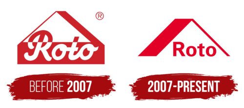
Before 2007
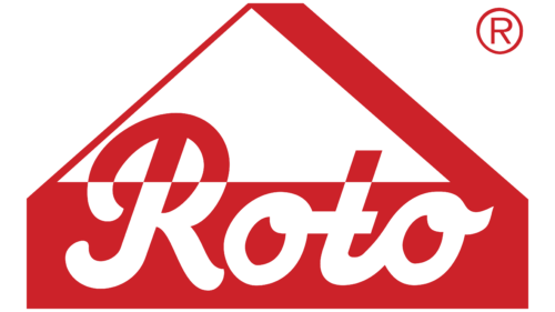
The old Roto logo is associated with architectural themes. The brand’s name is partly inside a red rectangle, which looks like a house’s wall; on top, two diagonal lines form a triangular roof. The right band is wider than the left, thus creating a visual effect of volume. The inside of the roof is represented by a white triangle. To prevent the white lettering from merging with it, the designers painted the tops of the “R” and “t” red. The semi-connected handwritten font symbolizes the company’s movement, dynamics, and progress. In turn, the bright palette is associated with energy and strength. The stylized image of the house underlines Roto’s specialization in the production and sale of complex solutions for the window and door industry.
2007 – today
Concentrating on producing such products for almost 90 years makes the brand Roto a master of its craft. That is why the roof badge on the emblem is immediately recognizable. It shows that in the stores of this company, you can choose any, even the most unusual, options for attic glazing.
The image on the logo is three-dimensional and focuses attention on the space inside. It is the company name that fills it out. Hidden under the roof, it creates a feeling of warmth and comfort. Full and reliable protection. It conveys the main direction of the company – practicality and maximum comfort. Roto has unusual technologies, which exclude leakage, and provide full insulation against adverse environmental factors. In its arsenal are remotely controlled and self-cleaning products, which require minimal user involvement and are very convenient. The manufacturer also offers all the necessary details to create coziness and privacy: shutters, blinds, and curtains.
Font and Colors
The main color of the logo is red. This is not only a tribute to the most common coloring of metal but also a hint of leadership, market leadership, love for what they do, and the rapidity of solutions to the problems.
The font of the name is steady but not very massive, which is consistent with the location in the attic. It belongs to the Arial family. The elongated lower leg R and the beveled top t hint at the sloping roof slopes.
Roto color codes
| Spanish Red | Hex color: | #e20026 |
|---|---|---|
| RGB: | 226 0 38 | |
| CMYK: | 0 100 83 11 | |
| Pantone: | PMS Bright Red C |
