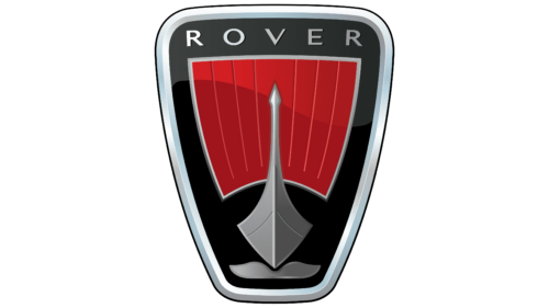
The Rover logo flies forward, demonstrating lightness, determination, and passion for travel. The emblem shows that the company does not like to retreat and always turns to face any difficulties.
Rover: Brand overview
| Founded: | 1878 – 15 April 2005 |
| Founder: | Jaguar Land Rover |
| Headquarters: | United Kingdom |
Rover is a British car company that has not existed since 2005. The right for the brand belongs to Indian Tata Motors.
Despite nearly a century of producing cars, the brand will go down in history as the first to introduce to the world a modern bicycle. It happened in 1884 when John Starley assembled equal-sized wheels, chains, and pedals into a single mechanism. In the automobile industry, Land Rover’s greatest success and the beginning of the company’s downfall can be considered the emergence of Land Rover in 1948. The model was a temporary project. Had the SUV not been spun off into a separate company, Rover would probably still exist today.
Meaning and History
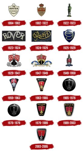
Company logos can be divided into two large groups: symbols associated with the production of bicycles, motorcycles, and cars; and symbols of the entire automotive period. They have clearly defined boundaries, reducible to the year 1925. With the complete focus on cars, the image of a ship entered the company’s identikit, which in various variations was retained until the closure and abolition of the brand.
What is Rover?
A British company that produced bicycles, motorcycles, and cars from 1884 to 2005. It is the ancestor of the modern bicycle and the Range Rover brand of popular SUVs.
1884 – 1902
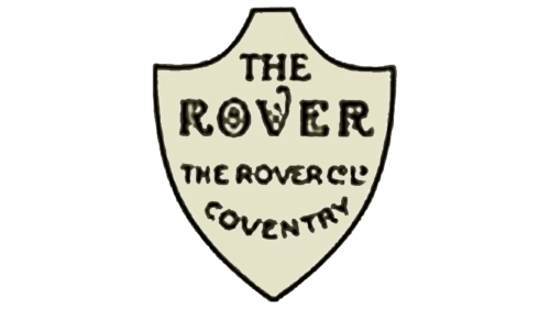
The brand logo appeared with the first bicycle, which saw the light in 1884, even before the company’s foundation. In shape, it resembled:
- The Shield of King Richard the Lionheart of England. The monarch was a famous commander and spent almost his entire reign in campaigns. The image relates to the desire to glorify his country and the travel theme.
- The stern of the ship. Prototype of roads and travels.
- The Sail. Symbol of a fair wind and the beginning of a long voyage.
In the upper part is written the name of the brand. It comes from the Scandinavian ruth (road) and has many meanings, from vagabond to pirate.
At the bottom of the emblem is the name of the English city Coventry, where the first workshop of the brand opened.
1902 – 1922
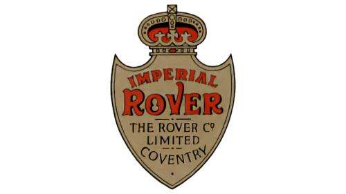
The company’s founder died at age 46 before his plans could be realized. His business was taken over by H. J. Lawson, who set up the production of motorcycles, starting with Rover Imperial.
The new owner made the logo more pretentious, crowning it with an English crown. The monarch’s symbol suited perfectly to the name of the models. The word Imperial was written on the shield with an arch, indicating the royal scope. All brand models were made of such high quality that they were worthy of emperors.
The detailing, double edging, and use of colors spoke of the great attention paid to the production of motorcycles, the love invested in the construction of bikes, and the thoughtfulness of technical equipment.
Adding the message of limited production runs emphasized the idea of exclusivity. All the gimmicks reflected Lawson’s ambitious desire to control the British automobile industry, something he strove for his entire career.
1922 – 1923
The company introduced the Rover 8 automobile. It was so popular that more than 17 thousand copies were sold until there was strong competition with Austin Motor.
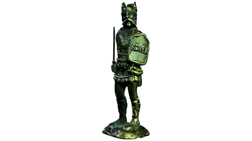
The company’s logo was changed to demonstrate power and strength to competitors and customers, and they chose a warrior with a sword and shield as the basis. One of the meanings of the word Rover is a traveling mercenary. A certain type of fantasy character, warriors who wander the world. They are close to the warlike Vikings. And one of them became the prototype for the company emblem.
The sign conveyed the desire to defend one’s niche in the market, to defend one’s position.
1923 – 1924
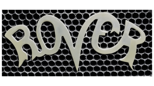
The logo changes into a word mark. The lower parts of the lettering elements split as if washed by waves. And the central V, like a boat cutting through the waves, stands firm and floats forward. With this symbol, the company wanted to demonstrate its unsinkability. It was from this year that the owners could no longer pay dividends and tried to appease the depositors.
1924 – 1929
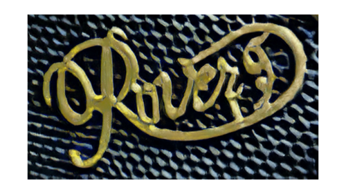
The firm closes the motorcycle division and produces a new Rover 9/20 auto model to hold on. In an omen of new victories and out of the crisis, the logo takes on a golden color, and the lettering rushes upward to the stars. The number 9 (model number) is added to the name.
1925 – 1929
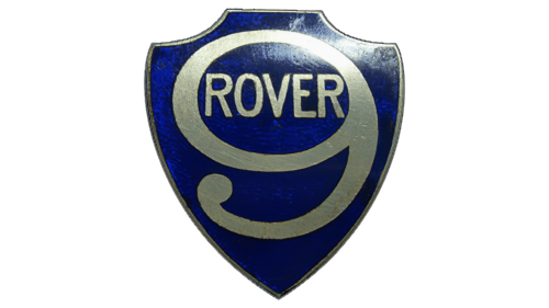
In 1925, the logo returned to the image of a shield. The central image inside the heraldic symbol of strength and maximum protection is the number 9, which indicates one of the company’s models. The name Rover is inscribed in the circle of the nine.
The emblem represents the conservatism of the brand, as the 9/20 model had already been unsuccessful for a year, and the company’s financial situation had worsened, but the emblem still features a nine.
1929 – 1947
The company had been loss-making for a long time and, in 1928, had to reorganize and accept a 60% reduction in capital. To save the company, the management was changed.
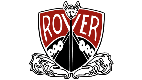
With his arrival, the famous Viking ship appeared in the logo. The bark reflected a new beginning in the emblem, the wind rushing into the sails. The image of the Viking and conqueror placed on the ship’s bow demonstrated the ambitions of the new leaders, the Wilks brothers (director and chief engineer), who dreamed of surpassing Ford.
1947 – 1949
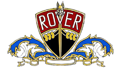
After the war, patriotic motives were felt in the company. The image of a ship was combined with heraldic leaves and the ribbon of the British flag, representing the waves of the sea. There were great prospects at the new factory in Solihull, so the ship in the logo was carrying on at high speed into the future.
1949 – 1959
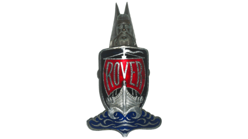
The clipper has been placed inside a shield held by a Viking. The image of the frigate became more realistic. The transformation of the Viking into a separate figure showed the power of human thought that controls movement and holds everything in its hands. Rover engineers developed the turbine engine, changing the direction of the company.
1959 – 1963
The emblem changed shape again, echoing the top of the car’s bumper. The ship under the shining red sail with the company’s name once again rode the waves unhindered, demonstrating development and improvement.
1963 – 1965
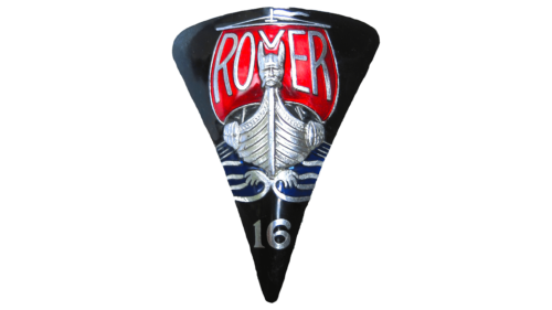
The triangular badge becomes trapezoidal, expanding upwards from below. And the Rover name soars over the ship. It is as if the company’s patronage helps the clipper sail. The emblem shows an increase in production. The bark represents the racing car, created in collaboration with BRM and raced in 1963.
1965 – 1976
The company becomes part of Leyland Motors. With the takeover, the logo becomes poorer. Colors disappear, and the ship is depicted schematically. The brand name is removed. Everything shows the loss of “face” and individuality. The silver lines on the round black background represent luxury (the new owner defined Rover in the division of his luxury cars).
1976 – 1979
Leyland Motors was nationalized by the British government and turned into British Leyland. The emblem is almost unchanged; only the black circle got more volume and shine. The sign reminds a pirate’s black mark. The color goes well with the new luxury Range Rovers that come out these years.
1979 – 1989
British Leyland brings back the 1963 unit logo idea: a red sail, thin lines outlining a ship, and gold Rover lettering. Under the updated logo, the cars are exported to the United States. The clipper resembles the wooden ships of the pilgrims as they docked at new shores.
1989 – 2003
Rover specializes in luxury and sports cars, becoming part of the Austin-Rover division and collaborating with Honda. The logo of this period acquires a wide white border background and more massive golden lines of the ship. The motion of the barque seems to slow down and freeze in radiant luxury. The sign resembles an ornament pleasing to the eye.
2003 – 2005
The last logo vividly demonstrates the brand’s gradual closure and its transition into the realm of history. The emblem loses its colors, golden lines, and detailed drawing as if frozen in stone and metal, like Rover, which was resold to BMW, Phoenix, Ford, and Tata Motors, disappearing from the market.
Font and Colors
The main colors of the logo are black, red, and white.
- Red – speed, passion, leadership, striving forward.
- Black – dignified competition.
- White – regular updating of the model range and usage of modern technologies.
The font reminds Gaultier Semi Bold, but with more pointed ends.
Rover color codes
| Safety Red | Hex color: | #c21d21 |
|---|---|---|
| RGB: | 194 29 33 | |
| CMYK: | 0 85 83 24 | |
| Pantone: | PMS 485 C |
| Carmine | Hex color: | #a0141c |
|---|---|---|
| RGB: | 160 20 28 | |
| CMYK: | 0 88 83 37 | |
| Pantone: | PMS 7626 C |
| Pastel Blue | Hex color: | #abc5d0 |
|---|---|---|
| RGB: | 171 197 208 | |
| CMYK: | 18 5 0 18 | |
| Pantone: | PMS 551 C |
| Medium Gray | Hex color: | #b8bbbc |
|---|---|---|
| RGB: | 184 187 188 | |
| CMYK: | 2 1 0 26 | |
| Pantone: | PMS Cool Gray 4 C |
| Spanish Gray | Hex color: | #96989b |
|---|---|---|
| RGB: | 150 152 155 | |
| CMYK: | 3 2 0 39 | |
| Pantone: | PMS Cool Gray 7 C |
| Davy’s Gray | Hex color: | #4d4d4d |
|---|---|---|
| RGB: | 77 77 77 | |
| CMYK: | 0 0 0 70 | |
| Pantone: | PMS 7540 C |
| Charleston Green | Hex color: | #242827 |
|---|---|---|
| RGB: | 36 40 39 | |
| CMYK: | 10 0 2 84 | |
| Pantone: | PMS 419 C |
| Black | Hex color: | #000000 |
|---|---|---|
| RGB: | 0 0 0 | |
| CMYK: | 0 0 0 100 | |
| Pantone: | PMS Process Black C |
