The sweet memorable taste can be traced in the large three-dimensional symbols of the emblem. The Royal Crown Cola logo emphasizes the addition and enrichment of the familiar cola recipe. All drinks of the brand are worthy of the attention of royalty.
Royal Crown Cola: Brand overview
| Founded: | 1905 |
| Founder: | Keurig Dr Pepper |
| Headquarters: | United States |
| Website: | rccolainternational.com |
Meaning and History
This brand name is closely associated with a store that opened in 1901 on West 10th Street in Columbus, Georgia. Two years later, it passed into the sole ownership of the Hatcher family, so it was renamed the Hatcher Grocery Store. At the same time, the demand for soft drinks began to increase in the country, so every grocery store tried to add them to its range. Claud A. Hatcher also decided to seize the moment and profit from it. He purchased a large quantity of Coca-Cola syrup from a local Columbus Roberts and began selling it.
However, when he ordered the next batch, the manufacturer refused to give him a discount for the bulk purchase, even though the grocery store owner was buying a large volume of the drink. Then a quarrel broke out between them, which laid the foundation for the world-famous RC Cola brand. The retailer-developer added to his recipe, besides the usual ingredients, a few more components that improved the product’s taste. The first version under the name Royal Crown Ginger Ale was released in 1905. The actual name of the soft drink got in 1934.
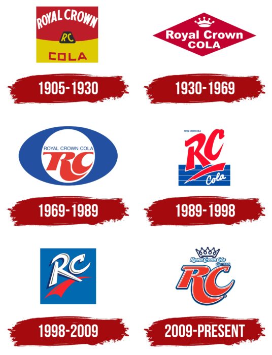
In addition, this company has been an innovator in several specialized areas. It was the first to offer a non-alcoholic drink in the tin and aluminum cans, introduce diet coke, and abandon corn syrup by using cane sugar instead. The brand changed hands many times, was bought and sold, merged with other companies, changed owners, so it has a rich history of logos, of which there are six.
1905 – 1930
The label introduced in 1905 was rectangular and consisted of two halves, red and yellow. The upper half was slightly larger than the lower half and contained yellow lettering on a red background. The phrase “Royal Crown” had an arched shape. The second side of the logo was in yellow, and it contained the third word of the drink’s name, “Cola.” It was in red. In the middle was a square with the abbreviation “RC.” The light-colored letters stood out clearly against the black background.
1930 – 1969
Almost 40 years later, the first redesign of the logo took place, after which it acquired a radically different look. It was a horizontally stretched red diamond with white inscriptions inside. The trademark name occupied the central place, above which a miniature crown with seven teeth – three at the back, two at the front, and one on the right and left. The letters were straight, chopped, lower case, except for the first in each word.
1969 – 1989
For the next 20 years, the logo was used in a different style and proportions. It was a mysterious big “O” of deep blue color with thickening on the sides. Inside the letter, the gap was a white circle with a massive monogram “RC,” above which the full brand name could be seen. It was typed in thin capital lettering. The abbreviation was elegant, shaped, and consisted of flowing lines. And the designers harmoniously placed the “C” in the curve of the “R” leg. Both had pointed ends.
1989 – 1998
The next step in the Royal Crown Cola identity was the appearance of a modern logo. It was associated with the transition of the name to the abbreviated form of RC Cola. To make the design as attractive as possible, the authors enlarged the abbreviation, placed it vertically, and underlined it with a short but expressive stroke with a white outline. Underneath it was the italic, handwritten word “Cola. It was set against a blue background, ruled out in four wide stripes. The full name of the drink was in the upper left corner.
1998 – 2009
Designers left only visually significant elements of the logo: white and blue letters “RC” with side shades and red strokes in the form of an arrow. They were in a blue square.
2009 – today
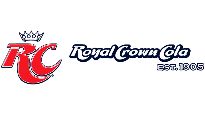
After the return of the former name, the emblem of the soft drink manufacturer has become radically different. Now it is decorated with an elegant crown with five prongs and four small circles. Under the crown is the word combination “Royal Crown Cola. It is italicized, white with a blue outline and blue shadows. An abbreviated version of the name occupies the central zone. The letters “RC” are large, bold, with wide and pointed feet like the 1969-1989 version. The only difference between them is the triple border. The signs are also complemented by light highlights that add volume. In addition, the year the brand was founded appeared on the logo.
Font and Colors
To attract potential buyers, the management of Royal Crown Cola used a technique that works well – patriotism, which subconsciously evokes solidarity with the state. It astutely colored the logo elements in the colors of the American flag – red, blue, and white. This happened in 1969. Since then, every version of the brand’s visual identity has contained this palette. And the evolution of the logo’s shape has moved from simple to complex, so there’s a lot more detail in it now than before.
For the lettering on the logo, the Royal Crown Cola brand has always chosen an unconventional style. The early versions were dominated by small font; then, there was an emphasis on coarseness. And at all times, the typeface remained individual – especially the abbreviation “RC” with graceful curves and wide lines, sharpened at the ends. The color scheme consists mainly of red (it was present in the emblem from the beginning), white (appeared in one of the early variants), and blue (was added in 1969).
Royal Crown Cola color codes
| Cinnabar | Hex color: | #ee3425 |
|---|---|---|
| RGB: | 238 52 37 | |
| CMYK: | 0 78 84 7 | |
| Pantone: | PMS Bright Red C |
| Star Command Blue | Hex color: | #017dc3 |
|---|---|---|
| RGB: | 1 125 195 | |
| CMYK: | 99 36 0 24 | |
| Pantone: | PMS 7461 C |
| Delft Blue | Hex color: | #1b2c5a |
|---|---|---|
| RGB: | 27 44 90 | |
| CMYK: | 70 51 0 65 | |
| Pantone: | PMS 655 C |
