The Royal Enfield logo reflects the brand’s centuries-old traditions and extensive experience in motorcycle manufacturing. Its dynamic shapes and bright colors convey the spirit of adventure, inspiring motorcycle enthusiasts to conquer new roads. The emblem’s elegant style emphasizes their vehicles’ prestige and superiority.
Royal Enfield: Brand overview
| Founded: | 1955 |
| Headquarters: | Chennai, India |
| Website: | royalenfield.com |
Tracing its roots back to Redditch in the UK, the first motorcycle under the Enfield banner saw the light of day in 1901. Fast forward to 1955, and the company made waves in international waters. The Enfield Cycle Company established a strategic alliance with Madras Motors in India, leading to the birth of ‘Enfield India,’ which took on the responsibility of piecing together Enfield bikes.
However, 1957 witnessed a significant shift. The original Enfield establishment in Redditch halted production. Sensing an opportunity, Enfield of India secured the rights to the ‘Royal Enfield’ moniker. The subsequent decades, particularly the 60s and 70s, saw Royal Enfield motorcycles solidifying their reputation for durability and their success in endurance races.
By the time the 1990s rolled around, the brand needed rejuvenation. This came in the form of Eicher Motors, which took the reins of Enfield India. Under this new leadership, the company was transformed. Production scales were elevated, quality was enhanced, and many new models were unveiled. Models such as the Bullet, Classic, Thunderbird, and Continental GT became synonymous with the brand.
The 2000s marked another evolutionary phase for Royal Enfield. Embracing its retro charisma, it captured the hearts of enthusiasts across Europe, North America, and Southeast Asia. This surge in interest was accompanied by the establishment of additional manufacturing facilities and the introduction of new motorcycle models. One such model, the Interceptor INT 650, has become a favorite amongst biking aficionados worldwide.
Presently, Royal Enfield enjoys a distinguished position in the motorcycle world. Dominating the mid-size motorcycle sector, which covers engine capacities ranging from 250cc to 750cc, the brand is celebrated for its timeless design and distinctive engine sound. Royal Enfield’s nostalgic allure sets it apart in a world of contemporary motorcycle designs, ensuring it remains a cherished brand for many.
Meaning and History
What is Royal Enfield?
Ever since its inception in 1955, Royal Enfield has epitomized liberation and exploration, kindling the spirit of adventure in numerous biking enthusiasts across generations. From the rugged terrains of the Himalayas to expansive highways, countless riders have trusted Royal Enfield as their faithful companion, relying on its dependable and potent bikes that can navigate any route. Operating from its base in Chennai, India, Royal Enfield persistently spearheads the motorcycle market, granting biking enthusiasts the thrill of embracing the boundless freedom offered by the open road.
Old
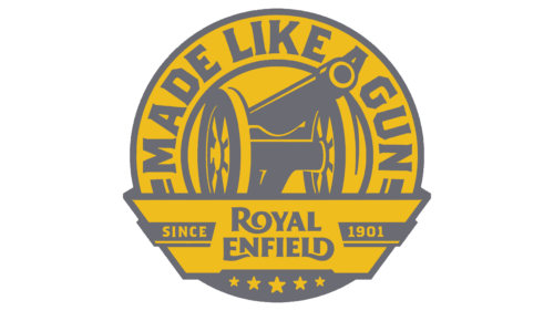
This logo owes its creation to a fortunate series of events. It was developed after George Townsend & Co. secured a lucrative contract to supply precision parts. At the time, such an order was considered very prestigious because the recipient was the Royal Small Arms Factory in Enfield.
The manufacturer of metal components was so proud of the collaboration with the royal enterprise that they changed their name to Enfield Manufacturing Company Ltd. and added one of the armory’s products—a wheeled cannon—to their emblem. This has led many to mistakenly believe that Royal Enfield was once an arms manufacturer.
The logo contains another element that reinforces this misconception: the phrase “MADE LIKE A GUN.” It forms an arch over the cannon, resembling a protective dome. The large letters, with sharp serifs, diagonal cuts, and angles where curves would typically be, evoke a sense of reliability, strength, and confidence. Royal Enfield was never involved in weaponry; the phrase “Made Like A Gun” was used solely to promote bicycles. The military style of the emblem is a remnant of the prestigious contract with the Royal Small Arms Factory.
The large cannon and the martial motto occupy the top half of the circle, while the bottom features a wide ribbon with the brand name. The two-tier inscription impresses with its elegant grandeur, contrasting with the ruggedness of the other logo components.
The edges of the ribbon are flanked by the words “SINCE 1901,” indicating the year the first Royal Enfield motorcycle was produced. At the bottom are five stars of varying sizes, symbolizing the high quality of the vehicles and reflecting their numerous successes in competitions. The colors of the emblem are chosen to match the military theme. Still, the combination of the mustard-yellow circle with gray images and inscriptions is not ideal, as the pale elements are difficult to see against this background.
1995 – 2014
1995, the brand’s history began anew when Enfield India acquired Royal Enfield. The company updated the logo to suit their new motorcycles better. Designers removed the cannon as the vehicle manufacturer began to take pride in its achievements rather than the long-forgotten collaboration with the Royal Arms factory.
Instead of a multi-component emblem, a simple wordmark is used without additional elements. The only decoration of the inscription is the decorative serifs, which are directed in different ways. For example, the serifs on “A” and “Y” are strictly horizontal, on “F” and “E” some point downwards, and on “L” upwards. Diagonal cuts create an illusion of movement, reflecting the rebellious spirit of the company. To convey a thirst for speed in every detail, the designers made the logo asymmetrical:
- Enlarged the initial letters, although the inscription is entirely in uppercase;
- Aligned the first word to the left and the second to the right;
- Extended the leg of the “R,” transforming it into a sharp blade-like shape.
This style has a vintage touch. The retro font highlights the brand’s deep roots, originating at the turn of the 18th and 19th centuries and gaining a second life after transitioning to new ownership. On the other hand, the bright red color of the logo is tied to the modern era. It appeals to passionate motorcycle enthusiasts with a thirst for excitement and adrenaline. Thin golden outlines create a sense of luxury, as Royal Enfield motorcycles combine sophisticated design and advanced technology.
2014 – today
In 2014, the logo evolved while retaining some features of the original. Its bold aesthetic targets the younger generation of motorcyclists, as the brand needed to attract new buyers due to fierce competition with renowned brands like Triumph and Harley Davidson.
Modernity, brightness, and freshness are the three pillars of Royal Enfield’s concept. The refined wordmark aligns with these qualities while also reflecting the brand’s historical connection to Britain, as the elegance of the inscription hides a distinctly British meticulousness.
The motorcycle manufacturer’s name is rendered in a customized font with short, sharp serifs that make the edges of the letters appear thickened, giving them a visually embossed look. The “R,” “E,” and “D” feature extended lines with smooth curves. These lines overlap with neighboring glyphs, adding uniqueness to each:
- The “O” appears as an elegant curl at the end of the “R”;
- The “N” lacks a fragment of the vertical stroke, covered by the protruding part of the “E”;
- The “L” fully merges with the “D,” forming a shape reminiscent of an inverted “G.”
The font used in the logo is roughly similar to Cleargothic Pro Xbold by SoftMaker and Brothers Bold by Emigre, but it has significant differences. Designers gave the letters unique shapes to achieve a vintage effect, aiming to blend authenticity with a modern style.
The dark red color is less expressive and aggressive than in the previous version. It lacks the passion that reflects the intense emotions of fast riding. The new shade evokes a sense of restrained love for motorcycles, subtly reminding us of driving safety. Nevertheless, it remains red—the color of adrenaline, vitality, energy, and movement.


