The Ruffles logo is one of those that has retained its identity over the years. Redesigns over different periods have only slightly altered the key concept of the company’s positioning and the style of the logo creation. The visual aspect has gained new colors and become more attractive with each modification.
Ruffles: Brand overview
Elmer Doolin, the founder of the Frito Company, chose to develop a new variety of potato chips in 1958, which marked the beginning of the Ruffles saga. The goal was to create chips with a ridged surface to set them apart from standard flat chips and increase market appeal.
Because of the chips’ distinctive wavy shape, reminiscent of ruffles on apparel, the name “Ruffles” was chosen. The chips’ unusual shape gave them a standout appearance and increased their durability for dipping without shattering.
Ruffles were made solely of salt, but consumers soon loved its ridged texture. The chips’ crisp texture and stronger potato flavor distinguished them from rival brands.
A significant development in the brand’s history occurred in 1961 when the Frito Company and H.W. Lay & Company combined to establish Frito-Lay. This transaction gave the brand access to a larger distribution network and more resources for marketing and development.
The product saw rapid expansion in the 1960s and 1970s. The company started experimenting with different flavors, including versions with cheese, sour cream, and onions. These novel tastes gained popularity quickly and contributed to the growth of the customer base.
When PepsiCo acquired Frito-Lay in 1965, it created fresh opportunities for the brand to grow. The business increased its marketing and advertising expenditures, which helped the chips’ appeal continue rising.
The product line expanded in the 1980s. The company unveiled new flavors like sour cream with chive and BBQ. Around this time, the brand also started promoting its products on television.
The company kept up the innovation in the 1990s, releasing a lower-fat version of the chips. This was a reaction to consumers’ growing worries about a healthy diet. The firm also started making bigger chips called Max.
The company saw a phase of worldwide expansion in the 2000s. The firm aggressively marketed itself in foreign markets, customizing tastes and using advertising tactics to suit regional preferences.
The “Max: Double Rush” promotion was introduced in 2010 and featured chips that combined two popular flavors into one product. This innovation helps the brand stay relevant in the cutthroat snack market by grabbing consumers’ attention.
The Ultimate variety of chips, which features larger cuts and stronger flavors, was introduced in 2013. This range targeted customers looking for a more “premium” snacking experience.
The brand started working with well-known athletes and celebrities in 2015 to promote its products.
The “Crispy Fries” brand of potato sticks, which imitate the flavor and texture of French fries, was introduced in 2016. This product provides a quick and easy snack option for those who enjoy fast food.
In 2017, the well-known Canadian taste “All Dressed”—which combines barbecue, sour cream, onion, salt, and vinegar flavors—was introduced to the American market. This growth showed the brand’s dedication to bringing flavors worldwide.
2018, a limited edition of chips created in association with NBA player Anthony Davis was released. The athlete’s favorite foods inspired the distinctive shape and flavor of the “Ridge Tops” chips.
In response to the rising demand for spicy snacks, “Flamin’ Hot,” a fiery take on the traditional ridged chip, was introduced in 2019. Young folks instantly took a liking to this rendition.
In 2020, the company released a series of chips created in partnership with rapper T-Pain, continuing its tradition of working with celebrities. The “Lime & Jalapeno” chips combined sour and spicy flavors to reflect the artist’s tastes.
In 2021, “Double Crunch,” chips with an extra crispy texture made possible by a novel frying method, were introduced. Customers’ need for more powerful sensory experiences led to this answer.
The company expanded its market share in the healthy eating space in 2022 by launching a range of chips fried in vegetable oil that included less saturated fat. The goal of this campaign was to draw in health-conscious customers.
The firm actively worked to build its online presence throughout the years by introducing interactive web campaigns, partnering with influencers and gamers, and testing the use of augmented reality in marketing. The company grew its global footprint by customizing flavors and advertising tactics to suit regional tastes.
Meaning and History
The red letters have maintained their grandeur, while some decorative elements have begun to convey modern motifs. The aesthetic beauty of the current logo, as well as its integrity, recognizability, and readability, are undeniable. The Ruffles logo is known worldwide. Thanks to the successful operation and vibrant presentation of delicious chips, the company has earned the trust of millions. The variety of flavors and types of chips has been a pleasant surprise for customers. No matter what country a person is in, seeing the brand’s shiny letters, the hand invariably reaches for them.
The logo prompts you to quickly indulge in spiced chips, sparking your imagination and desire for a pleasant break.
What is Ruffles?
It is a brand of ribbed potato chips owned by Frito-Lay, a division of PepsiCo. The chips are known for their distinctive ribbed texture, which makes them ideal for dipping and provides a satisfying crunch. They are available in a variety of flavors, including original, cheddar and sour cream, and sour cream and onion. The brand emphasizes high quality ingredients and bold flavors that appeal to a wide range of snack lovers. It is widely available in supermarkets, convenience stores and online retailers, making them a popular choice for parties, gatherings and everyday snacking.
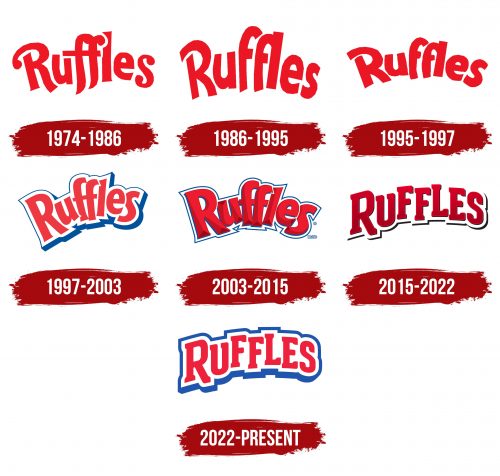
1974 – 1986
The brand’s first logo appeared in 1984. Its statement was concise and interesting. The bright logo, consisting of just the brand name, was beautiful and dynamic. It proclaimed that the letters’ font was as unique as the delicious chips. This is why the simple word “Ruffles” on a white background became so important to millions of customers in its original graphic presentation.
The letters were unconventional, especially the capital “R” and the two “f” s. These letters gave the word charm and appeal. The ends of the letters were rounded with a beautiful element resembling a comma, which added playfulness and lightness to the word. This visual presentation was liked by many. Some quickly fell in love with the chips and remained loyal to the brand, while others decided to experiment and were delighted.
In any case, the logo fulfilled its main mission — it attracted everyone’s attention.
1986 – 1995
Starting in 1986, the letters of the logo changed their shape and overall appearance. They became less playful but more precise, giving them a unique style. The color scheme remained the same: white and red created an excellent color combination. The letters no longer had outlines and were positioned closer together. The swirls became more graphic, giving the logo a geometric and concise look. The readability was high, and the overall perception was exceptionally positive.
Now, the “Ruffles” brand seems to declare that while traditions are preserved, the taste of the chips will become even more interesting for customers.
1995 – 1997
To fully appreciate rebranding’s multifaceted nature, comparing two logos from different periods is worth comparing. Only then will it be clear that the lettering style and placement have significantly changed.
The red letters appear placed on a rainbow, creating a certain inclination angle. The spacing between them conveys the lightness of the chips.
1997 – 2003
According to the company’s management, the identity needed a radical transformation. Therefore, it was decided to collaborate with Landor Associates. Designer John Burns was tasked with transforming the existing logo, making it more appealing and stylized.
The task was accomplished. The brand name became less bright, and key elements were transformed in color. The red color lost its intensity, giving the logo harmony. Subdued shades emphasized the company’s authority. White was no longer just a background; its combination with blue to create an outline was a successful decision. The three-color palette drew more attention to the logo and improved readability. The identity gained unique motifs and an original style.
2003 – 2015
The updated logo does not show critical changes to the main accents. The overall colors and company philosophy are preserved, but the logo becomes more refined. The red is rich and deep, combined with a lighter shade to create a three-dimensional effect. The lines and contours of the letters are clearly defined, enhancing the logo’s presentation.
The blue outline became less pronounced, more symmetrical, and narrower. The shape of the letters changed, and their placement became freer.
Many believe this brand name presentation is one of the most successful. The identity was used both in the USA and beyond.
2015 – 2022
It might seem like everything regarding logo updates should change. However, in practice, only a few new elements might be added while keeping the core unchanged. This is roughly what happened with the company’s new identity.
The white background and red letters were already familiar. However, the outline became less burdensome for the overall perception of the logo, being drawn only at the bottom, which conveys a sense of freedom of choice.
A new outline appeared, representing a play of colors. The muted red tone evenly fills each letter, and a shiny shade of the same color graphically traces each contour, giving the logo a three-dimensional and expansive look.
As practice shows, rebranding positively impacted sales, and the new logo attracted many customers.
2022 – today
Many claim that the 2022 logo used by the brand is familiar and has been seen before. However, the situation is not so straightforward. The color palette from the 1997 identity was returned, but the logo changed significantly.
The blue outline now varies in thickness at the top and bottom. Its color became more intense, harmonizing well with the red.
The font also changed, becoming simpler yet more presentable. The letters are placed at different heights and have softer shapes. There are no drawings or images of objects, as designers believe excesses are unnecessary.
