Details of the Ruinart logo connect the appearance and distribution of the champagne brand with the decree of the King of France. The emblem immerses the buyer in history, and each element informs about old recipes and long-term exposure to the collection.
Ruinart: Brand overview
| Founded: | 1729 |
| Founder: | Nicolas Ruinart |
| Headquarters: | Reims, France |
| Website: | ruinart.com |
Meaning and History
The Ruinart family represented the bourgeoisie of the province of Champagne and was mainly involved in the sale of textiles. But the Benedictine monk Dom Thierry Ruinart noticed the growing popularity of sparkling wine among the aristocracy, so he advised to move away from the original business, focusing on winemaking, and then to give up selling fabrics altogether. In this, he was aided by an instinct.
He passed on his concept to his nephew Nicolas Ruinart, who eventually realized his uncle’s idea because the situation was favorable for him. In 1728 King Louis XV, by a special decree, allowed to transport wine not in barrels, as it was before, but in bottles. Therefore, it became possible to deliver it even to distant markets. At first, customers offered Champagne wines as business gifts when buying cloth.
In the autumn of 1729, the wine house Ruinart started its work, and in 1730 it sent its first shipment. Baskets of bottles, packed 50-100 at a time, were transported along with bales of cloth. But in 1735, they completely superseded cloth because the family switched to the wine business because of the huge success of champagne. Then Claude (son Nicolas) moved his office, production facilities, and cellars to the town of Reims, where the company is now located. The entrepreneur felt the particular importance of the chalk cellars for aging wine, so he bought them. It happened in 1768.
The firm is now the owner of the largest cellars in the Champagne region, at a depth of 38m and 8km in length. Another commercial flair of the Ruinart family is related to art. It immediately caught the refined trend of the aristocracy and commissioned advertising posters from the famous artists Alphonse Mucha and Louis Tozen. Later, a similar approach was applied to the corks: they were designed by India Mahdavi, Christian Biecher, Patricia Urquiola, Maarten Baas.
The shape of the bottle was dictated by rarity examples – antique examples of glass champagne containers from the 18th century. They were always decorated with the personal label of the wine house – heraldic coat of arms in golden tones to match the color of the sparkling contents. It was changed only once to demonstrate the brand’s commitment to development and perfection. At the same time, Ruinart’s brand identity has always emphasized its historical heritage.
Old
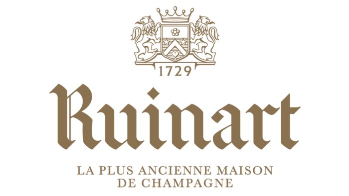
The iconic logo contains the main highlight – the name in the Gothic style of the 18th century. The old font embodies the charm of the Middle Ages: needle pointing at the ends, a clear sequence, exquisite proportionality, austerity, and at the same time, otherworldly unconventionality. Each letter has oblique cuts, geometric curves, and short, thin lines connecting the wide feet. Overall, the typeface is inline, bold, and aristocratic.
The graphic part is an ancient coat of arms: two lions holding a shield with a wild rose, stars, and a heart depicted. They are surmounted by a large crown. This attribute of monarchic power underlines the royal status of sparkling wines. On top of everything is the year of the brand’s appearance. Below is the inscription “The first established champagne house.”
New
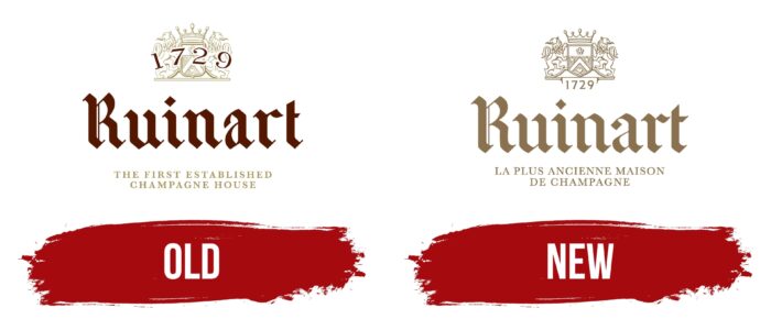
Renewal of the famous French wine house Ruinart logo was made by the design agency Pierre Kertz. Its task was to revive the emblem’s individuality and adapt it to modern trends. With several modifications, the designers managed to convey the historical roots of the oldest champagne producer. They completely changed the bottom part: made the letters clearer, increased their size, and used a new phrase instead of the old one – “La plus ancienne maison de champagne.”
The designers simplified the upper part by removing some small details that hindered the perception of the coat of arms. The pentagonal shield became clearer, and the lions and crown became smaller. The year of the company foundation, which was on top of the figure, the authors moved it down, allocating a special niche between the two strips. Although the name seems to be fully preserved, the lines of some letters have a little less slant, and the serif ends are much sharper.
Font and Colors
The modern Ruinart logo is lighter than the old one. According to the developers’ concept, it reflects the effulgence of champagne wines, symbolizes the brilliance of gold and sophistication of the aristocracy. During its modernization, the most important change is associated with removing the date, which was superimposed on the coat of arms. The designers moved it down and stretched it horizontally, whereas previously, it was arched.
A custom typeface was chosen for the emblem called Ruinart Gothic. It is a Latinized interpretation of the Gothic style, reflecting refinement and delicacy. Now a soft color scheme is used – dusty gilding. It also emphasizes the aristocratic and premium status of the champagne. Previously, the logo was dominated by a combination of gold and brown.
Ruinart color codes
| Shadow | Hex color: | #8a7250 |
|---|---|---|
| RGB: | 138 114 80 | |
| CMYK: | 0 17 42 46 | |
| Pantone: | PMS 874 C |
