![]() Rush Logo PNG
Rush Logo PNG
In the group’s history, the Rush logo is not the only one. And they are opposites: the first with large capital letters, the second with thin lowercase glyphs. But they share a common color: both emblems are red, with an intense shade. This makes them dynamic and energetic, allowing them to stand out against any background.
Rush was formed in Toronto in 1968 by guitarist Alex Lifeson, drummer John Rutsey, and bassist-vocalist Jeff Jones, soon replaced by Geddy Lee. In its early years, the band leaned toward heavy blues rock under the influence of Led Zeppelin, during an era shaped by British rock groups.
In July 1974, Neil Peart auditioned after Rutsey left because diabetes made touring difficult. Peart became the drummer and main lyricist, forming the long-running trio with Lee and Lifeson. The band’s 1976 album 2112 brought its first major success, with a sci-fi rock opera influenced by Ayn Rand’s Anthem. Rush held to the concept despite label resistance, setting itself apart from acts such as Pink Floyd and Yes through a heavier guitar base.
Permanent Waves followed in 1979, with “The Spirit of Radio” bringing Rush to FM radio. In 1981, Moving Pictures became the band’s best-selling album, led by “Tom Sawyer.” In 1984, Grace Under Pressure included “Red Sector A,” based on memories from Geddy Lee’s parents about concentration camps and liberation after World War II.
In 1997, Peart’s daughter Selena died in a car crash, and his wife Jackie died of cancer within the next ten months. Rush returned in 2002 with Vapor Trails. The final studio album, Clockwork Angels, arrived in June 2012 and reached No. 1 in Canada and No. 2 in the U.S. Rush entered the Rock and Roll Hall of Fame in 2013, with Foo Fighters’ Dave Grohl presenting them. The R40 tour ended on August 1, 2015. Peart died of glioblastoma on January 7, 2020, at 67.
Meaning and History
![]()
In the early years, the young musicians were essentially searching for themselves, often changing their lineup. Some members left the group due to creative differences, others due to incompatible personalities, and still others due to poor health. The band finally settled on its lineup in its seventh year and lasted until the end of its career. Despite the problems, Rush gradually transformed from a basement band to a concertmaster, working no less than six days a week. However, they could not sign a deal with major studios, so they created their own label, Moon Records.
The group recorded their first single in 1973, and in 1974, their first compilation was released, with a circulation of 3,500 copies. Although it was a limited edition, it led the musicians to success and a $200,000 deal. The cover of their debut album featured the rock collective’s name. The members consciously chose a textual emblem to gain recognition among music lovers and stay in the limelight. The most accessible, fast, and clear way to convey information is through text. To make it visible, designers colored it in a striking red. In total, Rush had two main logos.
What is Rush?
Rush is a Canadian rock band consisting of three musicians. It emerged in Toronto in 1968 and ended its musical career in 2018. Its main genres were hard rock, blues, and progressive rock, characterized by complex compositions, eclecticism, and lyrical motifs.
1973
![]()
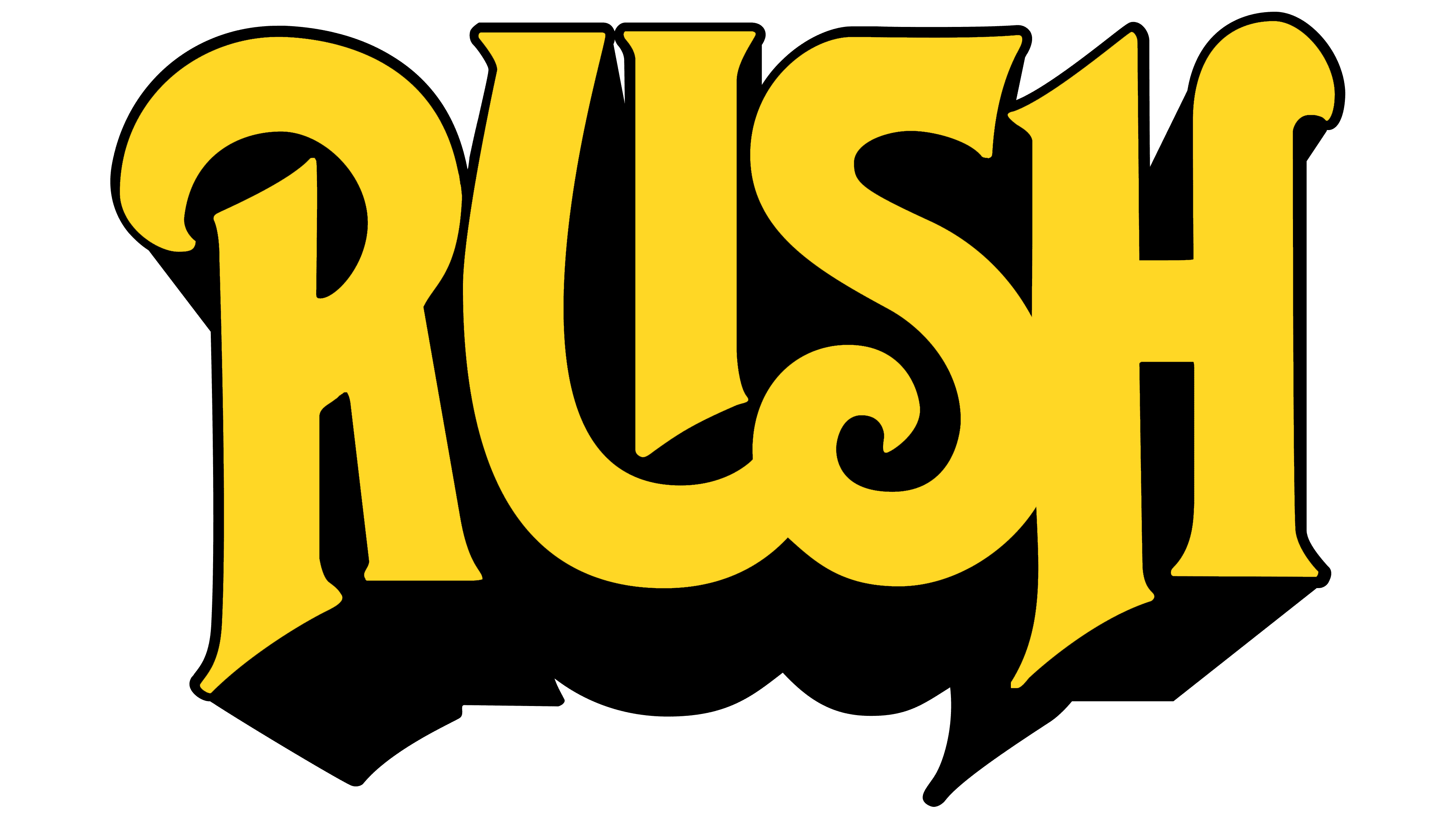
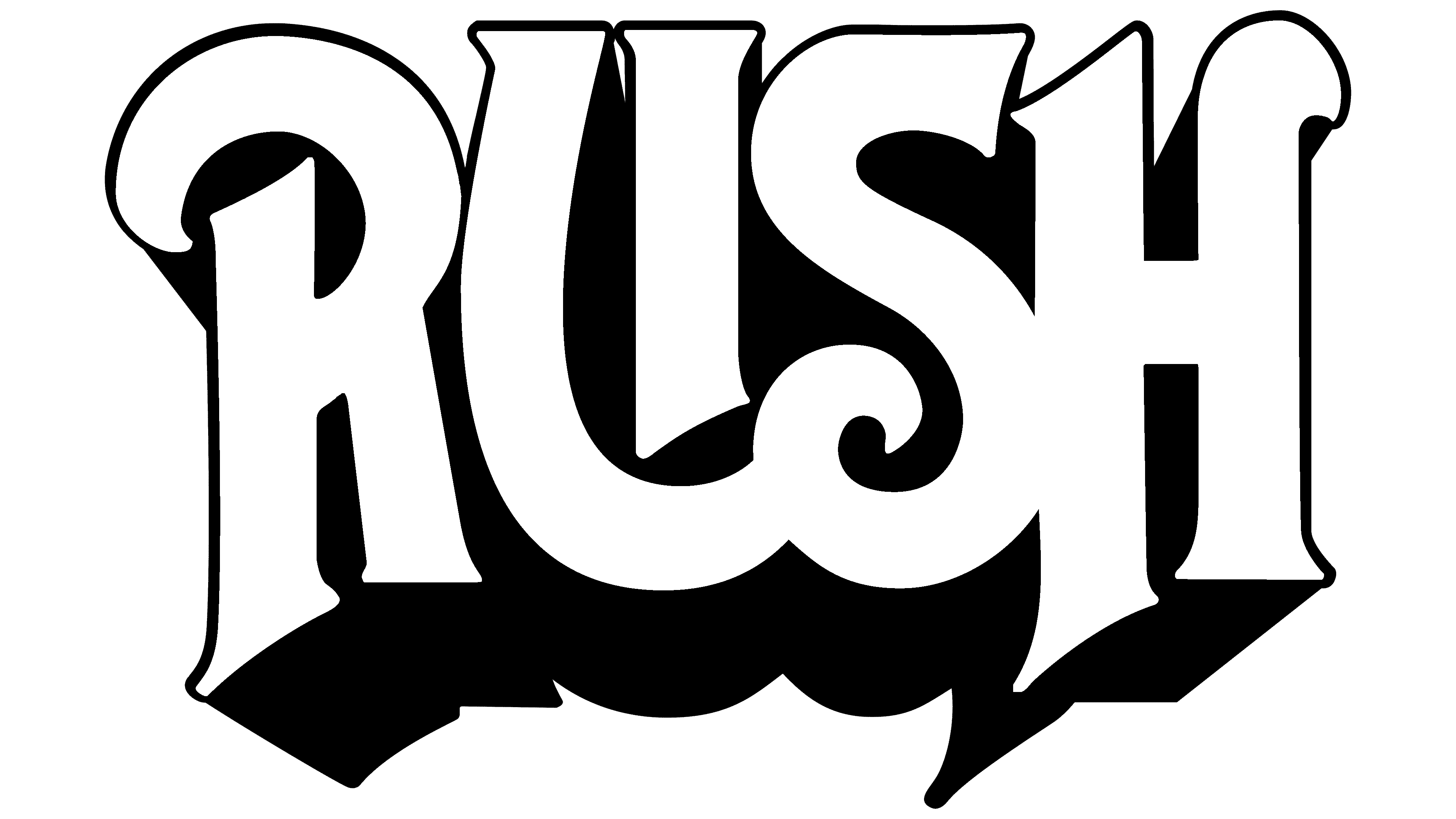
The earliest version of the Rush logo is large and solid. All the letters are connected, if not directly, then by the shadow that surrounds them. Paradoxically, the inscription has many curves and sharp points. They harmoniously complement each other, being balanced and optimally distributed. The presence of spikes is related to the rocker genre’s theme, aiming to address sharp issues. The letters are massive, bold, and three-dimensional due to the black outline. They are made in an Old English style with Gothic elements. The “R” and “H” extend below the lower boundary, while all glyphs are aligned at the top.
1978
![]()
On the cover of the sixth album (Hemispheres), the title is set in italic type. It looks as if it was written by hand quickly and unevenly, even clumsily, as if in a hurry. A testament to this is the barely distinguishable “h,” the right side of which is almost horizontal and looks like a wavy line. The edges of the letters are jagged and covered with nodular protrusions. The glyphs are thin, and the long leg of the “R” intersects with part of the “u.”
A distinctive feature of the first Rush logo is the double “U.” It consists of a short vertical line and a long hook going to the right. Together they form a standard letter. The lack of connection between them is not immediately noticeable because both sides of the glyph are equally red and located on a monochromatic background.
Font and Colors
The inscriptions in the Rush emblems are made in individual fonts. In the first version, they are tall and bold letters, while in the second, they are narrow and in italics. The only thing they have in common is the color red, which is saturated and energetically active.