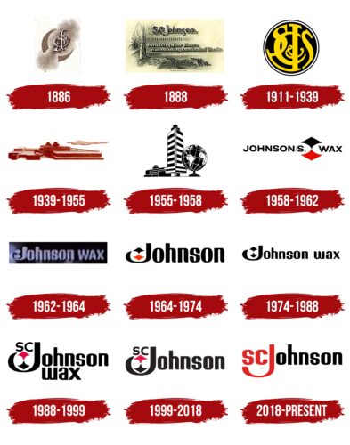
The household chemicals manufacturer has reflected the idea of creating a clean and healthy environment in its identity. Although the S.C. Johnson logo does not contain obvious images, it symbolizes the power and energy needed to fight against pollution. The logo is also associated with reliability, support, and mutual aid.
S. C. Johnson: Brand overview
| Founded: | 1886 |
| Founder: | Samuel Curtis Johnson Sr. |
| Headquarters: | Racine, Wisconsin, United States |
| Website: | scjohnson.com |
S. C. Johnson – the largest manufacturer of household chemicals with 13 thousand employees and annual sales of 5 billion dollars. Logo S. C. Johnson’s logo is known in 110 countries where its products are sold. Under the control of the corporation, about 50 subsidiaries.
The company’s history, deeply respectful of family values, began in 1882 when young Samuel Johnson began selling the parquet produced in his town. In 1886 he named the purchased parquet company after himself. Gradually Samuel engaged his son and then his grandson. However, the business of flooring, baseboards, and paneling did not attract the Johnsons for long. The family was much more successful in cleaning, detergents, and home fresheners. Therefore, the company opened its laboratory, where world-famous brands were invented.
Meaning and History
S.C. Johnson’s logos embody the history of one of the oldest American companies. The company took its name from Samuel Curtis Johnson, a businessman who first sold floor coverings and then products for cleaning parquet. His initials were intertwined in a bizarre monogram and long used as an emblem. It happened in the 1880s.
Five generations of the same family ran the company. They were in control of everything, right down to the visual identity, so for a century and a half, the S.C. Johnson logo evolved with the brand. It reflected the famous headquarters of the household chemicals manufacturer, the desire for international expansion, and a creative approach to design. In 1964, Lippincott & Margulies created a black wordmark that gave rise to a whole group of similar inscribed emblems.
What is S. C. Johnson?
A large American corporation is offering chemicals for home and personal care products. Since its founding in 1886, it has been owned by the Johnson family.
1886 – 1888
An interesting idea was chosen for the first logo – the owner’s initials floating in the sky. They seem to float in the embrace of the month on a cloud above any hardship and adversity.
The ornate monogram letters are stacked on top of each other. Have curly tendrils intertwined with each other. Such intertwining shows a person perfectly harmonious with himself, his family, relatives, and loved ones. Johnson relies on the strength, knowledge, and upbringing that his family gave him in building his company. He does not seek help from the outside. And it pays off: in four years, he was able to buy the parquet company he was working for. And then, after 1886, he invented a means of caring for it.
His thorough approach and strength of character are expressed in the logo by the fact that the monogram of the name looks forged from iron. It is sturdy and strong.
The initials move upward, higher and higher, as seen in the flow of the air masses. The choice of the Monthly for the base of the image shows not the way to the Sun to burn but the way to the stars to dream, to take one’s place among the prosperous and wealthy.
1888 – 1911
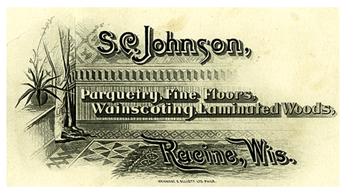
Samuel introduced Johnson’s Prepared Wax and expanded the range of wood products for the home. Johnson designed a new logo to boost profits, which barely exceeded three hundred dollars in the first year.
It is in the style of a business card or modern banner. The updated sign favors visibility. It’s an image of a part of an apartment that uses Johnson products in its interior. The designer tried to convey the coziness of a paneled and parquet-floored room to show customers how it might look visually. Right on top of the image is a listing of all of the firm’s offerings. A thick, shadowy backing highlights the inscription. It lifts the text above the picture, making the logo look three-dimensional.
The added details, including the interior and the list of products, helped us understand what the firm does, as the name S. C. Johnson didn’t tell us much.
At the top and bottom of the logo, the company name and location (Racine, Wisconsin) were added in black lettering and larger letters.
1911 – 1939
In 1892 the eldest son of the founder Herbert Fisk joined the business. Their joint effort significantly expanded the range of products, and the company name was changed to S.C. Johnson & Son (1906). The logo was also updated to match the new name.
The too-long name returned the owners to the idea of a monogram. The basis was chosen for a round coin with a black background and white edging. It symbolizes the profitability of the company. Inside are intertwined yellow capital letters from S.C. Johnson & Son: S, C, J, &, S. The yellow color hints at gold, which further reinforces the impression of wealth and importance of the company.
The logo demonstrates family values. It has no emphasis on products. It doesn’t matter what exactly Johnson and his sons do. It will always be a team effort and a great result. The logo reeks of reliability and consistency.
1939 – 1955
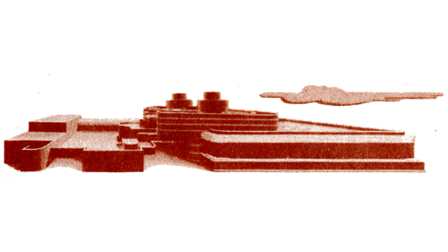
In 1928 the grandson of the founder, another Herbert Fisk, was already at the helm of the family business. He was in no hurry to change the visual identity. Before that, he had time to register the company as a corporation, since it had more than four subsidiaries, and to develop the hit floor care Glo-Coat. The new logo was introduced in time for the completion of the modern headquarters.
It is the new office that is depicted on the emblem. Added to the image is a cloud floating by, which makes it clear how tall the complex is – it’s higher than the clouds. Over the years, the Johnsons have managed to build a veritable empire. It is this greatness and prosperity that the emblem reflects.
1955 – 1958
From this period, the company switched to insect repellents and air fresheners, leading to the popular Raid, Off!, and Glade. The visual sign emphasizes the research laboratory where new products are created. This 14-story tower was built in the early ’60s and later even became a historical landmark. The logo showed the firm’s serious approach to its developments, researching the safety and effectiveness of products, which increased customer confidence.
The logo also demonstrated the scale of the corporation. The image of the globe emphasized world expansion.
1958 – 1962
By 1958, the company was planning a global expansion. Over the next ten years, representative offices are opened in 18 countries on all continents except Australia. The great-grandson of the founder, given the same name Samuel Curtis Johnson, becomes chairman. The company name was again fully in line with the owner’s initials: S.C. Johnson Wax.
The visual identity of the brand is also renewed. It includes a word mark and an emblem separating the words Johnson and Wax. The image looks like a red and black rhombus with notches on the right and left, in which the words of the name fit. Therefore, only the arrows looking up and down and connected by a thin bridge are visible from the figure. They show that the company produces household chemicals for both floors and air. Hint at the firm’s spread to the south and north by depicting compass arrows. They show the corporation’s deep roots and upward aspirations.
1962 – 1964
This was the first year when the idea of the enlarged letter J appeared, holding the company’s emblem like a cradle. The Johnson family nurtured the corporation, carrying it in their arms and nurturing the plan for its development in their hearts. The heart and soul are invested in every product of the company. The new letter J conveys the idea of caring and family and love for their business.
The white lettering signifies the purity of the company’s products.
1964 – 1974
In 1964 the company name was again changed to S.C. Johnson & Son due to the birth of an heir. However, it should be noted that the first son, Samuel Curtis Johnson, did not take over the family business. Herbert Fisk Johnson III, the third offspring, took over, but the male line continued, and there was a chance that his sons would inherit the business.
The logo changed a little after the renaming. They removed the word Wax from the name and changed the color of the letters from white to black. This made the logo more contrasting, crisp, and attractive.
1974 – 1988
Johnson adds personal care products to its list of products. And it reintroduces the word Wax back into the name.
1988 – 1999
The fifth member of the dynasty, Herbert Fisk Johnson III, joins the family business. The logo of this time becomes more intense. The name is placed in large font on two levels. And inside the letter, J has placed in the emblem and the founder’s initials. This demonstrates the idea of family identity. The company products are put on the same level as children. Every product is literally born by the corporation and is under the wing of the Johnson family.
1999 – 2018
In 1998 there was a major purchase of DowBrands, a manufacturer of plastic packaging while selling most of the personal care brands. After becoming the largest consumer products manufacturer, the firm again emphasizes its family focus. The word Wax is again removed from the logo, as it is only one of many products. The slogan “Family Company” is often used alongside the logo.
2018 – today
In its latest visual sign, the corporation attempted to remind itself that it takes the quality of its products and services very seriously. To this end, they added “at work for a better world” to the usual slogan about the family-owned company. S. C. Johnson strives to make the world a better place.
Font and Colors
The modern version of S.C. Johnson consists of two colors – red and black.
- Red is the color of passion and energy that evokes attention and increases adrenaline, so it is often used to attract attention. It is associated with strength, energy, action, and success. In the context of the brand S.C. Johnson, red can symbolize their energy and drive to succeed.
- Black is the color of elegance, luxury, and power. It is associated with seriousness and professionalism. In the context of the brand S.C. Johnson, black can symbolize their quality, reliability, and durability.
These two colors create a two-tone logo combining energy and elegance. This may reflect a company’s philosophy that strives for high standards of quality and efficiency but also places great value on elegance and design.
For the company’s customers, this two-tone palette can symbolize quality, reliability, and consistency, which can be especially important for consumers who are looking for durable and effective cleaning and home care solutions.
The latest version of the S.C. Johnson, introduced in 2019, also uses the Futura Bold font that was used in previous versions of the logo. Futura Bold is a sans-serif typeface designed by Paul Renner in 1927. It is characterized by clean lines and geometric shapes, making it easy to read. The soft flowing lines of the letters also are reminiscent of the Bahnschrift Light font family.
S. C. Johnson color codes
| Maximum Red | Hex color: | #de2525 |
|---|---|---|
| RGB: | 222 37 37 | |
| CMYK: | 0 83 83 13 | |
| Pantone: | PMS 485 C |
| Black | Hex color: | #000000 |
|---|---|---|
| RGB: | 0 0 0 | |
| CMYK: | 0 0 0 100 | |
| Pantone: | PMS Process Black C |

