


![]() SABIC Logo PNG
SABIC Logo PNG
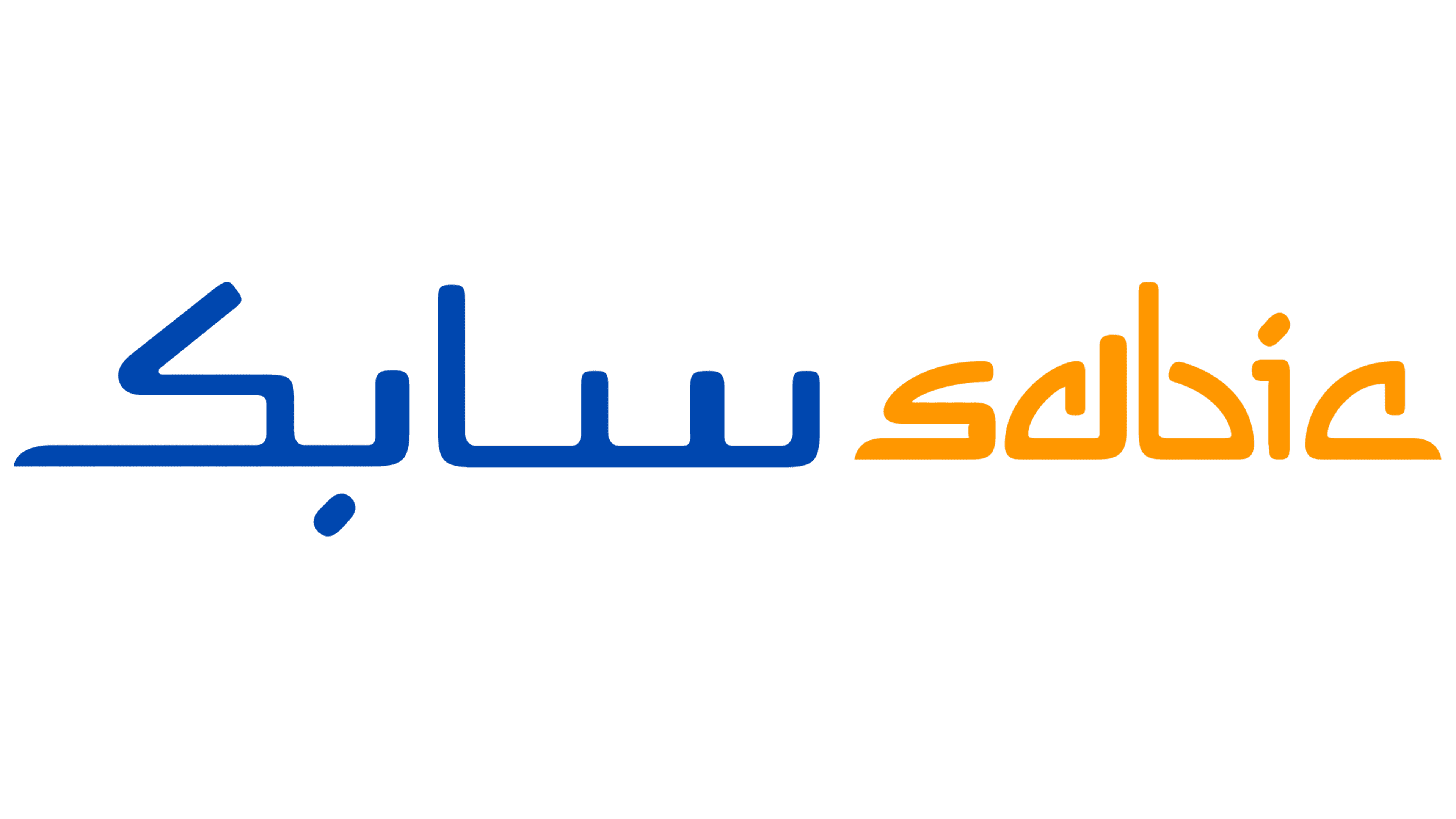
The SABIC logo has an unusual format that makes it particularly recognizable. It features the brand name, which is presented in two languages simultaneously. This design solution favorably emphasizes the features of the company’s policy. SABIC is based in the Middle East, but it also works with European partners. For this reason, the logo’s inscription is in both English and Arabic. This way, the company shows respect for its traditions and a friendly attitude towards its foreign partners.
SABIC was founded by royal decree in September 1976 as Saudi Basic Industries Corporation. At the time, Saudi Arabia exported crude oil while large volumes of associated gas were burned off during production. The new company was created to turn hydrocarbon by-products into chemicals and reduce dependence on raw oil exports.
At first, 70% of SABIC was owned by the Saudi government, while 30% went to private investors from Gulf states. Its early growth relied on joint ventures with global partners such as Shell, ExxonMobil, and Mitsubishi, which supplied technology and management experience in return for access to low-cost Saudi feedstock. Production centered on Jubail on the Gulf coast and Yanbu on the Red Sea.
In 1979, SABIC created Hadeed, the Saudi Iron & Steel Company. In 1980, Al-Razi was launched, thereby entering SABIC into the methanol market. By 1983, Hadeed, Al-Bayrouni, and Al-Razi had reached full production, and SABIC exported methanol for the first time. In 1984, its shares were listed on Tadawul. In 1985, SADAF, YANPET, Petrokemya, KEMYA, SHARQ, and Ibn Sina began production, expanding the output of polyethylene, polypropylene, and ethylene glycol.
In 1988, SABIC opened marketing offices in New York, London, Tokyo, and Hong Kong. In 2002, it bought DSM’s petrochemical business for $2 billion, gaining sites in the Netherlands, Germany, and the UK, and moving into competition with BASF in Europe. In 2006, it acquired Huntsman Petrochemicals UK for $685 million. In 2007, it bought GE Plastics from General Electric for $11.6 billion. In 2018, SABIC took nearly 25% of Clariant, and in 2020, Saudi Aramco bought 70% of SABIC for $69.1 billion.
Meaning and History
![]()
Despite ongoing improvement, the visual identity remains consistent across the company. Its central element is a simple, functional logo with elements in two different languages. One corresponds to the region where SABIC is located, and the other is a language understood by the majority of customers from European countries. This combination underscores the importance of the company itself and the respect for foreign firms.
In 1976, a royal decree was issued, forming the basis for SABIC. Initially, the company processed petroleum by-products. These substances were used here to create fertilizers, useful polymers, and chemicals. Over time, the company expanded its facilities to the point that the nearby townships became industrial cities, and its operations went global. Since then, SABIC has used the same stylish bilingual logo, which reflects its basic principles and values.
What is SABIC?
SABIC (Saudi Basic Industries Corporation) is one of the world leaders in the chemical industry. The multinational brand is currently owned by the parent company Saudi Aramco. Its main specialization is the production of polyethylene, ethylene glycol, metals, fertilizers, and other chemicals. The scale of activity is so large that, at different times, SABIC has held a leading position in world rankings. This also applies to revenues, which reached tens of billions of dollars.
It is a two-tiered inscription, with Arabic text at the top and the name in English at the bottom. Combining these verbal signs into a harmonious whole was made possible by a special design approach. It consists of the fact that the lower part of the inscription, though written in English letters, has a characteristic Arabic curve. For this reason, the illusion is created as if both inscriptions were made in this language.
Overall, the design looks very confident and stylish. The effect is achieved by using straight lines that create sharp angles. The dots in the lettering also appear unusual. In both words, they are presented in a slightly elongated diagonal shape. This adds dynamism to the logo and, at the same time, symbolizes growth and striving for something new. These features are fundamental to the company’s policy, so the company continues to use the logo today.
In addition, SABIC can be characterized as a credible and reliable company that values its reputation and is open to new collaborations. This is evident in both the level of coloring and the layout. The logo has no unnecessary decorations and graphic elements, which can be interpreted as a high focus on activities and their improvement.
Font and Colors
The SABIC logo is a striking example of brand design for companies located in Arab countries. The main element in the trademarks of most of them is the Arabic inscription. The presented logo is no exception. It features the company name in this format.
The distinctive features of this font are the straight lines, clear contours, dynamic curves, and elongated characters. The same style was chosen for the design of the bottom inscription, which denotes the name in English. The design of the Arabic font gives it an authentic look while retaining the legibility essential for customers from other countries. The coloring is also symbolic here. It features yellow and blue.
The former is often used in the logos of energy and oil companies. In their context, it means energy, which they supply to consumers. In addition, yellow may have another interpretation of the SABIC logo. It is associated with sand and sunshine, which describes the nature of Saudi Arabia, where SABIC’s main production facilities are located.
The blue color, in which the bottom lettering is colored, can also refer to the field of activity. It is often compared to the natural gas symbol, which is why it is used to decorate companies involved in gas extraction. In addition, yellow and blue together demonstrate reliability, progressiveness, and professionalism, which can be used to describe the company as a whole.