


![]() Safeguard Logo PNG
Safeguard Logo PNG
Protection is the main message of the emblem. Soap provides a reliable defense against all microbes. The Safeguard logo indicates exceptional cleanliness. The product removes all impurities and improves the skin’s health. Its action is fast and flawless.
In 1837, Procter & Gamble was founded in Cincinnati by William Procter and James Gamble as a producer of soap and candles. Soap remained a core business, and in 1879, the company introduced Ivory, which secured a strong position in personal hygiene in the United States.
By the early 1960s, consumer demand shifted toward antibacterial and deodorant soaps. The segment already included Dial from “Armour”, launched in 1948, and Lifebuoy from Unilever. P&G relied on its research base before entering the category.
In 1963, Safeguard was launched as an antibacterial bar soap. Clinical testing indicated a 99.3 percent reduction in bacterial counts on the skin. Studies published in medical journals reported a 44 percent decrease in skin infections. The packaging featured a shield symbol, and the communication focused on family hygiene.
In 1966, Safeguard entered international markets, starting with the Philippines, where it overtook Lifebuoy to become the market leader. In the 1970s, P&G updated the formula by adding coconut oil and repositioned the product, which supported further growth.
In the 1990s, Safeguard expanded into China and Pakistan. In China, it became a leading antibacterial soap brand, while in Pakistan, it achieved wide household adoption. In 1992, the brand introduced liquid antibacterial soap in response to a shift toward dispenser formats.
In 2004, Safeguard extended into body wash. In 2008, P&G became a co-founder of Global Handwashing Day, linking the brand to hygiene campaigns. In 2011, a hand sanitizer was added, completing a broader hygiene portfolio.
By 2013, Safeguard was present in more than fifteen countries across Asia, Europe, Africa, and Latin America, maintaining leading positions in China and the Philippines.
Meaning and History
![]()
Over the trademark’s long history, it has had many emblems, and almost all of them visually play with its name. To date, seven individual Safeguard marks are known on the American segment.
What is Safeguard?
Safeguard is an antibacterial soap brand that protects against various microbes. The product line was launched in 1960 and includes several types of hygiene products. It is owned by the international company Procter & Gamble.
1960 – 1984
![]()
The debut logo consisted of the line’s name, set in a handwritten font, with the only connecting element: the transition between the letters “g” and “u.”
1984 – 1990
![]()
At this time, beige tones prevailed on the label, in the color of a bar of soap. The word “Safeguard” is written in blue, slightly slanted. On the right, above the word, is a shield with wide stripes.
1990 – 1993
![]()
The designers moved the shield below, making it a background element. The inscription was made in white and supplemented with a dark blue edging, and the beige was removed.
1993 – 2002
![]()
The shield took on a narrow shape and was divided into two identical halves. The brand name has turned completely blue.
2002 – 2007
![]()
The letters are arranged vertically without tilting. Moreover, in this version, they are thin. The dash-shaped shield is enlarged, and its right corner is extended upward. An orange line appeared under the word “Safeguard,” and the inscription “Antibacterial” was located on the horizontal rectangle.
2007 – 2011
![]()
The emblem design became more complex, with added details: a sideways-turned shield, two circular arrows, and the brand name running diagonally. The text is white again with a blue border.
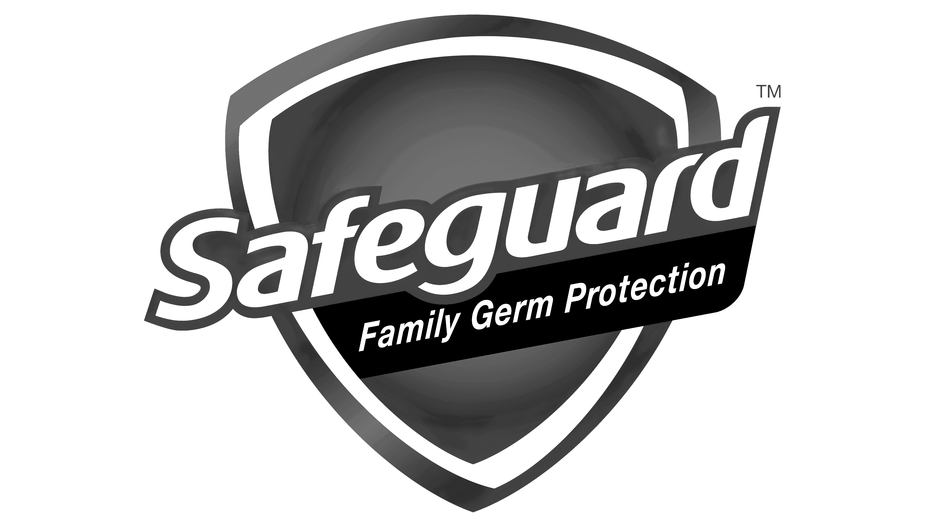
2011 – today
![]()
The developers changed the shield’s shape, straightened it, and added a red rectangle with a slogan.
Font and Colors
The Safeguard logo has always had two main elements: the name and the shield. They both go from one variant to the next, getting a new look. As a result, the text became diagonal, and the shield was curved with a gradient and edging.
Typography has gone from simple handwritten text to unique lettering with individual elements. For example, the head of the letter “r” is made almost invisible, with a sharp top. And in the very word “Safeguard,” there is not a single corner that consists of roundings. The color scheme is also varied, including white, beige, several shades of blue, red, and orange.