On a visual level, the characteristics are conveyed by the distinctive colorful Saint-Gobain logo. It demonstrates the enterprise’s scope and its main advantages and principles. The characteristics are shown in a modern font, a thematic graphic element, and atypical for this segment coloring. These elements create a solid image of a reliable manufacturer that values quality, professionalism, and responsibility.
Saint-Gobain: Brand overview
| Founded: | 1665 |
| Headquarters: | La Défense, Courbevoie, France |
| Website: | saint-gobain.com |
Saint-Gobain is one of the leading international suppliers of products for the construction industry. The company produces insulation materials, building mixes, high-strength ceramics, gypsum plasterboard, and various types of glass containers. The company is managed from its headquarters in Paris.
Saint-Gobain is one of the oldest building materials manufacturers. The origins of the company go back to 1665. Initially, the company was engaged in the manufacture of glass and mirrors. But over time, it expanded the list of directions and became one of the best in manufacturing products used in construction and repair. At the moment, the company produces a large number of products, including well-known developments Weber-Vetonit, ISOTEC, Gyproc, etc.
Meaning and history
Despite a solid history in the market, the company did not have many logos. During the entire period, the brand underwent only one rebranding, after which a beautiful modern logo appeared, fully expressing the features of Saint-Gobain. It can be seen on the building, as well as on the company’s products. It is a bright recognizable picture that immediately attracts attention and remains in the memory for a long time.
What is Saint-Gobain?
Saint-Gobain is a major manufacturer specializing in building materials. The main office is in France (Paris). But the company is not limited to the domestic market. Its branches are located in different countries, and its staff includes over 100 thousand employees. Currently, the brand produces insulation materials, plaster, putty, plaster-based mixes, special sheets, and other building products.
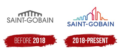
Before 2018
The company was founded in 1665, but its first logo came a little later. It was a modest component of the name and a figure resembling a high bridge. Creative icons have several important meanings. It emphasized the geographical component, as it was similar to the Pont-à-Mousson bridge. The structure was in the region where the manufacturer was originally based.
In addition, the geometric figure symbolizes the field of activity – the manufacture of building materials. They are directly used to construct buildings, houses, and different structures, so the emblem depicts a symbolic result. Under the creative icon was a large inscription in the form of the company name.
It was designed as a neat, clean font with clear spaces and no serifs. It is a modern format that demonstrates quality, progressiveness, and professionalism. The designers chose the basic achromatic colors for coloring – white and gray. In tandem, they demonstrate the company’s principles of work – responsibility, honesty, and perspective.
2018 – today
In 2018, Saint-Gobain achieved incredible success and became one of the best in its segment. The old logo no longer corresponded to the new status of the famous company, so they decided to replace it. The designers kept the general concept and elements in the new emblem, but the design style changed dramatically. The figure, reminiscent of the Pont-a-Mousson bridge, got a futuristic look. Instead of the traditional straight lines, a single line was used for its design, which created peaks of different heights.
This element made the logo more dynamic and modern, which was directly in line with Saint-Gobain’s work style. The font also succumbed to the changes. In the new version, it looks more confident due to the more compact shape of the letters. Especially noticeable is the difference in the letters G. In the earlier version, it has elongated lines, and in the updated logo, the symbol is presented in a rounded shape with a short tail. All this emphasized the modernization of the production, and the bright rainbow coloring reinforced the effect.
Font and Colors
Saint-Gobain’s corporate identity is incredibly recognizable. The unusual gradient coloring and the original geometric font ensure this. The chosen combination demonstrates the heritage of the famous brand and, at the same time, emphasizes the desire to innovate. The bridge figure demonstrates respect for the past. The other elements of the visual image symbolize progress and active growth.
The features can be seen in the rounded straight typeface, the style of which is similar to Aristotelica Small Caps. Among its features are the smooth cuts, the absence of serifs, and the clear contours. Due to this, it is associated with comfort and trust. In addition, the logo has additional meanings. The bright rainbow gradient in which the figure is executed demonstrates dynamism and development, while the blue color of the name reflects a high level of trust.
Saint-Gobain color codes
| Verdigris | Hex color: | #53b5b0 |
|---|---|---|
| RGB: | 83 181 176 | |
| CMYK: | 54 0 3 29 | |
| Pantone: | PMS 326 C |
| Spanish Sky Blue | Hex color: | #41a1ce |
|---|---|---|
| RGB: | 65 161 206 | |
| CMYK: | 68 22 0 19 | |
| Pantone: | PMS 638 C |
| Marian Blue | Hex color: | #264a9a |
|---|---|---|
| RGB: | 38 74 154 | |
| CMYK: | 75 52 0 40 | |
| Pantone: | PMS 7687 C |
| Purple Wine | Hex color: | #853070 |
|---|---|---|
| RGB: | 133 48 112 | |
| CMYK: | 0 64 16 48 | |
| Pantone: | PMS 7649 C |
| Red | Hex color: | #ef1e3d |
|---|---|---|
| RGB: | 229 30 31 | |
| CMYK: | 0 87 74 6 | |
| Pantone: | PMS 185 C |
| Mystic Red | Hex color: | #f35b19 |
|---|---|---|
| RGB: | 243 91 25 | |
| CMYK: | 0 63 90 5 | |
| Pantone: | PMS 1655 C |
