


 Salamander Logo PNG
The Salamander logo embodies a truly unique brand emblem. Its meaning is clear and concise, making it easy to “read” and evoking associations with the brand’s German origins.
The creators harmoniously combine traditions with modern trends in the visual mark, reflected in the products. The identity remains consistent: each element appears stable and well-founded.
Despite its single color, the monochrome design is highly expressive, stirring the audience’s imagination and creating vivid visual impressions. The Salamander emblem stands out with elegant simplicity; the static text block emphasizes its stability, and the white background evokes purity and high quality. This symbol is consistently perceived positively, and its visual impact remains unique.
Salamander began in Kornwestheim in 1885, when shoemaker Jakob Sigle opened a small workshop with his wife and apprentices. The business first operated as J. Sigle & Cie and focused on work shoes. By 1891, it employed more than 100 people and had mechanized part of production. The salamander trademark, designed by Heinrich Vogeler, was registered in 1897.
The first retail store opened in Berlin in 1903, reducing reliance on wholesalers. In 1904, the company introduced assembly-line shoe production, and by 1910 it operated 40 stores in Germany and other European countries. Exports reached North and South America. During World War I, production shifted toward military footwear, followed by a return to civilian sales.
A sports shoe line arrived in 1925 and was promoted through film advertising. The company survived the Great Depression, then again produced for military needs during World War II, when factories and stores suffered damage. Reconstruction in the 1950s and 1960s brought new stores, higher output and wider international distribution. Competition from Asian manufacturers led to diversification during the 1970s.
Franchising and European expansion continued through the 1980s and 1990s. Energy Baden-Württemberg AG acquired the business in 2000, followed by Ara Shoes AG in 2005. By 2020, Salamander had more than 300 stores. During 2021 and 2022, the company increased online sales and digital operations, while footwear production and retail continued through 2023.
Meaning and History
What is Salamander?
This well-known German footwear company has established itself in the market, focusing on classic style and craftsmanship. The brand offers a wide range of shoes for men and women, including elegant dress shoes and comfortable casual footwear. It combines advanced comfort technologies with traditional shoe-making methods, creating fashionable and functional models. Loyal customers appreciate the shoes’ high quality, thanks to premium materials like top-grade leather and durable soles. Despite lacking the glamour typical of fashion brands, the company remains relevant, consistently producing quality and reliable footwear for various occasions and lifestyles.
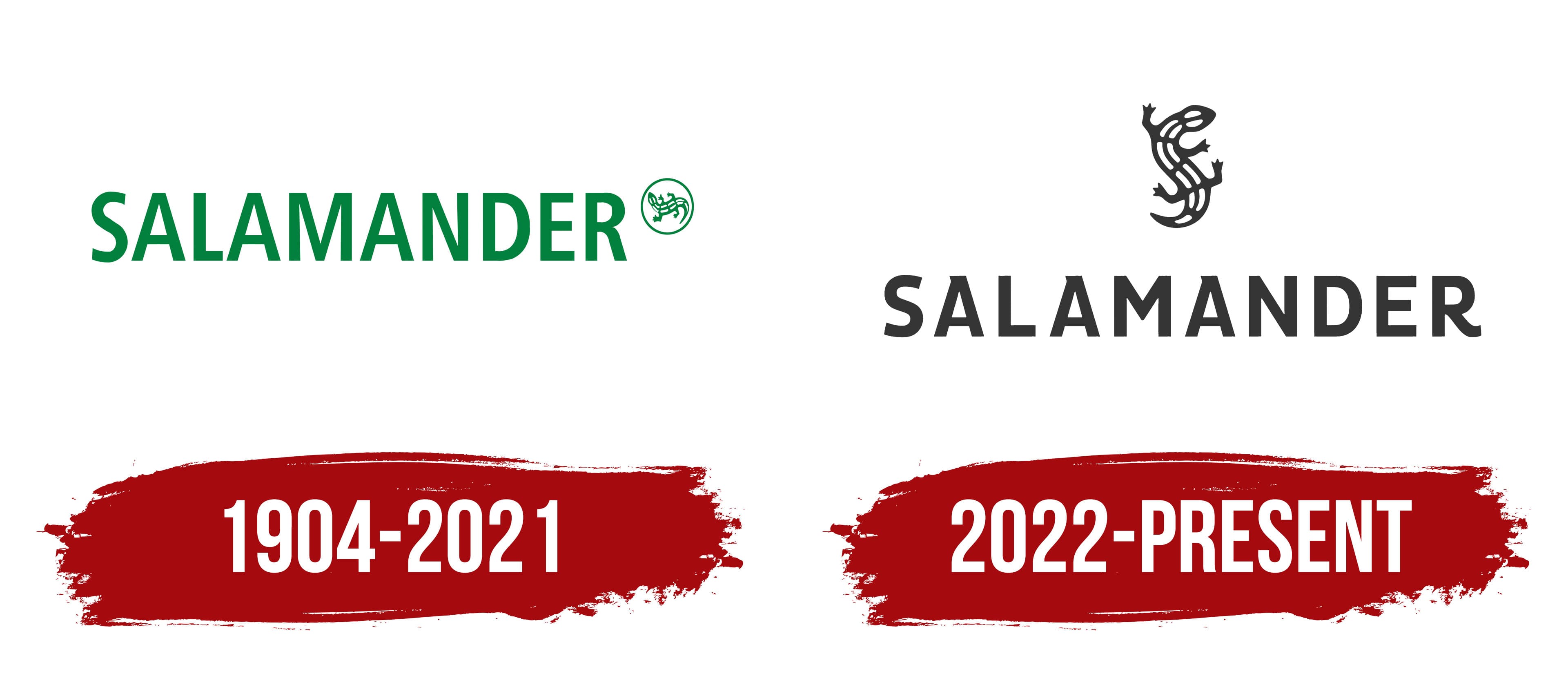
1904 – 2021

The first Salamander logo was crafted in an elegant natural palette. A soft green color embodied calm and comfort, becoming the foundation of the brand’s identity.
Salamander is a footwear and accessories brand made from natural materials, and its association with nature is entirely fitting. The visual mark skillfully combined text and symbol, displayed on the left and right, respectively, creating visual harmony and unity between the two key meanings.
The font was chosen to be as simple and concise as possible: letters of equal height and width, without curves or serifs, positioned close together. This highlighted the brand’s seriousness and solidity. The one detail that made the logo unique was the image of a small lizard placed to the right within a circle, almost like a graphic frame. The size of the elements was modest but executed with precision and expressiveness. The brand name referred to the product, while the lizard became the symbol that made the company recognizable.
The emblem is multifaceted, unique, individual, and stylish, underscoring the brand’s philosophy.
2022 – today
In 2022, the Salamander logo changed, achieving a new level of simplicity and minimalist style. The logos from different periods appear quite similar. However, upon closer examination, it becomes clear that while the meanings connect them, the graphic elements differ significantly. The color palette has become less bright, leaning toward classic shades. A white background is the base, with dark letters acting as visual anchors.
The emblem’s visual structure comprises two main parts: the image and the text. The company symbol is positioned at the top, while the text appears below. This design brings a fresh emphasis to the concept of movement: the lizard is depicted in motion, symbolizing the company’s continuous development and ongoing improvements across all production areas. The upward direction resembles a rising sun, embodying the brand’s steady growth and ambitions.
The logo’s text portion possesses a distinct elegance and energy. The letters appear resilient and steadfast, reflecting the brand’s enduring character and consistently reaffirming its reliability and stability in business.