The characteristic Samsonite logo distinguishes products with a swirling decorative icon. The stylish emblem is quite recognizable through the use of an unusual layout, minimalist design, and futuristic font. Expressive design is a real decoration of quality brand products and demonstrates the basic principles and features of activity. Many customers associate the Samsonite badge with high-quality products that meet all requirements.
Samsonite: Brand overview
| Founded: | 10 March 1910 |
| Founder: | Jesse Shwayder |
| Headquarters: | Luxembourg; Massachusetts, U.S. and Hong Kong, China |
| Website: | samsonite.com |
Samsonite is one of the best international brands making bags and suitcases. The company is of American origin, but the main office is located in Luxembourg. Structural units are also located in Massachusetts (USA) and Hong Kong (China). The company operates globally, so the products are present in different countries.
Samsonite is one of the oldest American brands specializing in manufacturing suitcases and bags. The company has been manufacturing these products for many years, gaining invaluable experience and creating incredibly reliable products. It offers customers a wide range of products, including bags, suitcases, briefcases, and various accessories. They are distinguished by their functionality, high quality, and durability.
Meaning and History
The very name Samsonite is dedicated to the biblical hero Samson. The modified inscription is present in all versions of the logos used by the manufacturer during the whole period of its work. There were many of them, and each new emblem more clearly expressed the message of the constantly evolving company. In later versions, you can also notice the characteristic decorative symbol created from several swirling inward stripes. The figure demonstrates an extensive range of products of similar purposes.
What is Samsonite?
Samsonite is one of the world’s best manufacturers of bags and suitcases. It produces high-quality products, which customers from different countries highly appreciate. The range includes briefcases, small bags, travel cases, and various accessories in this category. The main headquarters are in Luxembourg. The corporate and financial departments are located in Mansfield (USA) and Tsim Sha Chui (China). The company currently has a staff of over 14 thousand employees.
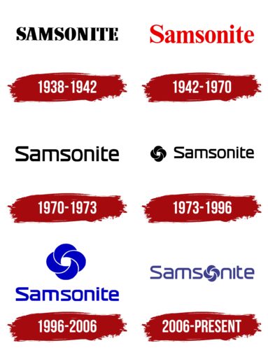
1938 – 1942
The first company emblem did not appear until 1938, sometime after the brand was founded. It signified the brand name under which the Shwayder Trunk Manufacturing Company manufactured durable conical suitcases. One could notice a strict minimalist logo with just the name Samsonite on each product.
For the design of the badge, a classic powerful font was used that featured massive serifs. It could be attributed to the category of traditional Serif varieties. Fonts in this group demonstrated reliability, reverence, and confidence. These features were also manifested through the simple basic coloring. It was based on black, symbolizing prestige and authority, and white, emphasizing an excellent reputation.
1942 – 1970
In 1942 the visual concept changed dramatically. Instead of a minimalistic emblem, the company used a bright, energetic picture. The central element was the lettering, made in classical serif type. Unusual cuts, including the letter T, were a feature. This style showed the value of the brand and its progressiveness.
A bright picture was also used with the laconic inscription in that period, consisting of an image of a strongman and two inscriptions. The figure of a man with a sporty physique symbolized the level of product reliability. The picture conveyed vigor, strength, authority, and professionalism.
1970 – 1973
In 1970 Samsonite returned to the minimalist visual image with a modern interpretation. The new emblem featured only an inscription in the form of the name, which demonstrated resilience and authority. At the same time, it reflected the desire for change, progressiveness, and openness to new solutions. This was emphasized by the original elongated font, which featured a combination of rounded shapes and straight lines. The T had a sharp diagonal cut. The coloring became achromatic again. Black symbolized prestige and elitism, and basic white symbolized responsibility.
1973 – 1996
In 1973 the rebranding took place again. Its result was the appearance of the distinctive Samsonite badge. It represented a circle of stripes that were intertwined with each other. The symbol demonstrated the variety of manufacturers’ products and their belonging to one group. Almost nothing changed in the design of the inscription. It was made in an elongated stylish font, as in the previous version. The coloring also remained, indicating the stable development and strengthening of the company’s status.
1996 – 2006
Another change in the visual image of Samsonite took place in 1996. This time the designers changed the location of elements, colors, and the size of the decorative badge. The circle of stripes became larger and was placed on top.
Under it was an inscription decorated with a flat thin font used in previous emblems. This arrangement made the logo compact and neat, and the enlarged graphic symbol emphasized increasing the range of products. The coloring, consisting of a rich blue hue, revealed an important principle of the company – trust.
2006 – today
The current version of the Samsonite logo was formed in 2006. It has some similarities with the versions created in 1196 and 1973. Mostly it has to do with the font and the presence of a creative addition. But unlike the earlier icons, the 2006 logo is more stylish. An unusual design approach is used here, which involves replacing the letter O with a distinctive symbol in the form of intertwining stripes.
This significantly refreshed the visual concept and made the logo memorable. In addition, the changes can be seen in the level of the font. In the letters, M, N, and T, sharp corners were taken out, and in “I,” the point was changed. The new stylization made the image more friendly and futuristic, hinting at the progressiveness of the famous company.
Font and Colors
Samsonite has a fairly light and progressive logo, in which all the details harmonize with each other. The font chosen is a unique variety from the modern Modern group, creating a stylish modern look. This format is distinguished by the absence of serifs, smooth rounded lines, the presence of neat curves, and a fairly dense arrangement of letters.
It gives the impression of an actively developing business that watches its reputation and the quality of its products. Additional company characteristics are reliability, professionalism, and a responsible attitude to production. On the visual level, these features are reflected in the light color scheme consisting of blue and white.
Samsonite color codes
| Dark Slate Blue | Hex color: | #3d3f8e |
|---|---|---|
| RGB: | 61 63 142 | |
| CMYK: | 57 56 0 44 | |
| Pantone: | PMS 7672 C |


