


![]() Samsung Galaxy Logo PNG
Samsung Galaxy Logo PNG
The Samsung Galaxy logo represents the devices as a separate series within the renowned, large company. The emblem showcases the brand’s youthfulness yet sufficient stability. This is because it is developing and flourishing under the wing of a reliable parent conglomerate.
Samsung Galaxy was developed by Samsung Electronics, a company founded in 1938 by Lee Byung Chul. Electronics production began in 1969, while mobile devices appeared later, with the SC-1000 in 1985 and the SH-100 in 1988. Early phones had a limited commercial impact but built the technical groundwork.
In 2007, Apple introduced the iPhone, reshaping the market dominated by Nokia. Samsung chose Google’s Android as its platform. In June 2009, it released the i7500 Galaxy, its first Android smartphone, which sold modestly.
In 2010, the Galaxy S marked a turning point with its Super AMOLED display and 1 GHz processor. It sold in large volumes and entered direct competition with the iPhone 4. In 2011, Galaxy S II became one of the best-selling Android devices. By 2012, Samsung surpassed Apple in global smartphone shipments.
In 2011, Galaxy Note introduced large screens and the S Pen, forming a new segment despite early skepticism. In 2016, the Galaxy Note 7 caused a major crisis due to battery fires, leading to a global recall of about 2.5 million units and losses exceeding $ 5 billion.
In 2014, the Galaxy S5 added water- and dust-resistance. In 2017, the Galaxy S8 removed the physical home button. In 2019, Samsung launched the Galaxy Fold, entering the foldable category after resolving early design issues.
Foldable models Z Fold and Z Flip established a separate segment. In 2024, the Galaxy S24 introduced AI features, competing with Apple’s Intelligence on the iPhone.
Meaning and History
![]()
The Samsung Galaxy trademark is placed on all products as proof of their originality. It has always reflected the brand’s name, but it looked a bit different at the very start: designers used a concise font with thin, elongated letters.
What is Samsung Galaxy?
Samsung Galaxy is a brand of digital devices belonging to the South Korean company Samsung Electronics. It represents a line of smartphones, tablets, phablets, foldable phones, and smartwatches. The first device was released in 2009.
2005 – 2012
![]()
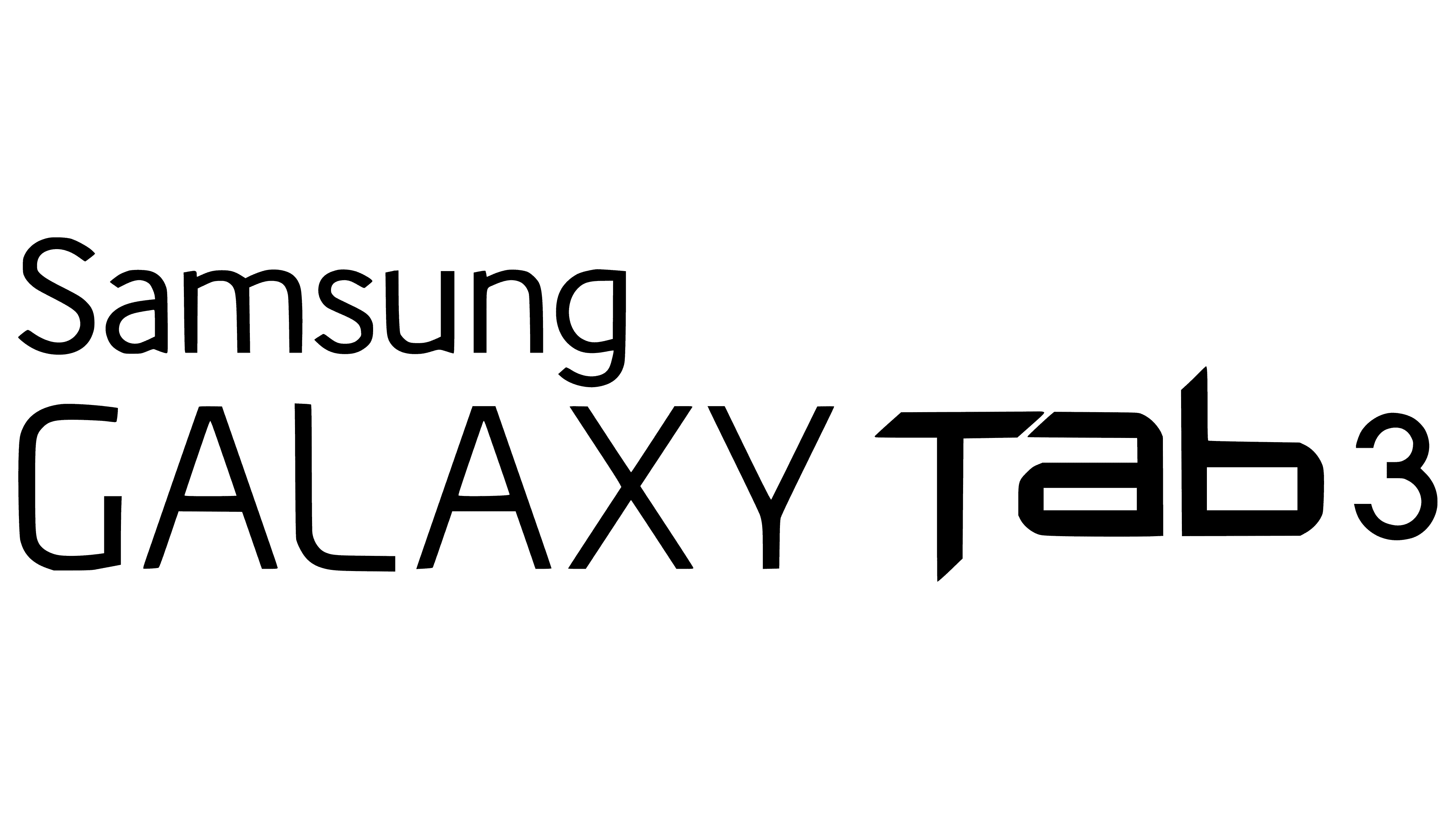
2009 – 2013
![]()
Users saw the first logo on April 27, 2009, when the manufacturer announced the Samsung Galaxy (GT-I7500) mobile phone. It was a simple two-line inscription: “Samsung GALAXY.” In choosing the font, the developers adhered to minimalist principles.
2013 – 2015
![]()
In 2013, designers slightly changed the font of the first word. They rounded the lines, making them smoother and improving readability.
2015 – 2018
![]()
At the New York presentation of Samsung Galaxy Unpacked 2015, the company introduced a new logo: the same inscription but a different design. In place of Samsung, the text from the Samsung Electronics Co., Ltd. logo appeared. “Galaxy,” in turn, received the custom Samsung Sharp Sans font. The trademark was used on SM-G920F, SM-925F, and other devices.
2018 – today
![]()
In August 2018, the Samsung Galaxy Note 9 smartphone was released. Customers noticed a new logo with a proportional inscription in which both words are of the same size. If “SAMSUNG” was noticeably smaller than “Galaxy” in the previous version, now they are equal.
Font and Colors
The brand’s trademark consists only of its name, without a graphical element, which is standard practice for many brands. But there is one atypical element: the text from the original Samsung logo. Designers endeavored to ensure that the word “Galaxy” did not get lost against the backdrop of the famous inscription. To do this, they used unusual symbolic attributes, operating only with typographic settings. As a result, a simple phrase became a symbolic and recognizable logo.
The font for the first word is somewhere between DDT Cond SemiBold and Helvetica Black. The second part of the name is set in Samsung Sharp Sans, a font developed in 2015 for the Samsung Galaxy brand. Since the designers focused not on colorfulness but on stylish minimalism, the main palette includes just two colors: black for the letters and white for the background. The monochrome emphasizes the manufacturer’s high status and the reliability of its products.