


![]() San Jose Sharks Logo PNG
San Jose Sharks Logo PNG
The California team’s San Jose Sharks logo features the hockey club’s mascot, a shark depicted in a moment of battle fervor. The shark symbolizes strength and assertiveness, the ability to go to the end in pursuit of victory, which is characteristic of the team’s playing style.
The franchise traces back to earlier NHL attempts in Northern California. In 1967, the California Golden Seals entered the league. Still, they failed to gain stability, changing owners, coaches, and names before moving to Cleveland in 1976 and folding in 1978 after merging with the Minnesota North Stars. Former stakeholders Gordon and George Gund later secured a new expansion team rather than relocate Minnesota.
On May 5, 1990, the NHL granted them a franchise for $45 million. The name Sharks replaced the fan-voted Blades, and the shark biting a hockey stick logo appeared from the start. The team debuted in 1991–92, playing at Cow Palace before moving to SAP Center in 1993. Early results were poor, including a 71-loss season and a coaching change.
In 1993–94, under Kevin Constantine, the team improved by 58 points and reached the playoffs, eliminating the Detroit Red Wings in seven games before losing to the Toronto Maple Leafs. In 1997, Patrick Marleau was drafted, later becoming the franchise scoring leader.
A major shift came in 2005 with the arrival of Joe Thornton from the Boston Bruins. In 2005–06, he won both the Hart Trophy and Art Ross Trophy, while Jonathan Cheechoo led the league in goals. In 2008–09, the team won the Presidents’ Trophy but lost in the first round of the playoffs.
In 2015–16, San Jose reached its first Stanley Cup Final, losing to the Pittsburgh Penguins led by Sidney Crosby. In 2022, Mike Grier became general manager, and in 2024, the club selected Macklin Celebrini with the first overall draft pick.
Meaning and History
![]()
The famous shark-and-club logo has been used since 1991. It has changed several times as artists experimented with colors and shapes to make the drawing more realistic. However, they couldn’t stray far from the cartoonish design: they added a proportionality marker missing in the first versions.
What is San Jose Sharks?
The San Jose Sharks are a National Hockey League team that debuted in the 1991-1992 season. They are the first NHL franchise based in the Bay Area since the Bay Area Seals moved there. The team rents the SAP Center in San Jose and participates in the Pacific Division.
1991 – 1998
![]()
For the debut season, designer Terry Smith created the first emblem of the “San Jose Sharks.” He drew a black shark with fins, gills, and razor-sharp teeth capable of biting even a wooden hockey stick. The graphic composition is arranged within an inverted triangle formed by four lines: two black (on the edges), teal, and gray.
1998 – 2007
![]()
In 1998, the artist slightly changed the stick’s color to light brown. He also slightly shortened the three arc-shaped lines indicating the gills. Everything else remained the same.
2007 – 2008
![]()
The first significant redesign occurred in 2007. As before, the central figure was a shark, but the developer-experimenter gave it new features: in the race for realism, he made it three-dimensional. As a result, the deadly predator looked like a comic character, especially emphasized by the demonically glowing eyes.
Simultaneously, the 3D effect allowed the shark to set its direction and create a sense of movement. For the same purpose, the designer added edges and shadows to the club. He also changed the shape of the triangle, making it concave at the top.
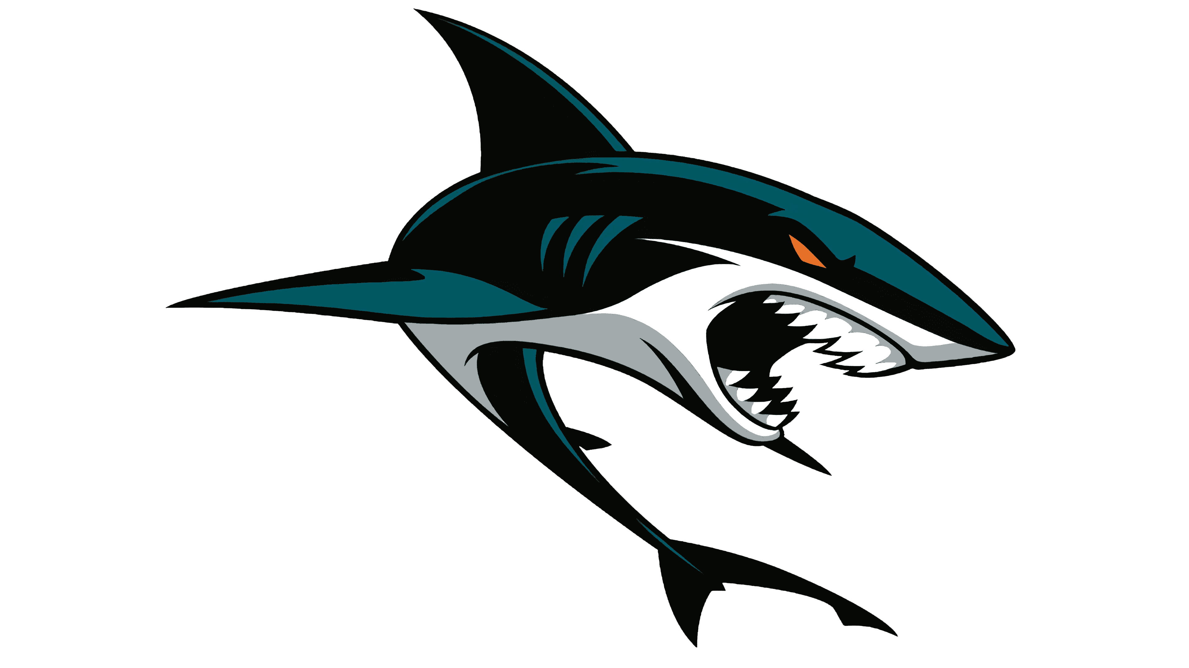
2008 – today
![]()
Only the teal color in the current logo has been updated, and a lighter shade has been acquired. Compositionally, nothing has changed: the shark with the stick occupies the central place in the drawing.
Font and Colors
The official “San Jose Sharks” sign features the team’s mascot and an allegorical element: an inverted triangle. According to one version, it’s a graphic embodiment of the Red Triangle, a triangular area in the Pacific Ocean near the Bay Area. This area is home to many sharks, making it dangerously deadly. Considering the club’s name, the Red Triangle fits the chosen concept perfectly.
According to another version, the emblem’s triangle indicates the Bay Area’s main conurbation centers: Oakland, San Francisco, and San Jose. Despite the disagreements, everything boils down to the fact that the emblem contains encoded objects indicating the team’s territorial affiliation. In turn, the hockey stick identifies the sport, and the shark symbolizes fearlessness, speed, and determination.
The drawing is intentionally cartoonish: even when the designer wanted to give the image a sense of three-dimensionality, he chose a comic style. He made the shark look like an exaggerated villain. According to experts, the “San Jose Sharks” didn’t want to scare children, so they didn’t go with a realistic approach. It’s enough that the predator’s eyes are highlighted in orange, and the teeth resemble the pointed teeth of a saw.
The San Jose Sharks’ emblem is not inscribed; it doesn’t even include the city’s abbreviation, which other clubs traditionally use. The designer decided to focus on the drawing, choosing a striking palette. The colors are not unnaturally bright, but their combination still attracts attention.
Black and teal suggest that the shark is underwater in shadow, and the orange eyes evoke a sense of hidden danger. The hockey stick is painted the same orange. The teeth and the inside of the triangle are white. The main shades present in the logo are Pantone 152 C and Pantone 3155 C.
FAQ
What does the “San Jose Sharks” logo represent?
The hockey club’s logo looks menacing. It depicts a shark with sharp teeth biting a stick in half. The shark’s eye glows with mystical orange light. The predatory fish emerges from the dark corner of the triangular frame.
Who designed the “San Jose Sharks” logo?
Artist Terry Smith, owner of Terry Smith Creations, created the San Jose Sharks’ famous logo. He created both versions of the design: old and new.
How did the “San Jose Sharks” get their name?
Like many other sports teams, the “San Jose Sharks” were named after competitions. However, a completely different name won first place – “Blades.” They decided to refuse it as it was associated with criminal groups. The “Sharks” option, which placed second, automatically became the winner.
Who owns the “San Jose Sharks”?
San Jose Sports & Entertainment Enterprises, which also owns the SAP Center in San Jose, is the team’s main owner. German businessman Hasso Plattner leads it.