The stroke of the elements is like pure transparent water that comes out of a mountain spring. The useful mineral composition of the San Pellegrino logo conveys the sign’s shades. The emblem is marked with a star as the best product appreciated by consumers.
San Pellegrino: Brand overview
| Founded: | 1899 |
| Founder: | Sanpellegrino S.p.A |
| Headquarters: | Milan, Italy |
| Website: | sanpellegrino.com |
Meaning and History
The thermal spring that became the basis for the mineral water has been known since the time of Leonardo da Vinci, who visited it in 1509. But in fact, the spring is much older: the local population has been using its water for over 620 years. Even in the 13th century, Italian doctors recommended patients be treated with the life-giving water of Val Brembana. However, they started to bottle the water for commercial purposes only in 1899, the starting point of the brand’s history.
Before that time, several health resorts had been active near the dolomite mountain wall. The fact that mineral water San Pellegrino is distinguished by the presence of 14 components, which have a positive effect on the body. It treats several diseases, activating the kidneys, urinary system, and gastrointestinal tract. And thanks to the saturation of carbon dioxide, it gets a sparkling and individual taste. That is why many restaurants of the world serve bottles with a star on the logo, and sommeliers recommend drinking this water with red wine.
Now the branded range includes different drinks: clear mineral water and sparkling water with natural lemon, grapefruit, orange, raspberry, cherry, pomegranate, strawberry, and mint juice. There is also a line with the usual flavors. The products are poured into the legendary bottles, which have retained their original shape since 1899. And they come not only in the glass but in plastic (production of the latter was launched in the late 1990s). Each unit is marked with a label with blue lettering and a red star. The neck also has a picture of mountains and the main building with the founding date of the plant’s founding for bottling water from a natural spring.
Old
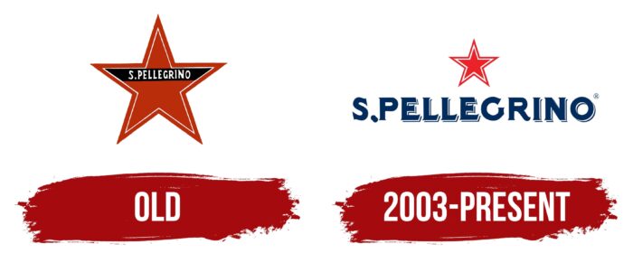
The old emblem has a single red star with pointed rays. It has a symmetrical white line inside that repeats the shape of the key figure. Under the upper ray is a horizontal black stripe with the brand’s name. The inscription got a recognizable style: with graceful and slightly extended serifs, diagonal cuts at the “L” and “E.” For the text to be readable and fit perfectly on the miniature star, the designers shortened the first word and put a dot after the ‘S.’
2003 – today
In the present version, the name of the mineral water brand is removed from the star and placed below. It is much bigger than before but has the same diagonal cuts and curved serifs on ‘G’ and ‘R.’ The rest of the letters are sharpened and shaped like miniature spikes. A thin shadow stroke runs to the right and bottom of each symbol, located at a small distance. This makes the signs look three-dimensional. Above the name is a red star with a white outline inside. It looks laconic and immutable.
Font and Colors
Adjustments in the San Pellegrino logo are related to the improvement of the readability of the text because the small label, according to the conception of the company administration, should look modest but eye-catching. For this purpose, the developers removed the brand’s name from the star, increased its size, and placed it at the bottom. And they, on the contrary, reduced the geometric sign.
The lettering in the San Pellegrino logo remotely resembles a bold version of the vintage Quattrocento font. It has the same curves on the ends, which smoothly pass into short and sharp serifs. The signature palette of the Italian mineral water brand contains only two colors: navy blue and red. They stand out against the white background, which adds purity and stability to the emblem.
San Pellegrino color codes
| Pigment Red | Hex color: | #eb2228 |
|---|---|---|
| RGB: | 235 34 40 | |
| CMYK: | 0 86 83 8 | |
| Pantone: | PMS Bright Red C |
| Cool Black | Hex color: | #012d5e |
|---|---|---|
| RGB: | 1 45 94 | |
| CMYK: | 99 52 0 63 | |
| Pantone: | PMS 648 C |
