


![]() Santa Cruz Skateboards Logo PNG
Santa Cruz Skateboards Logo PNG
The manufacturer’s emblem reflects energy and drive. The Santa Cruz logo, featuring a powerful, flightful skater, suggests that its sports equipment will enable skateboarders to experience the true pleasure of the sport.
Santa Cruz began in 1969, when surfers Richard Novak, Doug Haut, and Jay Shuirman formed NHS in Santa Cruz, California. The company first sold fiberglass and related materials to surfboard workshops, boat builders, and racing teams, but the business had thin margins. Its turn came in 1973, when Jimmy Hoffman from a Hawaiian company asked NHS to make 500 skateboards. The founders had never made boards before, but used surplus fiberglass, and the first Santa Cruz batch sold quickly.
Early boards looked like small surfboards, with no kicktail, narrow trucks, and large soft wheels on loose ball bearings. In 1974, Anthony Roderick introduced the NHS to the idea of Road Rider wheels with sealed precision bearings. Compared with clay wheels and Frank Nasworthy’s Cadillac Wheels from 1972, Road Rider solved the problem of loose bearings jamming. By late 1975, more than one million sets had sold worldwide.
In 1975, the NHS hired artist Jim Phillips, who created the Road Rider Wheels logo, the red dot, and early slanted Santa Cruz lettering. In 1978, NHS and Ermico Enterprises founded Independent Truck Company, adding trucks to a business that already had decks and wheels. Jay Shuirman died of leukemia in 1979, while Doug Haut later sold his share and built his own surfboard company.
Phillips created the Rob Roskopp series in 1984 and the Screaming Hand in 1985. In the late 1980s and 1990s, Santa Cruz and Powell-Peralta shaped street skateboarding through riders such as Natas Kaupas, Rob Roskopp, Steve Olson, and Jason Jessee, as well as “Wheels of Fire” and “Streets on Fire.”
Meaning and History
![]()
First, the parent company, NHS, was founded, named after three friends. To obtain a concise, understandable form, they used the first letters of their names: Novak, Haut, and Shuirman. Initially, the company specialized in supplying surfboard materials. Skateboarding entered the lives of young entrepreneurs later, when the fateful call from the head of McCully’s Bike Shop in Hawaii rang in the office. He approached them with a request to customize 500 skateboards. Friends accepted the application, and in 1973, they introduced the Santa Cruz skateboards. At the same time, the famous Road Rider Wheels and Independent Trucks wheels and bases were produced.
The debut models resembled a mini-cruiser. The decks were small and looked more or less like modern Penny skateboards. Back then, boards were the main task of skateboarding – fast downhill and speed racing. Therefore, their design was slightly different: a narrow base, large soft wheels, and noisy bearings. But with the advent of the trick era, they’ve been refined, so Santa Cruz is now believed to make the best skate components, and their wheels are sold separately.
What is the Santa Cruz logo?
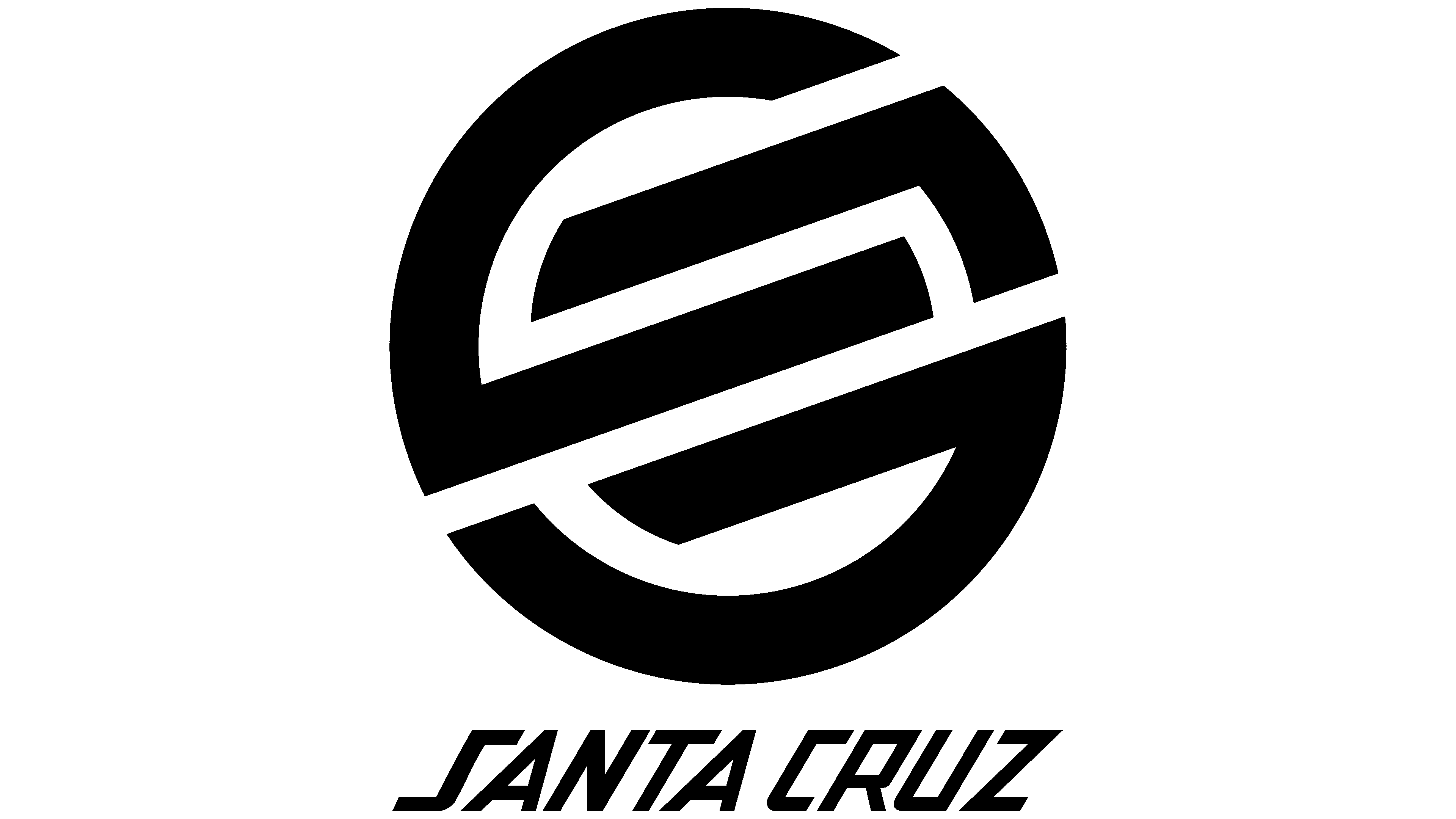
Santa Cruz is an American manufacturer of legendary high-end skateboards and bicycles. It appeared in 1973 through a business partnership of three friends: Rob Roskopp, Rich Novak, and Mike Marquez. In 1993, the company started producing bicycles. The current logo is a red circle with the brand name across it, and below, in small letters, is marked “SKATEBOARDS.” The central inscription is placed diagonally, the lower one in a semicircle. In Santa, both A’s are ramp-shaped.
With the development of the production base and improvements in skateboard performance, ramps began to appear in large numbers in Americans’ backyards and at skateparks across the United States. Precision bearings, urethane wheels, and boards with the iconic logo emerged in parallel. The brand owners have also focused on highly artistic graphics for their decks.
But in the 1980s, the parent company and all its brands suddenly fell into crisis over Jay Shuirman’s passing. Thrasher Skateboard Magazine helped save the day. He became the “Bible” of skateboarders, bringing attention to the sport and putting the industry on its feet. The rebirth of this brand took place in 1984-1985 with the help of Eric Swenson and Fausto Vitello, founders of Novak and Independent Trucks.
In the mid-1970s, the NHS hired freelance designer Jim Phillips, who played a crucial role in the brand’s success. He designed the legendary Road Rider Wheels emblems, the early “oblique” Santa Cruz logo, the Santa Cruz “Red Dot” insignia, and the “cross” symbol for Independent Trucks.
In addition, he presented a series of decks with the Rob Roskopp logo, which became the most popular in 1989. Before that, in 1985, Jim had a revolutionary design that became a skateboarding icon. This is the legendary Screaming Hand symbol. He was present on almost all brand boards and even earned the attention of world art exhibitions. The Santa Cruz brand also owns other iconic skateboard icons. This is the logo of Neptune & Sungod (Jason Jessee), Toybox (Jeff Grosso), and Atomic Man (Jeff Kendall). All of them gained incredible popularity and became classics of skateboarding design.
The oblique stamp with the word “Santa Cruz” is the company’s iconic label. It is associated with the city in which skateboards were first produced. The mark is a red disc with a black line on the edge. In the center is the brand name diagonally in yellow letters with a few italics. The font is in uppercase. Each character has a shadow, which makes the text seem voluminous. “S” (it is elongated, ribbon-like) and both “A” (made in the form of pyramids) have an unusual design. At the bottom of the red circle is the word “Skateboards.”
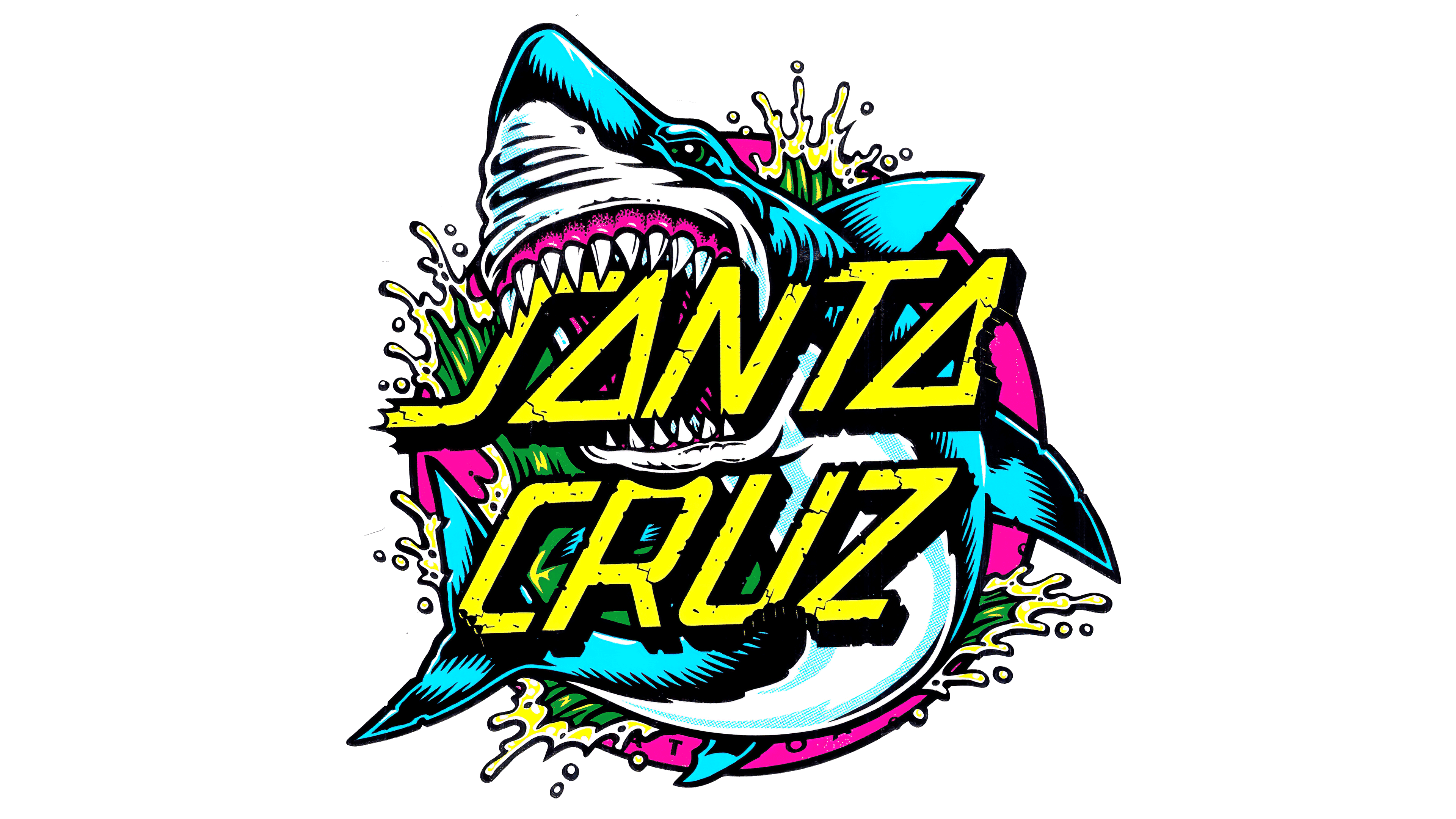
Another iconic emblem is the Screaming Hand. It is the most recognizable logo in skateboarding, equated to a work of art. Its base is a turned left hand, depicted with the palm facing forward. It is blue and resembles a stump, as evidenced by its veins and blood. A mouth is drawn on the palm. He opens wide in a cry of terror. Strong white teeth and a red tongue are visible against the backdrop of gaping darkness. All elements are complemented by shadows, which make the hand appear volumetric. “Santa Cruz” is written under the lower lip in small letters.
Font and Colors
Although the inscription is made in a typeface of our design, it is very reminiscent of the Santa Carla font. Its creator is Kirk Shelton, who focused on the techno style. The S looks like a railing and a skateboarding ramp at the same time.
The branded palette is bright, juicy, and rich, which corresponds to this sport because skateboarders are always at the peak of their emotions. Black, blue, red, white, and yellow are the primary colors in the logo’s color scheme.