Sanyo: Brand overview
Founded in 1947 by Toshio Iue in Moriguchi, Osaka, Japan, Sanyo was an ambitious venture. Iue, a former employee of Matsushita Electric, named the company “Sanyo,” which means “three oceans,” reflecting his ambition to enter the international market. Two years after its founding, Sanyo became a legally incorporated company.
The company’s early years were marked by its focus on the Japanese market, where it gained a strong foothold with the introduction of the country’s first plastic radio in 1952 and the first pulsator washing machine in 1954. The decisive entry into international markets took place in the 1970s, especially in North America, under the leadership of Howard Ladd. Here, Sanyo excelled in consumer electronics such as car audio systems and home entertainment devices.
The company now operates in a variety of industries, including batteries, solar power, home appliances, and electronic components. Despite becoming a well-known global brand, Sanyo faced serious challenges in the 2000s, including strong competition from more affordable manufacturers and a significant financial downturn.
A dramatic turnaround occurred in 2009 when Panasonic acquired a controlling stake in Sanyo for more than $4 billion. By 2011, Sanyo was fully integrated into Panasonic, operating as a subsidiary. Today, Sanyo remains under the Panasonic corporate umbrella, specializing in specific markets and regions, as well as embedding its technology assets into Panasonic’s broader operating structure.
Meaning and History
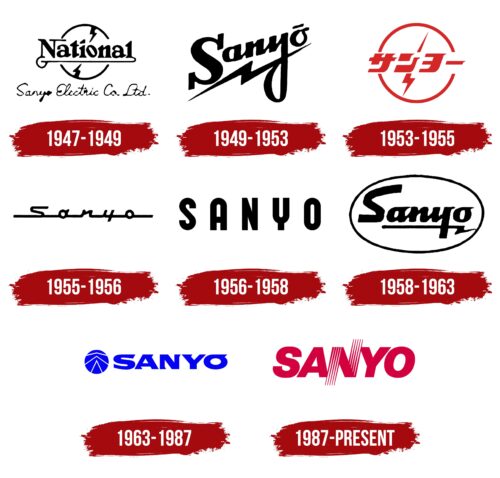
1947 – 1949
1949 – 1953
1953 – 1955
1955 – 1956
1956 – 1958
1958 – 1963
1963 – 1987
1987 – today
The Japanese electronics manufacturer likes understated uniqueness, so it chose a minimalist logo with a single original feature. It is the letter “N,” which consists of thin lines – five on each leg, making it look like a flat multicore cable. The surrounding letters are more standard, emphasizing the unique centerpiece. The writing utilizes uppercase letters slanted to the right and bold characters. The lack of serifs creates a positive atmosphere that disposes customers. The emblem is executed in crimson color.
The crimson color is interesting because it is not so common in logos, so it is easy to notice. The cable-like letter “N” is very clever because it hints at what the company does without giving much away. It’s as if the logo is saying, “We know our business.”
Sanyo color codes
| Rich Carmine | Hex color: | #d3003f |
|---|---|---|
| RGB: | 211 0 63 | |
| CMYK: | 0 100 70 17 | |
| Pantone: | PMS 1787 C |
