 Saudi Arabian Airlines Logo PNG
The golden Arabian fairy tale, which the Saudi Arabian Airlines logo evokes, inspires and calls for a journey. The fast plane of the emblem promises to take you anywhere in the world. The mark guarantees high-class service and convenience.
Saudi Arabian Airlines: Brand overview
Saudi Arabian Airlines (SAA) is a carrier linking Saudi Arabia with Africa, Europe, Asia, and America. It is the 3rd largest carrier in the East. Saudi Arabian Airlines logo can be seen on three airports in the country, but the central one is Abdulaziz base. Americans, Jews, and oil were involved in the emergence of SAA. Roosevelt first met with the king of Saudi Arabia in ’45 to discuss the emergence of a new Israel in Palestine and to strengthen oil agreements. The president gave him an airplane to leave a pleasant impression and accommodate the ruler. The king quickly used the gift for the good of the country. Two more planes were bought, and an Arab carrier was created.
1945, King Abdulaziz Ibn Saud established Saudi Arabian Airlines through a decree. The airline’s foundation was marked by the gift of a Douglas DC-3 (Dakota) from U.S. President Franklin D. Roosevelt, symbolizing the developing growth of civil aviation in Saudi Arabia and strengthening diplomatic ties between the two nations.
By 1947, the airline had commenced regular domestic flights connecting Jeddah, Riyadh, and Dhahran, essential routes that facilitated the kingdom’s economic development by linking its key cities.
In 1949, the fleet expanded with five additional DC-3 aircraft, enabling an increase in route offerings and flight frequency.
The 1950s saw the first foray into international travel. In 1953, the inaugural international flight was launched to Cairo, followed by routes to Beirut and Damascus, marking the beginning of the airline’s international presence.
In the 1960s, the fleet was modernized by acquiring Boeing 707 and Boeing 720 aircraft, enhancing its capability to offer long-haul flights and compete internationally.
In 1967, the airline rebranded itself as Saudia, a move aimed at strengthening national identity and enhancing brand recognition globally.
The oil boom of the 1970s fueled rapid growth, and the company expanded its network to include destinations in Europe, Asia, and North America.
By 1981, the headquarters moved to a new facility in Jeddah, signifying growing importance to the national economy and marking a new chapter in its development.
1985, the airline delivered its first Boeing 747, significantly boosting passenger capacity on high-demand routes and improving service quality.
The 1990s were characterized by technological advancements, including implementing a computerized booking system and introducing electronic tickets, which streamlined operations and enhanced customer service.
In 2000, the Saudi government announced plans to partially privatize the airline to increase efficiency and attract private investment.
By 2006, the company had reorganized into a holding structure with multiple strategic business units covering passenger services, cargo, and technical maintenance.
On May 29, 2012, the airline joined the SkyTeam global airline alliance, opening new opportunities for international cooperation.
In 2014, it reverted to its original name, Saudi Arabian Airlines, while using the Saudia brand for marketing purposes.
From 2015 to 2019, the focus was on fleet modernization, placing orders for new Boeing 787 Dreamliners and Airbus A330-300s, and expanding the route network to new destinations across Europe, Asia, and Africa.
In 2020, facing unprecedented challenges in the aviation industry, the airline adapted its operations to the changing market conditions by optimizing its route network and implementing new safety measures.
Meaning and History
The visual mark of Saudi Arabian Airlines is inextricably linked to the country of origin. Only a change in the organization’s name, which occurred three times in the history of SAA, led to changes in the logo.
What is Saudi Arabian Airlines?
This is Saudi Arabia’s national carrier, based in Jeddah. It operates a diverse fleet that includes Boeing 787 Dreamliners and Airbus A330s, serving an extensive network of routes across five continents. The company is known for its Alfursan loyalty program, offering privileges tailored to the region’s cultural specifics. It is part of the SkyTeam alliance.
1945 – 1971
In its first years, Saudi Arabian Airlines was a government agency mainly engaged in transportation within the kingdom. It did not have a separate emblem. The organization gained independence only in 1963, and by the 1970s, it had acquired a permanent name, a livery, and a logo.
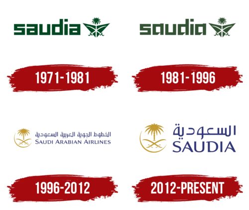
1971 – 1981
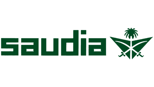
In ’71, the company received its first logo after the name change to Saudia and the employees’ branded clothing development.
As a special symbol, they used Saudi Arabia’s common emblem: a palm tree with two crossed sabers under it. The picture was placed over the schematic silhouette of a flying plane. The composition simultaneously indicated that the aircraft belonged to Saudi Arabia and were departing from Saudi territory.
The sabers, forged in gold and steel, represented the two rich territories (Nejd and Hijaz) that united to create Saudi Arabia in 1932. Weapons protect the kingdom and ensure order and justice. The palm tree is the most widespread in the country. It symbolizes wealth, nature, resources, and cultural heritage.
The image of the airplane informs us of the main direction of the company’s activity. The trunk of the palm and the saber divide the plane into six parts, symbolizing the six continents.
The name is in front of the logo’s image. The inscription is in lowercase square type. The airlines are in the service industry, so the sign has no capital letters. Customers have the dominant position. The angularity of the elements hints at the four sides of the world.
1981 – 1996
In the 1980s, the company expanded into other areas, including catering and commerce. Saudi Airlines Catering took over the “ground” business.
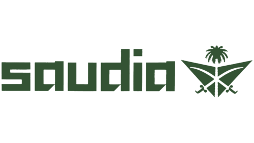
The changes were reflected in the company’s logo. The font of the lettering has gained elegance and more elongated line ends. The elements showed purposefulness and focus on certain areas of work—narrowing the fields of activity.
The letters stayed English but were given features similar to Arabic script, stressing the Middle East region where the company did business.
The visual element of the emblem remained unchanged.
1996 – 2012
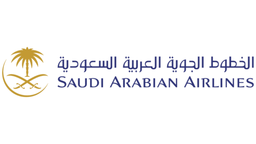
The airline changed its name to Saudi Arabian Airlines, followed by a major rebranding. As the carrier began positioning itself as a representative of Arab airlines, authentic traits appeared in the brand identity.
The sign used the Arabic script as the first of two linguistic name variants. The inscription showed work primarily for members of the Muslim world, ensuring their connection with other countries. A special attitude was shown in respect for the laws and religion. For example, during Ramadan and Hajj, special charter flights assisted believers in transportation.
The English name is placed in the second line of the emblem. It is for customers traveling from other countries to the Middle East.
In front of the inscription is an image of a circle with the emblem of Saudi Arabia. The circle represents the globe. Thanks to Saudi Arabia, residents can visit almost all continents. The company adequately represents the country in the world. The golden color of the image emphasizes high standards of service.
2012 – today
The SAA carrier joined the merger of 19 SkyTeam airlines, giving the giant a new direction for development.
The owners revived the firm’s former name, wanting to draw on history and a name that was better known and remembered by all. The shortening of the name also improved perception, made it easier to remember, and made the company less formal.
Shifting the focus from “lines for Arab countries” to “an airline without borders” allowed Saudia to expand its horizons and increase the number of flights to other countries.
The globe with the palm tree and sabers on the logo remains unchanged. Only the new name, available in Arabic and English, distinguishes the logo.
The SkyTeam logo is often used alongside the airline’s main logo.
Font and Colors
The first primary color of the Saudi Arabian Airlines emblem is dark green. It echoed the tone of the country’s flag and coat of arms, demonstrating prosperity and comfort.
In the modern logo, the preference is given to gold and blue. The first shade conveys the company’s income and shows that passengers here fly with royal comforts. The blue is a prototype of the sky.
The font has no counterpart. The lettering is distinguished by the unusual lettering of the letters A and the serifs on the D, reminding of the flight path, a thin trace in the sky left by the flying plane.
