The Savage logo features crisp, clean lines, contrasting colors, solid shapes, and a decorative component. These are excellent tools with which the designers could create a confident image of the famous arms manufacturer. The Savage emblem demonstrates strength, dynamism, professionalism, and high-quality value – fundamental aspects of the Savage philosophy.
Savage: Brand overview
| Founded: | 1894 |
| Founder: | Arthur William Savage |
| Headquarters: | Westfield, Massachusetts, U.S. |
| Website: | savagearms.com |
Savage is one of America’s oldest gun brands. For a long time, it was under the management of a large company Vista Outdoor. But, over time, it became an independent manufacturer headquartered in Westfield, Massachusetts, USA. Most of the company’s products are shotguns and rifles.
Savage is one of the few companies that operated during the world wars and continues to operate now. They made heavy ammunition, unique models of rifles, pistols, and at one time also, machine guns. The products were used for arming the state paramilitary structures and the people’s militia. High-tech developments became the basis for creating new, more advanced models of weapons, which the company currently produces.
Meaning and History
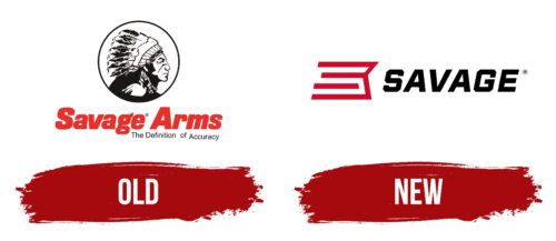
The visual identity of Savage company was originally based on a non-standard for this field emblem. It included two-level lettering and a detailed image of a Native American in a traditional headdress. But, it was short-lived because it could not fully reveal the company’s main message. After a while, it was replaced by a more modern bold logo, which reflected the features and main advantages of Savage.
What is Savage?
Savage is a well-known American company specializing in the manufacture of various types of firearms. The most famous developments of the brand are the 300 Savage rifle cartridges and the Model 99 lever-action rifle, which has been withdrawn from production. Currently, the manufacturer produces high-tech rifles (Model 64, Model 93, Rascal, sporting varieties) and combination rifles.
Old
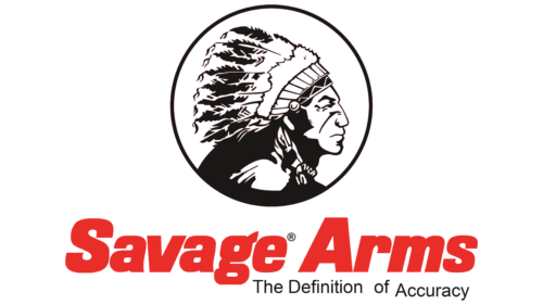
The first sample logo appeared in 1919, 25 years after the company’s foundation. The brand’s founder, Arthur Savage, was approached by a Native American tribal leader with a request to buy rifles for his warriors. He also offered his image as a badge for the corporate logo. Arthur Savage accepted his offer and provided him with rifles at a discount. Thus an early version of the emblem appeared, the centerpiece of which was a detailed picture of Chief Limp Deer.
The picture showed a Native American face in the profile. He also wore the tribe’s traditional headdress, a hat made of many feathers. The picture was placed inside a thin black frame and decorated with thin black outlines, which made it quite realistic. At the bottom of the emblem was a large inscription – Savage Arms. It had a massive thick sans serif typeface with straight cuts and smooth curves.
There was also a neat little inscription below the name – The Definition of Accuracu. This sign indicated the motto of the manufacturer – the definition of accuracy. Savage was constantly improving and periodically introducing new technologies to bring the products to perfection. The efforts yielded results, and the company gained a firm position in its segment.
The aspiration for this status was embodied in the black color that was used for the design of the decorative sign and a miniature motto. The rest of the logo, in the form of a massive red inscription, demonstrated energy, progress, and openness to new solutions. The large size of the letters also indicated confidence and reliability.
New
After a while, the brand had to renew the logo, as the previous version was outdated and didn’t correspond to the brand’s essence. The designers used a complex solution to reflect all aspects of its main message. Its essence was the combination of a verbal sign and a unique graphic element. Both elements were made in a minimalist style and looked very modern.
The straight stripes were reminiscent of the stylized feathers that were present on the previous emblem. But, unlike the earlier version, the figure is more abstract here, so it is difficult to determine the exact similarity. According to the designers’ idea, the decorative lines denote development, innovation, and improvement, which the company excels at.
In addition, the stripes create the effect of movement, emphasizing the dynamism. The main part of the logo – the name of the brand – was designed in the same format. It consisted of solid, confident letters in italics. Combined with an abstract figure, the inscription demonstrated the company’s high professionalism and desire for improvement.
Font and Colors
The Savage logo combines elements of modern design, demonstrating active development, and the features of traditional style, reflecting reverence and tribute to the past. Classic motifs are noticeable in the font. A thick geometric typeface is chosen for the lettering, with well-balanced spacing and clean lines. Beveled cuts across the entire surface are noticeable in the letters S and G.
The style chosen evokes the associations of prestige and authority that directly describe Savage. In addition, confidence, reliability, and excellent reputation lie in solid forms. The austere black color is perfect for such a solid inscription, continuing the semantic line mentioned above. An abstract figure painted in red makes a profitable contrast with the dark color scheme. It is a symbol of energy, courage, and strength, which have characterized the brand’s activity since its creation.
Savage color codes
| Fire Engine Red | Hex color: | #d00a2c |
|---|---|---|
| RGB: | 208 10 44 | |
| CMYK: | 0 95 79 18 | |
| Pantone: | PMS 185 C |
| Black | Hex color: | #000101 |
|---|---|---|
| RGB: | 0 1 1 | |
| CMYK: | 100 0 0 100 | |
| Pantone: | PMS Black 6 C |
