


![]() Scentsy Logo PNG
Scentsy Logo PNG
A halo of special stellar fragrances hovers over the company logo. The Scentsy logo evokes the beauty, freshness, and unique individual style that perfume products give.
Scentsy began in 2003 in Salt Lake City, Utah, when Kara Egan, inspired by an Oprah Winfrey show about women entrepreneurs, developed wickless candles with Colette Gunnell. Their warmers melted scented wax using a light bulb, avoiding the risk of flame, soot, and fire. Early production ran from an unfinished basement, with sales at home shows and small fairs.
On March 13, 2004, the brand’s path changed at the Home & Garden Show in Sandy, Utah. Orville Thompson, who was selling portable game controllers nearby, noticed the product and took the scent testers home. After seeing how strongly Heidi Thompson and her relatives reacted to the samples, he saw the business potential. On May 1, 2004, Orville and Heidi bought Scentsy from Egan and Gunnell.
The Thompsons moved the company to Meridian, Idaho. Its first office was a 40-foot shipping container on Orville’s sheep farm. On July 1, 2004, Scentsy signed its first consultant and became a direct-sales company built around home parties. By the end of the first year, revenue reached about $140,000, with 66 consultants.
Growth accelerated after 2006, when Scentsy introduced its segmented clamshell packaging for wax. The company moved into larger facilities in 2006, 2007, and 2008, then entered Puerto Rico, Canada, the United Kingdom, Germany, Australia, and Mexico. In 2011, revenue reached $535 million, and Forbes and Inc. Magazine noted its rapid rise. Unlike Yankee Candle and Bath & Body Works, Scentsy built its position through direct sales. In 2014, it opened a 73-acre campus in Meridian. By 2017, annual sales had passed $450 million, and in 2021, a new distribution center opened in Rock Hill, North Carolina.
Meaning and History
Colette Gunnell and Kara Egan founded Scentsy in 2003 and, a year later, sold their small business to the larger entrepreneur Orville Thompson. The new owner and his wife moved the headquarters to Idaho and changed the sales system to focus on recruiting consultants. As a result, he increased the company’s annual income, entered foreign markets, and earned several prestigious ratings.
From a humble basement venture, Scentsy has evolved into one of the world’s leading retailers. Ann Dalton Design Inc., ScentsySuccess developed the first marketing materials for the brand. In 2008, the manufacturer of aromatic products bought the organization and incorporated it into its structure. Therefore, all elements of visual identification were created by the company’s designers without the involvement of third-party specialists.
What is Scentsy?
This direct sales company revolutionized home fragrance with aromatic wax bars and wickless candles. Operating through a network of independent consultants, the company offers a range of scented products, from fragranced cleaning supplies and personal care items to decorative warmers and diffusers. Customers can create a unique atmosphere at home by choosing from hundreds of fragrances, ranging from warm and spicy to fresh and clean.
The current logo system was adopted in 2015, a year after Lyndsey Randolph took over as Creative Director. The Thompsons saw her as someone who could rebrand to reflect Scentsy’s valuable heritage. The styling update was timed to coincide with the Scentsy Family Reunion event.
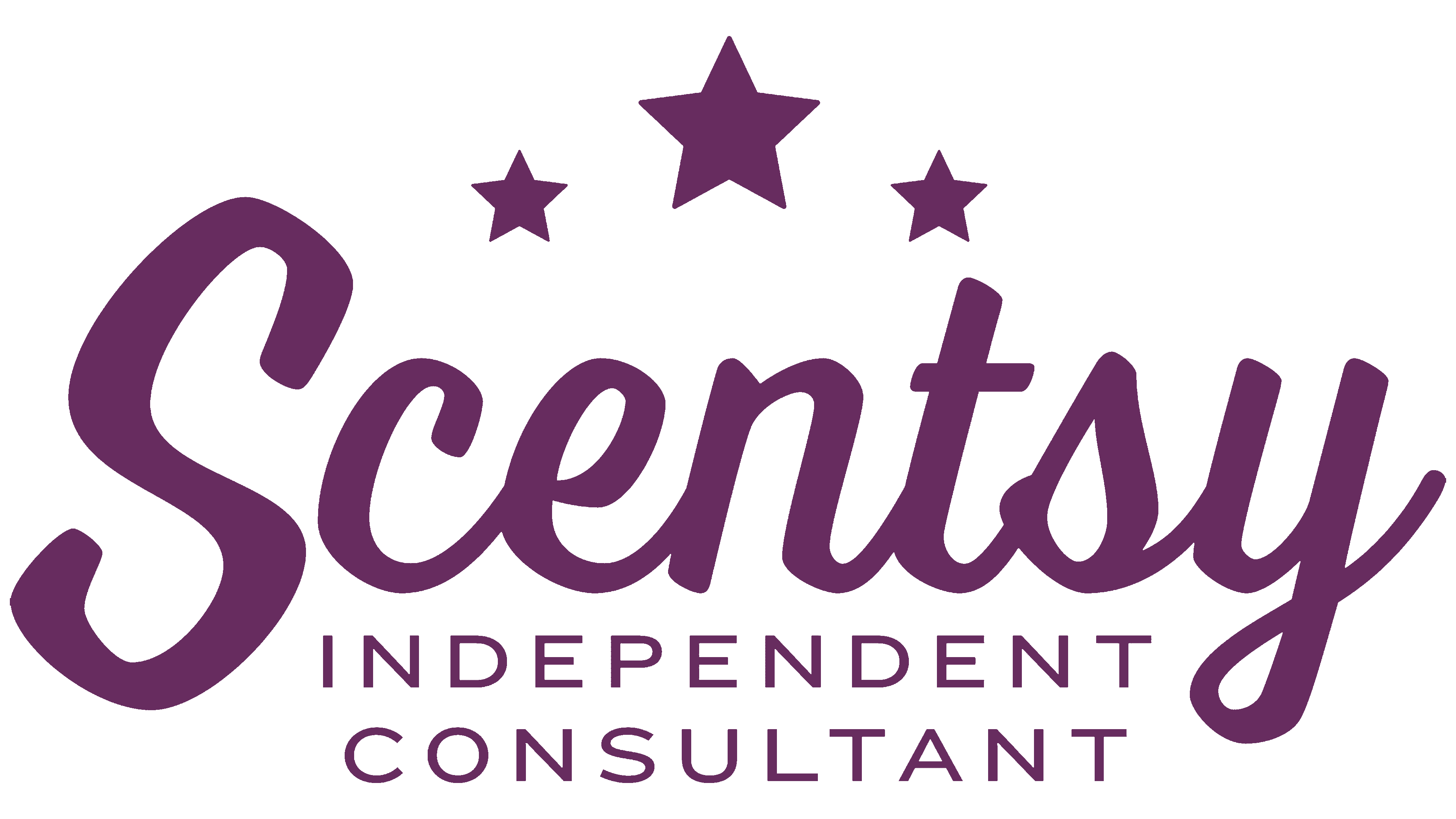
During the first decade, the inscription on the main logo was set in the bold, unusual Sister Frisky typeface. Later, a symbol in the form of a seal appeared, which adorned all types of products. He served as the basis for the new wordmark Scentsy: the name of the company with three five-pointed stars at the top. The word is written in thin sans serif type, and the stars are arranged in the form of a miniature arch, with the central geometric figure almost twice as large as the side ones.
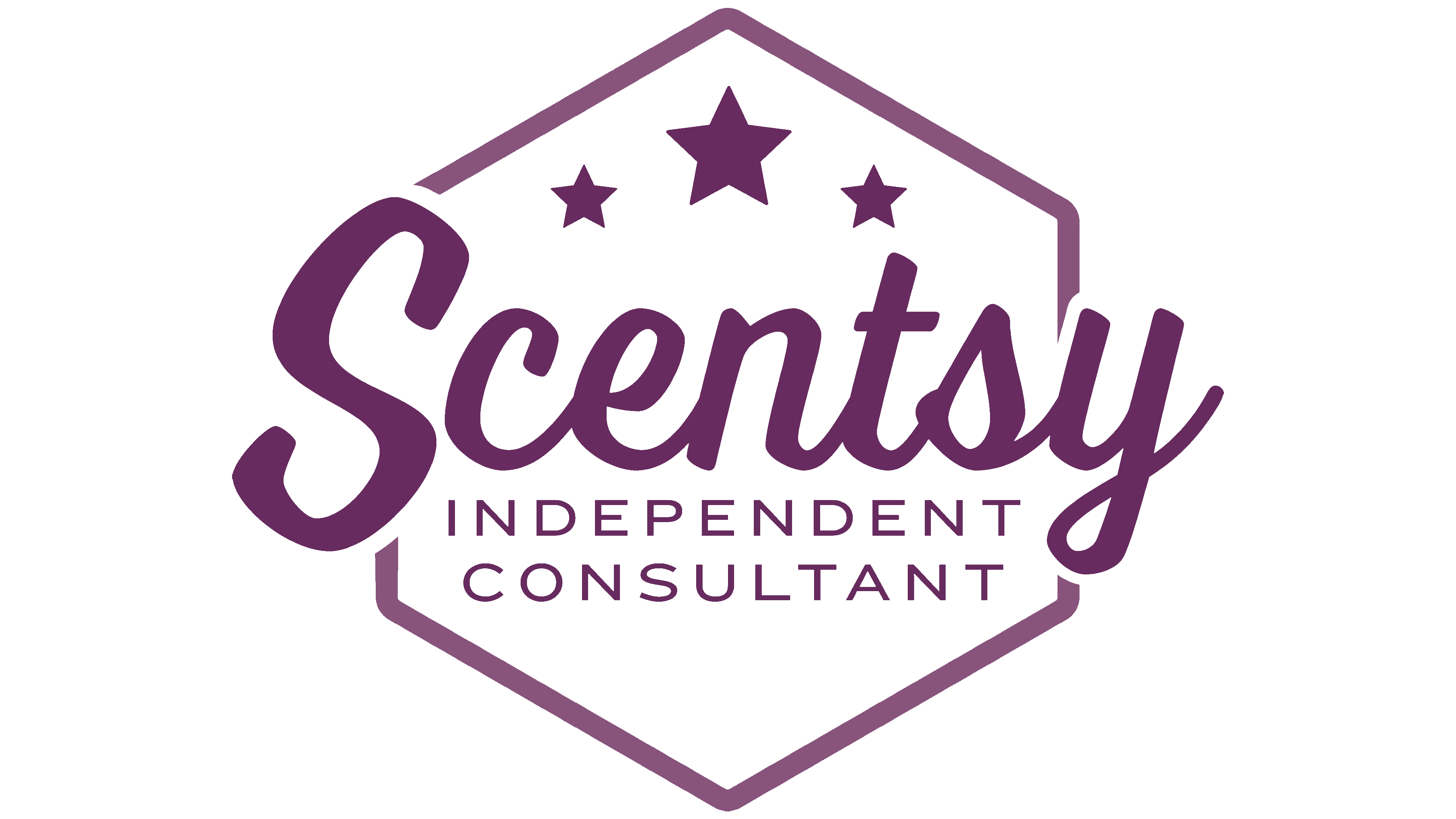
Logos have been developed especially for independent consultants that can be used as promotional materials. The most complex version contains the stylized word “Scentsy,” written in an imitation handwritten font. Above it is a mini-constellation, and the free space at the bottom is occupied by the phrase “INDEPENDENT CONSULTANT,” divided into two lines. All elements are enclosed in an octagonal frame.
Font and Colors
The Independent Consultant logo typeface was created in 2015 by graphic designer Laura Worthington, who has turned her passion for typography into a business. This is a custom character set called Scentsy Spirit, a model of balance and consistency. It was developed based on another Worthington font, Voltage. The CEO of a fragrance company noticed that Voltage resembled the typeface of the old Scentsy wordmark. Laura has redesigned the design to match the client’s wishes for the lettering.
All other letterings in the logos use a modern font based on Mister Eaves. This is a modified version of the subtle sans serif previously seen in Scentsy’s lyrics and headings.
A varied typographic system contrasts with a simple color scheme. It includes only three shades: purple (#59315F), white (#FFFFFF), and black (#000000). Company logos can be painted in any of these colors, but purple is the priority.