The stylish geometric Schindler logo, designed in a three-dimensional space style. It reflects several important meanings and also perfectly underlines the excellent brand design. The base is the word mark, above which there is a massive graphic element of special value to the company. This symbol is based on the original visual concept, clearly describing Schindler’s activities. The modern emblem fulfills the same function but has a more modern design.
Schindler: Brand overview
| Founded: | 1874 |
| Founder: | Robert Schindler, Eduard Villiger |
| Headquarters: | Ebikon, Canton of Lucerne, Switzerland |
| Website: | group.schindler.com |
Schindler is one of the leading European companies producing lifting equipment (escalators and elevators). The manufacturer operates internationally, representing its products in more than 90 countries worldwide. Management of a large enterprise is concentrated in Ebikon (Switzerland). The brand stands out from other similar companies.
Schindler is a unique company that has evolved from a small enterprise to a major international company with a leading position in its segment. The success was provided by the constant improvement of technology, modernization of equipment, as well as expansion of production capacity. Currently, the brand has hundreds of operating offices in America, Europe, Asia, and Latin America.
Meaning and History
The company’s main feature is that it is constantly looking for new ways to improve products, but at the same time, cherishes its heritage and traditions. This trait is also noticeable at the level of visual identity. In all the logos Schindler has used throughout its existence, there is one clear line of meaning. It stands for professionalism, perfection, and reliability.
What is Schindler?
Schindler is a famous Swiss manufacturer of lifting equipment. The company has been on the market for over 100 years and, during this time, has managed to create an incredibly functional and reliable design. Now, Schindler supplies high-quality elevators, escalators, and moving walkways in hundreds of countries. The scale of production is provided by the structural units located almost on all continents.
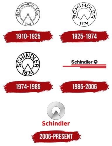
1910 – 1925
The owners of Schindler announced its launch in 1874. But the first emblem of the brand appeared much later. The badge was presented to the public in 1910. Its development was entrusted to the young artist Maxim Chatel and one of the founders’ family members. Their efforts resulted in a creative image, symbolizing the direction and the company’s main principle.
The result was a round frame, inside which was another circle, the manufacturer’s name, the founding date, and a sign that resembled a compass. The designers intended to demonstrate perfection (through a perfectly flat circle) and architectural specialization (through the compass figure). The coloring favorably emphasized the main message. Black symbolized high quality and professionalism, and white symbolized responsibility.
1925 – 1974
In 1925 the company updated the logo and officially registered it. The basis for the emblem was the previous composition. But, it became more abstract and minimalistic. A large outline frame now contained the name, made in a more stylish font, and a circle with a triangular cutout. It was a better circle version with a compass used in the 1910 logo.
In addition to this mark, the logo featured the founding date and the name in a neater and more expressive font without serifs. These updates were intended to emphasize the respect for the company’s past and the high quality of its products.
1974 – 1985
1974 was a landmark year for Schindler as the company celebrated its 100th anniversary. In honor of this event, the brand decided to rebrand itself, which resulted in a more confident and clear logo. It was created based on the previous two versions but with expressive and thicker contours. The filling of the logo remained the same.
It had a circle with a triangular notch, a circular frame, the company name, and the date of the foundation. Each of the elements became clearer due to thicker lines and increased size. This design demonstrates the preservation of the brand’s basic strategy while at the same time strengthening its position in the market. This line also continues in an achromatic black-and-white color scheme.
1985 – 2006
In 1985, the company launched a new era of visual identity, which continues to this day. It was based on a new approach to the Schindler corporate identity. It retained the characteristic brand badge, demonstrating respect for tradition and the main element – the name. At the same time, the logo layout and style were completely changed.
An additional feature was the appearance of thick decorative stripes at the bottom of the badge. A dense simple font without serifs was used for the company’s name. It was notable for its excellent readability, as it had a balanced shape. In addition, the font reflected the confidence and authority of the company, which was expanding its production capacity at the time.
Next to the name was the traditional brand icon, including a circle with a triangular cutout. This version’s part was filled with black, giving a solid look. The new element in the form of red stripes of varying lengths symbolized the additional features of Schindler – energy, and progress.
2006 – today
In 2006, the company returned to its original concept, which included a large round icon combined with the company name. But, the old outline style no longer suited the actively developing brand, so the designers created an incredibly stylish abstract emblem. The decorative symbol, which includes a circle with a triangular cutout, got a new format.
The effect of three-dimensional space was used for it. Volumetric shapes were achieved through shadows, expressive lines, and filling the space in some areas. The lettering was designed in a simple, massive font. On the whole, this design underlined the heritage of the business, professionalism, and the active development of the company.
Font and Colors
The Schindler corporate identity is a prime example of how an original visual concept can be played with modern brand design trends. Instead of the old-fashioned thin typeface, an expressive and beautiful sans-serif typeface is used for the lettering. Massive shapes, smooth curves, unequal line thickness, and small spaces characterize it.
These features make the lettering look confident and powerful. In the context of visual identity, it signifies power, strength, and high status. In addition, the name is well-readable, contributing to the recognizability of the logo as a whole. The color scheme also favorably contrasts with the colors of the old version. The current emblem uses metallic gray shades, demonstrating prestige and elitism, as well as a rich red color. The bright hue emphasizes energy and vitality, which fit perfectly with Schindler’s characteristics.
Schindler color codes
| Lust | Hex color: | #e80408 |
|---|---|---|
| RGB: | 232 4 8 | |
| CMYK: | 0 98 97 9 | |
| Pantone: | PMS 172 C |
| Dark Gray | Hex color: | #afb0af |
|---|---|---|
| RGB: | 175 176 175 | |
| CMYK: | 1 0 1 31 | |
| Pantone: | PMS 421 C |
| Eerie Black | Hex color: | #202020 |
|---|---|---|
| RGB: | 32 32 32 | |
| CMYK: | 0 0 0 87 | |
| Pantone: | PMS Neutral Black C |
