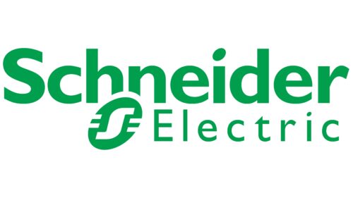
The basis of the visual identity is the incredibly modern Schneider Electric logo. It is dynamic, progressive, and professional, focusing on green technology. The use of several components, a combination of different styles of fonts and colors typical of the energy industry, conveyed this message. Despite the many details, the logo looks very harmonious, emphasizing the balance within the company and the well-established pattern of managing subsidiaries.
Schneider Electric: Brand overview
| Founded: | 1836 |
| Founder: | Eugène Schneider, Adolphe Schneider |
| Headquarters: | Rueil-Malmaison, France |
| Website: | se.com |
Schneider Electric is a major international brand that supplies various types of electrical equipment. It is managed from its headquarters in Rueil-Malmaison (France). The company’s most famous products are unique high-tech solutions in energy management and automation systems.
Schneider Electric is a well-known brand working in the field of electrical energy. Its products are valued in France and far beyond its borders. The company supplies the international market with high-quality power subcomplexes designed for residential and civil facilities, industrial plants, and data centers. Uninterruptible power supplies are of special value in the assortment.
Meaning and History
Throughout its history, the company has improved technology and upgraded equipment, bringing the manufacturing process to perfection. Despite this, the visual concept has not changed. Loyalty to the original visual concept of the logo means stability in the work of Schneider Electric and strict adherence to the main principles. The French Schneider Electric brand was founded in 1836, but the corporate logo appeared much later.
What is Schneider Electric?
Schneider Electric is a well-known progressive company of French origin engaged in the production of electrical equipment of various types. Goods are produced in the main factories and in the production of subsidiaries. Its main feature is the focus on environmentally friendly solutions, which are used for the new generation of equipment. It was even included in the rating of the most socially responsible companies in the world, taking the first position.
1902 – 1938
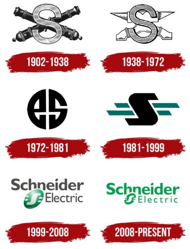
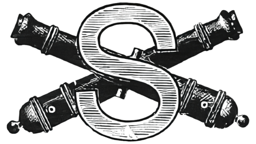
The forerunner of Schneider Electric was the iron foundry Schneider & Cie, which got its name in the late 1830s. It produced various types of products – from steel to transport equipment. After the Franco-Prussian War, the company began making weapons, so by the early 1900s, it was already an expert on armament. The logo evidenced this with two crossed cannons on a background of a large letter “S.” The artists adhered to a realistic style and painstakingly depicted all the details to make the barrels look like the real thing.
1938 – 1972
In 1938, black guns gave way to a white anvils. This reflected the peaceful nature of the brand, which wanted to be associated with more than just the arms industry. The new symbol demonstrated that the company was historically linked to the forges of Le Creusot. And its appearance roughly coincided with the centenary of Schneider Electric.
1972 – 1981
In 1969, Baron Empain bought Schneider & Cie and merged it with his industrial group Empain. The newly formed company was named Empain-Schneider and had an emblem consisting of the letters “E” and “S” with a custom design. The monogram looked like an exquisite round pattern in black.
1981 – 1999
In the 1980s, the company, which became Schneider, decided to focus on the electric power industry. By giving up shipbuilding and steel production, it also changed its logo. In the logo’s center is a stylized letter “S,” which looks like a sideways-turned “N.” Designers made it black and complemented it with four short horizontal stripes of cyan. These lines were associated with the wires that carry current.
1999 – 2008
The official version of the emblem was introduced in 1999 when the manufacturer’s focus shifted to producing only electrical equipment. This event affected all business aspects and influenced the company’s visual image. The first official logo highlighted all the important features of the revamped Schneider Electric.
It symbolized vitality, connection with nature, solid status, and high quality. A confident position on the market and the reliability of the presented products were expressed through the well-chosen font. The logo has two styles that complement each other favorably and convey the desired meaning. The word Schneider is more expressive, which is large and is located in the upper part of the logo.
It used a massive, moderately thick typeface that demonstrated tenacity, authority, and integrity. Underneath it was a continuation of the brand name, Electric. The word was presented in a smaller size and a neater design. Fine, elegant lines, a decorative beveled corner in the T, and larger gaps between the letters could be seen. In the chosen design, a creative approach to the work and the use of innovative technology were readily apparent.
The picture was completed by an outstanding graphic sign, which nicely dilutes the austere style. It was a slanted oval with the letter S and stripes on each side. It looked like a drop, symbolizing the connection with nature and the emphasis on the environmental technology used by Schneider Electric. The same meaning was conveyed by the neutral, calm colors associated with balance, harmony, and reliability.
2008 – today
Continuing to break into new market segments, the company did a little rebranding. The Schneider Electric lettering turned a deep green. The font did not change, but in the second line, the glyphs were reduced, and the letter spacing was increased. The stylized “S” icon in the ellipse was also made small, although it still covers the bottom of the “hn” in “Schneider.” The usual gradient is gone: all logo elements are now two-dimensional and single-color.
Font and Colors
The Schneider Electric logo is a multi-component picture in a pleasant, calm color. It combines different fonts, shades, and elements. Despite this, the logo looks harmonious, creating a unified company image. The main semantic load is laid on the fonts. There are two different formats on the picture.
The word Schneider is in a simple, thick, sans serif font. There are minimal gaps and lines of varying thicknesses. The message of this style is reliability, professionalism, and progressiveness. It is complemented by a fine, thin font used for the word Electric. Among its features are big spaces, no serifs, and an unusual cut in one of the letters.
All the elements are colored light green. It is a symbol of nature, purity, and balance, which emphasizes the focus on green technology. The background and the filling of the decorative badge are designed in the traditional white color, denoting reliability, transparency, and openness to new solutions. It is also an important part of Schneider Electric’s strategy.
Schneider Electric color codes
| Pigment Green | Hex color: | #009e4d |
|---|---|---|
| RGB: | 0 158 77 | |
| CMYK: | 100 0 51 38 | |
| Pantone: | PMS 354 C |
