The creative component perfectly conveys the bright and funny Schuco Modell logo. It has the features of the old, but at the same time, relevant to the present time styles. We are talking about expressive retro and even, to some extent, pin-up. The resemblance to them is mainly due to the unusual decorative font used to decorate the main element. According to the designers’ idea, it conveys the main values of Schuco Modell – a sense of style, professionalism, creativity, and friendliness.
Schuco Modell: Brand overview
| Founded: | 1912 |
| Founder: | Heinrich Müller, Heinrich Schreyer |
| Headquarters: | Fürth, Germany |
| Website: | schuco.de |
Schuco Modell is a popular German brand engaged in developing and creating unique models of children’s toys. The central office of the company is located in Fuerth (Germany). Unlike similar manufacturers, Schuco Modell specializes in manufacturing miniature and scale models of various types of transport.
Schuco Modell is one of the few companies that survived the crisis in their work and was reborn on a larger scale. After the decline, the management has developed a new strategy, successfully operating today, offering its collectible products to customers worldwide. The range now includes updated copies of earlier models and brand-new stylish products.
Meaning and History
Throughout its history, Schuco Modell has shown unprecedented resilience, preserving its heritage even during bankruptcy. This line is visible at the level of the visual concept. The company has never changed its distinctive logo since its founding. It stayed with it even when it was part of other big firms. This confirms once again its self-confidence and desire for independence.
What is Schuco Modell?
Schuco Modell is a well-known company of German origin that specializes in manufacturing toy replicas of vehicles. The manufacturer’s collection includes both miniature products and scale models. To manufacture products, the company uses plastic and tin materials, as well as injection molding technology.
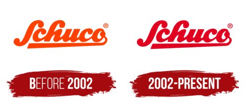
before 2002
Schuco Modell entered the market in 1912 with a corporate identity already established. The basis of the visual image was an energetic, bright logo, which evoked associations with the creative sphere. Every detail immediately attracted customers’ attention, who subsequently viewed the products with interest. In part, this was one of the goals of the logo. That is why a saturated coloring was used for its design, in which there was a place for contrasts.
It provided recognizability of the emblem, which positively influenced the business. In addition, the color scheme demonstrated several important meanings that Schuco Modell wanted to convey to its potential audience. We can highlight progressiveness, determination, energy, and vitality among them. The qualities perfectly describe the company.
A striking confirmation of this is when the company became successful and independent again after several years of being part of large manufacturers. But, coloring is not the main component of a company badge. Its content is of particular importance. In Schuco Modell, it is represented by a large thick inscription, supplemented by a graphic element in the form of a long neat stripe connecting with the letter O.
In such a design, you can see the resemblance to the company’s products, in part a neat miniature motorcycle model. But, such associations do not arise with everyone, so the explanation of the logo comes down to the peculiarities of the font. An amusing decorative format was used for the inscription, which demonstrated creativity, exclusivity, confidence, and professionalism. The lower underline, in the form of a dense stripe, symbolized firmness and sturdy support. These characteristics could be seen throughout the company.
2002 – today
There were no noticeable visual changes except for the color. The place is orange, and they began to use rich red.
Font and Colors
The Schuco Modell logo is an example of timeless style, which does not lose relevance with the arrival of new trends in design. The stylish design features a powerful large-sized font, which belongs to decorative varieties. It has no serifs, but most letters have nice rounded thickenings.
They are present in the S, H, and C. In addition, a round bold dot is present in the letter O. But it is the beginning of a decorative line that emphasizes the lettering. Due to these circles, the inscription looks very friendly and positive. In addition, the modifications emphasize the creative beginning of the company. Another feature is the absence of gaps.
The letters are smoothly connected, just as the brand’s products are united by one idea. Two colors, red and white, were chosen as colors. They create a contrast effect, which contributes to the recognizability of the logo. Separately, the colors have a special semantic meaning. Red shows active work, vigor, and improvement, and white – trustworthiness.
Schuco Modell color codes
| Cadmium Red | Hex color: | #e20021 |
|---|---|---|
| RGB: | 226 0 33 | |
| CMYK: | 0 100 85 11 | |
| Pantone: | PMS Bright Red C |


