


Schweppes has updated its identity with a focus on heritage. The brand dates back to 1783, when Johann Jacob Schweppe began working with carbonated water. Over its long history, Schweppes became associated with tonic water, lemonade, ginger ale, and drinks for an adult audience.
The update was developed by “JKR Studio.One”, Mischief, and the in-house team at the Coca-Cola Company. The goal was to carefully shape a new image. The brand was reconnected with its origins, quality, and elevated position in the category.
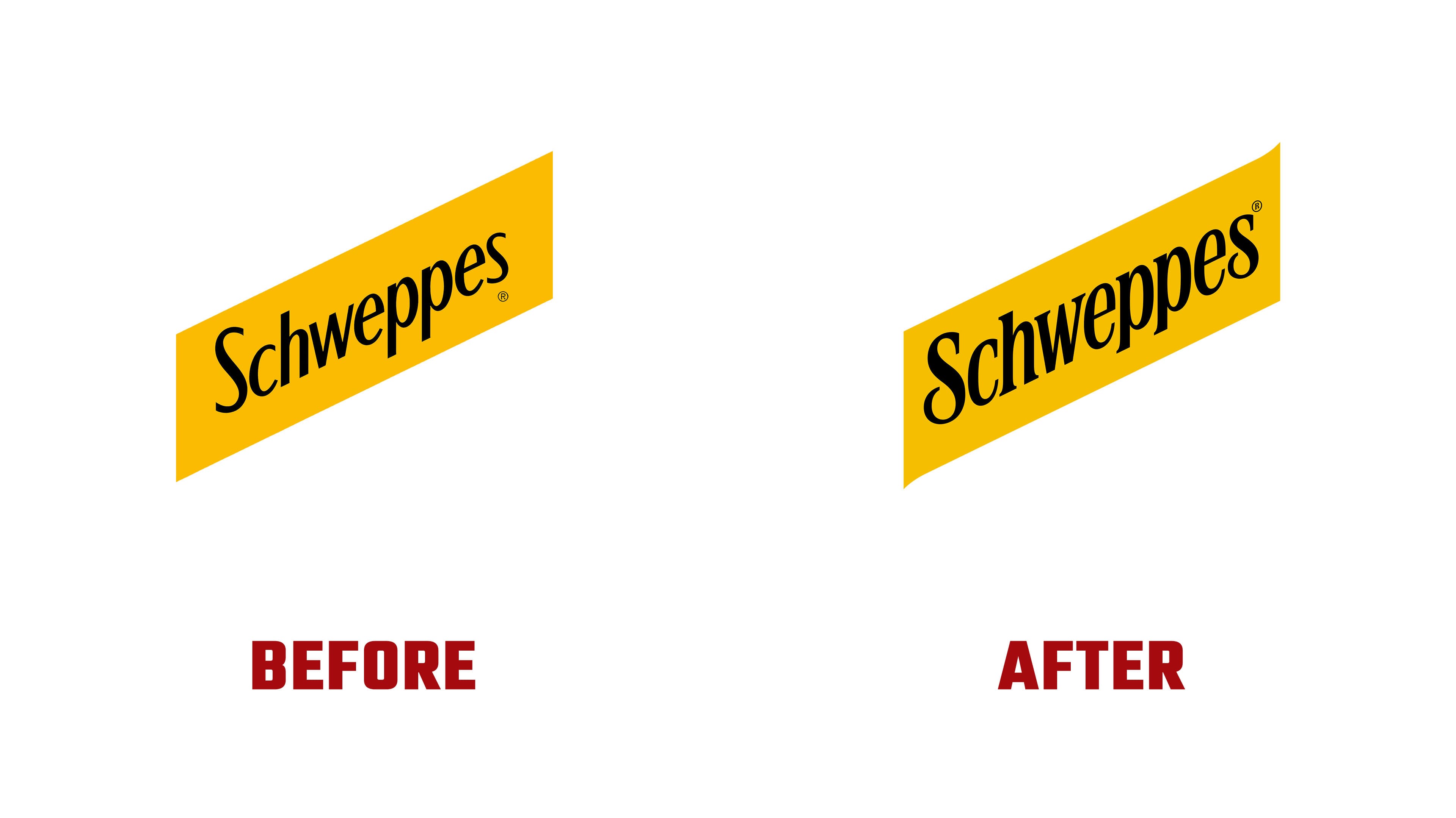
The yellow diagonal parallelogram kept its role as the main shelf cue. The changes affected the lettering, proportions, and overall appearance of the mark. The previous version looked stretched and uneven inside the frame. The new wordmark is tighter and calmer, with the name filling the yellow field more fully.
A key part of the update is the typeface. It has regained serifs close to the eighteenth-century style and early versions of the brand before the Cadbury period. The letters are more compact. They have a large x-height, short ascenders and descenders, and tight spacing.

The fountain symbol in the identity is tied to the brand’s history. The reference leads back to the Great Exhibition of 1851 at the Crystal Palace, where the brand strengthened its reputation as one of the early players in the category. The new fountain mark and monogram recall embossing, a seal, or a quality stamp. They add a sense of heritage while keeping the brand’s tone current.
Saffron yellow became the shared base for the global range. It helps unite different Schweppes products and maintain a familiar look. Together with the updated logo, the packaging looks cleaner, more premium, and more contemporary.
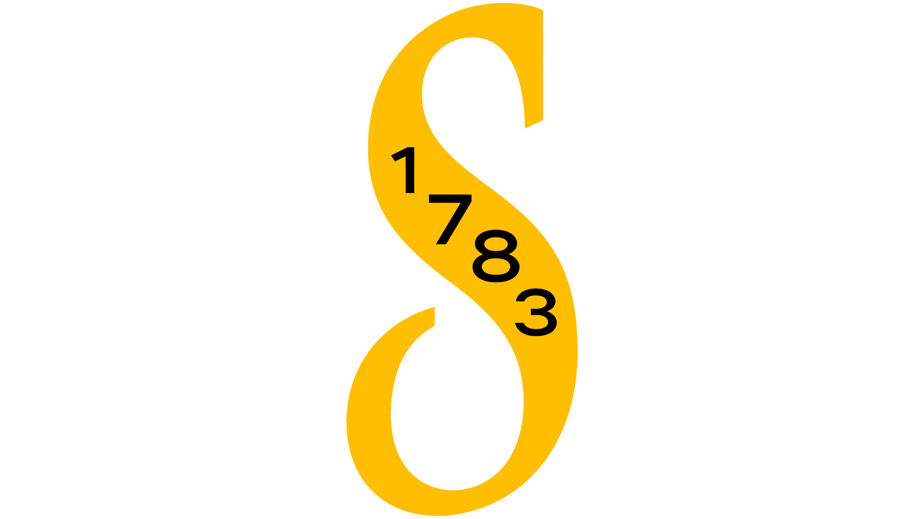
The redesign came amid growing interest in craft carbonated drinks and mixers for an adult audience. Schweppes recalled the brand’s age and demonstrated its relevance in a category with many new players. The new logo keeps the familiar shape and brings the details into order.