


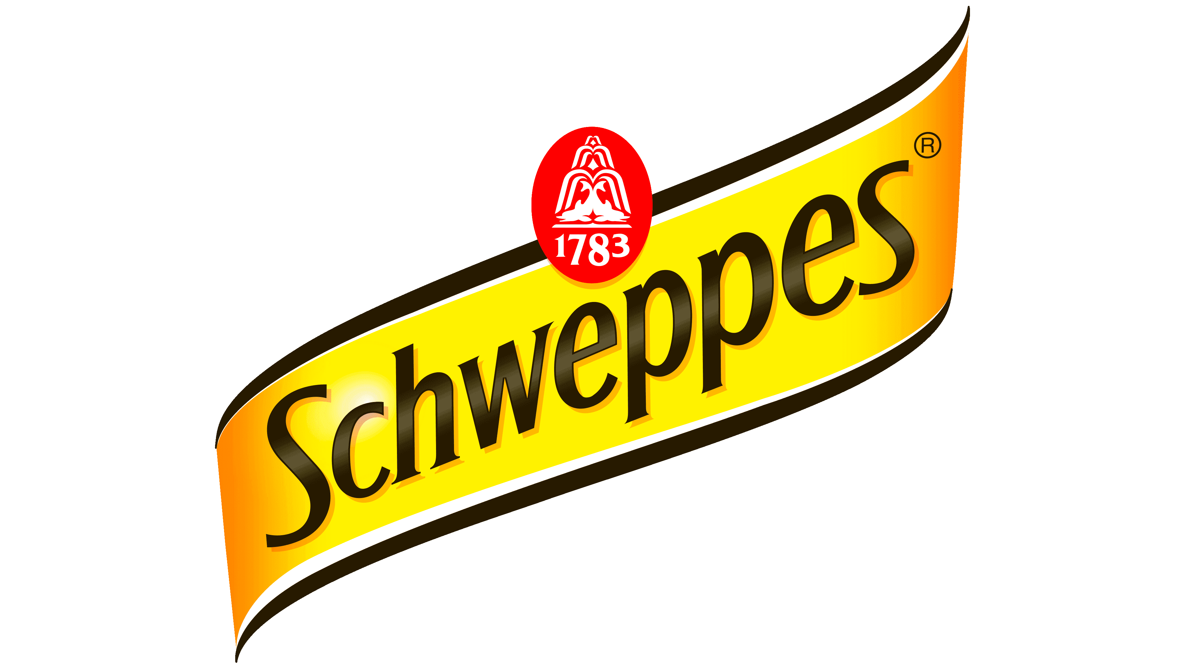
![]() Schweppes Logo PNG
Schweppes Logo PNG
The Schweppes Logo represents the company’s beverages as a top choice for social occasions. According to the company, they add a sense of enjoyment and liveliness to any event. Each sip of lemonade or ale offers a refreshing and pleasant flavor.
Johann Jacob Schweppes was born in 1740 in Witzenhausen and later moved to Geneva, where he worked as a jeweler and studied natural science. Inspired by Joseph Priestley’s research on carbon dioxide in water, he developed a mechanical compression pump for carbonating water under pressure. In 1783, he patented the device and started a small business producing carbonated water.
In 1790, Schweppe partnered with pharmacist Henri Gosse and engineer Jacques Paul under the name Schweppe, Paul & Gosse. Two years later, he moved to London to enter the British market, but the first attempt failed, and the London branch went bankrupt in 1795. Interest in carbonated water was sparked after Erasmus Darwin, grandfather of Charles Darwin, recommended it to patients for digestive problems.
The brand gained royal status in 1831, when King William IV granted it a Royal Warrant as supplier of mineral waters to the royal court. In 1843, Schweppes began selling water from the Holywell spring in the Malvern Hills. At the Great Exhibition in London in 1851, the company served as an official sponsor and sold more than one million bottles.
Schweppes expanded its range with ginger ale in 1870 and bitter lemon in 1957. Its advertising became part of British popular culture, from William Barribal’s posters in the 1920s and 1930s to the “Schweppervescence” campaign in 1946 and Commander Whitehead TV ads in the 1950s and 1960s. In 1969, Schweppes merged with Cadbury, later competing with Coca-Cola and Pepsi-Cola. After the 2008 split of Cadbury Schweppes, the drinks business became Dr. Pepper Snapple Group. In 2018, Schweppes in the U.S. and Canada was acquired by Keurig Dr. Pepper.
Meaning and History
![]()
The brand has always paid considerable attention to visual identity and marketing. It used graphics to promote itself in the 1920s and 1930s, commissioning several posters from artist William Barribal. Later, the London-based advertising studio STGarland Advertising Service (specifically Edward Whitehead) coined the word “Schweppervescence,” which perfectly conveyed the hissing and bursting of bubbles in an open bottle of soda water. After five years of using the phrase in advertising, the agency sold it to Schweppes for £150.
The brand innovated in the production of industrial soda and sweet lemonade. The brand has undergone several transitions, mergers, and expansions, all of which are reflected in its identity. However, it has retained its original style, concise, tenacious, clear, and accurately conveyed in a personal logo. Most of the modernization touched on the typeface, which has survived five revisions.
What is Schweppes?
This well-known producer of carbonated beverages developed a special tonic recipe, setting a standard in mixology and cocktail culture. Among its many non-alcoholic beverages, the signature bitter Indian tonic water and a line of cocktail mixers, including ginger ale, lemon bitters, and soda, stand out. A distinctive feature of this brand is its “spicy” carbonation, characterized by fine, lasting bubbles that give the drinks a unique taste known as “fizz.” The range also includes a Premium Mixers series, crafted specifically for cocktails, flavored tonics, and fruit sparkling drinks.
1783-1918
![]()
The early Schweppes logo centered on the brand name. It resembled a compact trademark consisting of a red horizontal panel, white lettering, and an enlarged initial “S.”
The name came from the founder’s surname. Early product labels used names such as “Schweppe’s Water” and “Schweppe’s Table Water.” By the beginning of the twentieth century, the modern spelling had emerged.
A deep red rectangle formed the background. Its surface was solid and uniform, with the word “SCHWEPPES” set in white. The red-and-white combination placed the product name at the forefront.
All letters were uppercase, with the initial “S” larger than the remaining letters. It opened the word and created the main point of emphasis within the lettering. The typeface was bold and sans serif, with tightly spaced letters, a straightforward structure, and a heavy visual weight.
During the early period, the logo served as clear product identification. It linked the brand to the founder’s surname and to the trade names “Schweppe’s Water” and “Schweppe’s Table Water.” The red panel kept the focus on the name, while the white capital letters made it the dominant visual feature.
1918-1948
![]()
In 1918, Schweppes replaced the red panel and white capital letters with black lettering on a light background. The logo became lighter in appearance, and the name’s shape assumed the leading role.
In the revised version, the word began with a large capital “S,” followed by lowercase letters. The first letter rose above the others, emphasizing the beginning of the name. The lettering appeared in black with an open, unframed presentation.
The typeface adopted an ornamental serif style with historical influences. Its forms were derived from European typography of the late nineteenth and early twentieth centuries. The letters featured subtle curves, varied stroke endings, and a hand-drawn quality.
The serifs were large and decorative, with soft turns, teardrop-shaped terminals, and widened sections. Some strokes ended in flowing projections resembling calligraphic marks. Such details gave the logo a more refined, traditional tone than the earlier version, which featured a dense red panel.
The 1918 redesign shifted the focus toward the name, typography, and ornamental styling. A wordmark replaced the heavy trademark with a historical sensibility and carefully drawn letterforms.
1948-1956
![]()
During the postwar years, Schweppes placed greater emphasis on its advertising image, while the earlier focus on the name alone gave way to a packaging-oriented presentation. In 1948, the logo received a vivid appearance suited to store shelves and window displays. The updated design introduced a yellow background, black decorative lettering, a rounded frame, and a red oval emblem featuring a fountain.
The S. T. Garland Advertising Service agency played a major role during this period. It managed advertising for the brand and introduced the word “Schweppervescence.” The term first appeared in 1946 and was used in outdoor advertising during the London Victory Parade. It was later sold to the company for £150. The word reinforced associations with carbonation, bubbles, and lighthearted advertising humor.
The 1948 logo took the form of a horizontal rectangle with rounded corners. A black outline ran around the edge. The interior was filled with a rich golden yellow, while the black brand name occupied nearly the full width.
A red oval emblem appeared at the top, bordered by a thin white line. Inside it was a white image of a fountain. Its history can be traced to the Great Exhibition held at the Crystal Palace in 1851. A large fountain was created for the exhibition, and its image later became part of the brand’s symbols and printed materials. The brand’s owners associate the fountain emblem with the 1851 exhibition.
The main lettering appeared in black. The letters were far larger than the oval emblem, allowing the name to dominate the composition. The typeface belonged to the decorative italic serif tradition. Its letters were vertically elongated, slanted to the right, and formed with flowing lines and a historical appearance.
The 1948 version combined the brand name, the Fountain from the brand’s history, and the post-war advertising style. The yellow background performed well on packaging and in retail displays; the red oval referred to the company’s origins, and the black italic lettering maintained a traditional tone.
1956-1978
![]()
In 1956, the brand returned to a wordmark format. Following the version with the yellow background, border, and red fountain emblem, the logo was reduced to lettering alone. Its appearance became more restrained and closer to a traditional commercial signature.
The wordmark appeared in a dark color. It began with a large capital “S,” followed by lowercase letters. The first “S” was taller and wider than the remaining characters, establishing the overall silhouette of the name.
The typeface belonged to the decorative italic serif category. All letters leaned to the right, although the treatment appeared calmer than in earlier versions. The connection with the brand’s earlier typography remained, while packaging-related details were removed from the primary logo.
Serifs appeared on all letters. They had flowing shapes, gently widened bases, and pointed endings. The lettering transformed the name into a self-contained wordmark with a distinctly British tone.
The 1956 period was closely associated with the Commander Whitehead advertising program. Edward Whitehead, a real British naval officer, became the face of the brand in the United States. The campaigns developed the themes of “Schweppervescence” and the beverage’s British origins, turning a dry product name into a lively advertising world.
Stephen Potter wrote the copy for “Schweppeshire.” Schweppeshire was a fictional brand territory built around British manners and absurdist humor. The advertisements featured the audio signature “Schhh… You Know Who.” The opening “Schhh” imitated the sound of gas escaping from a bottle. The sound associated with the name became a separate advertising device, replacing the need to pronounce the full brand name.
1978-1980
![]()
In 1978, Schweppes returned to a rich, label-based presentation. After the restrained wordmark period, the design became more formal. Borders, ornamental details, and historical references reappeared, bringing the overall appearance closer to traditional British packaging.
The foundation was a horizontal rectangle with heavily rounded corners. A thick dark brown border ran around the outside. Inside it sat a wide light gray field serving as a second outline. The middle area was filled with dark brown, giving the design a layered appearance similar to an old printed label.
An ornamental border made from repeating semicircular forms appeared inside. The scalloped edge separated the main field from the outer outlines. It brought the logo closer to traditional bottle labeling associated with heritage, status, and history.
The United Kingdom’s royal coat of arms appeared at the top center. It was rendered in red against a white background. The emblem included a shield, crown, lion, unicorn, and many fine-line details. The motif connected the brand with its British origins and its role as a supplier to the Royal Household.
Below the coat of arms was a multi-line statement describing the company’s status as a supplier to the British Royal Household. All lines were set in capital letters. The type size varied from line to line, increasing toward the middle, where “SCHWEPPES LIMITED” received greater emphasis. The hierarchy allowed the formal wording to remain visible beside the main brand name.
The name occupied most of the logo. It appeared in light gray and rose diagonally from left to right. The typeface retained the serif foundation of previous decades, along with its slant, ornamental serifs, and historical tone. The 1978 version combined a large diagonal wordmark with the coat of arms, layered borders, and the formal appearance of a traditional label.
1980-1989
![]()
In the 1980 version, Schweppes retained the label-based structure of the previous logo while increasing visual density and color intensity. The design centered on the brand name, an ornamental border, and an oval emblem. Fewer secondary details gave the wordmark greater prominence.
The logo took the form of a horizontal rectangle with heavily rounded corners. A wide black border with a soft outline ran around the outer edge. Inside was a rich golden-yellow field, providing strong contrast for the black lettering and decorative trim.
A line of repeating semicircular arches followed the inner perimeter. The ornament resembled the shaped edging found on traditional labels, separating the middle field from the outer border. The structure preserved the brand’s packaging-oriented style while removing many of the small formal details used in the 1978 version.
A red oval emblem appeared at the top center. It extended partly beyond the inner field and crossed the upper edge of the rectangle. Inside the oval was a stylized fountain linked to the brand’s history and earlier symbols.
The words “SCHWEPPES SINCE 1783” followed the oval’s inner edge. All letters were uppercase and arranged along the curve of the emblem. A light color was used for the fountain, the oval outline, and the lettering inside the red area.
The brand name occupied most of the design. It appeared in black and rose diagonally from left to right. The angled placement brought energy to the framed layout and distinguished the lettering from the strict horizontal base.
The color scheme served four separate functions. Black was used for the border, brand name, ornamental outline, and registration mark. Golden yellow filled the interior field. Red identified the upper emblem. A light tone was reserved for the fountain, oval border, and the words “SCHWEPPES SINCE 1783.”
1989-1997
![]()
The Schweppes logo of the early 1990s gave the brand a more active appearance. Earlier versions usually relied on calm, symmetrical layouts, while the new design introduced an angled structure and denser styling.
The base became a square with rounded corners, filled with a rich golden-yellow color. Wide dark brown lines crossed the background. They formed a large tilted frame and established the direction of the full composition. The brand name followed the same diagonal. Large black lettering occupied most of the logo.
A red oval emblem appeared near the top. Inside was the fountain long associated with the brand’s history. The words “SCHWEPPES • BEST • 1783” followed the inner edge of the oval in uppercase serif letters. The detail referred to the company’s origins and a key year in its history.
The color scheme combined a golden-yellow background, dark brown bands, a red oval, and a large black wordmark. The separation of colors distinguished the brand name, frame, and historical emblem.
The period when this logo was used coincided with one of the brand’s best-known advertising campaigns. In 1993, Schweppes began working with photographer Jean-Paul Goude and actress Nicole Kidman. The redesigned identity accompanied the brand’s promotion during the campaign.
1997-2002
![]()
In 1997, Schweppes replaced the rigid rectangular base with a freer form. The logo resembled a wide ribbon rising diagonally from the lower left to the upper right. The new silhouette gave the brand a lighter appearance and brought the name, color, and emblem into one unified form.
The ribbon was filled with bright yellow. Its left edge was rounded and narrowed toward the end, while the right side rose into a high curve with a pointed tip. A golden-orange strip followed the lower edge, repeating the contour and adding depth.
The brand name occupied most of the ribbon. The dark lettering followed the same angle as the overall shape and appeared integrated into the silhouette. The calligraphic style preserved a link with the brand’s past. Decorative details were reduced, and the lines became calmer.
The red oval with the fountain appeared above the wordmark. The fountain was drawn in yellow, while the words “SCHWEPPES • SINCE 1783” followed the inner edge. The date linked the updated identity to the brand’s history and underscored its long presence in the market.
The 1997 version replaced strict geometry with a flexible silhouette while retaining the main identifying features. Two years later, a leopard named Clive appeared in Schweppes advertising. The character conveyed the tonic’s bite, bitterness, and sharpness, reinforcing a vivid, edgy brand image.
2002-2005
![]()
In 2002, the Schweppes ribbon gained a dimensional background inspired by the beverage itself. Airy circles and a light field created a sense of freshness. At the same time, the large wordmark maintained continuity with the brand’s earlier identity.
The yellow ribbon rose diagonally from the lower left to the upper right. Compared with the 1997 version, its outline became softer and more unified. The rounded left section widened toward the middle, then rose upward and ended in a long pointed edge. The rich yellow color preserved the familiar appearance and separated the brand name from the background.
The wordmark occupied most of the ribbon and followed its angle. The lettering and the base read as a single form. A red oval emblem associated with the brand’s historical identity appeared above the name.
The primary change involved the area surrounding the logo. A large fountain illustration appeared on a light gray background, outlined in translucent white lines. White circles of various sizes were scattered throughout the field, resembling carbonation bubbles. The background conveyed the beverage’s qualities through associations with freshness and effervescence.
2005-2014
![]()
In 2005, Schweppes moved from a flat logo to a three-dimensional structure. The yellow ribbon preserved continuity with earlier versions while gaining a complex outline, folded edges, and layered trim. The logo began to resemble a separate object made from several overlapping forms.
A wide ribbon rose diagonally from the lower left to the upper right. The bright yellow field was surrounded by a white border, with thin light gray lines running along the inside. Shadows, outlines, and soft curves created a sense of depth, making the edges appear raised above the surface. The brand name sat inside the ribbon and followed its angle. Large black lettering maintained the familiar Schweppes appearance.
The emblem underwent the main transformation. The red oval used in previous decades was replaced by a circle positioned over the ribbon. Several white and light gray rings formed a rim with a metallic appearance. The red center preserved the established color accent and linked the new symbol with the brand’s earlier identity.
The fountain received a new treatment. Instead of a line drawing, its silhouette was built from white bubbles of different sizes. They resembled streams of water and carbonation in the drink. The phrase “PLEASURE OF MIXING” followed the upper curve, while “1783” appeared at the bottom in reference to the founding year.
The 2005 version combined historical details with the three-dimensional styling common in brand identities of the period. The ribbon, circular emblem, bubbles, and layered trim connected the company’s origins with the product and the culture of mixed drinks.
2014-2016
![]()
In the 2014 Schweppes identity, the brand name assumed the leading role. The ribbon and circular emblem remained part of the familiar image, while the number of decorative layers was reduced. Compared with the 2005 version, the logo appeared more unified, and the contrast among yellow, white, black, and red gave the structure a stricter appearance.
A wide golden-yellow ribbon rose diagonally from the lower left to the upper right. A white border outlined the logo, separating it from the background. A thick black band ran along the bottom, continuing the ribbon’s curve and forming a second layer. The light gray outlines from the previous version were replaced by high-contrast edging.
The brand name occupied most of the yellow field. The black letters leaned to the right and retained a serif foundation. The company rarely discloses the official typeface name. Reference sources mention Formica Bold Italic, Columbia Serial ExtraBold Italic, and Castle TS Medium Italic as similar alternatives.
A red circular emblem appeared above the wordmark inside a black frame with a white outer border. The fountain was formed from white dots of different sizes. They resembled streams of water and carbonation bubbles, linking the historical symbol to the beverage’s qualities.
The circular phrase used in the 2005 version was removed. Inside the emblem, only the word “SINCE” and the large date “1783” remained. The added open space gave greater prominence to the fountain and founding date. At the same time, the full structure relied less on small decorative details.
2016-2017
![]()
In 2016, Schweppes retained two core brand assets in its logo, the yellow ribbon and the name. The British identity was developed by Epoch Design and launched in April as part of the brand’s largest UK marketing campaign in 20 years.
A wide golden-yellow ribbon rose from the lower left to the upper right. The outer outlines, shadows, and layered borders used in earlier versions were removed. The flat form adopted a freer silhouette without the details that had separated it from the background in the 1997, 2002, 2005, and 2014 logos.
The brand name extended across nearly the full length of the ribbon. The black lettering followed the diagonal axis and became the dominant part of the identity. The serif style maintained continuity across eras, even though the emblem and its surrounding treatment changed repeatedly.
Removing the circular emblem, fountain, founding date, and decorative layers shifted the focus to the wordmark. The 2016 version felt less constrained than earlier logos and relied on two long-established brand assets.
2017-2025
![]()
The 2017 redesign began with a reassessment of the brand’s position in the market. British studio Kenyon Weston worked with the global Coca-Cola Design team to move Schweppes closer to the premium adult beverage category. The Coca-Cola side was led by James Sommerville, Vice President of Global Design, and Rapha Abreu, Senior Director of Global Identity.
The team developed both the bottle and a unified brand system. Coca-Cola specialists set the direction and shared their brand knowledge. At the same time, Kenyon Weston examined the Schweppes legacy from an outside perspective. The designers reviewed two centuries of archival material. They evaluated it by asking how Jacob Schweppes might operate in the modern world. The idea preserved a connection with the company’s history while avoiding an overload of period references.
The logo adopted a strict diagonal base in place of the flowing ribbon used in previous years. The golden-yellow band became a straight four-sided form with clean edges and nearly uniform width. It still rose from the lower left to the upper right, preserving continuity with the earlier ribbon.
The brand name occupied a large portion of the yellow field and followed the same angle as the field. A new sans serif typeface was developed for the wordmark. The serif lettering used in previous versions gave way to a more controlled typographic style. Black lettering and the geometric band created a restrained appearance suited to premium positioning.
The team updated the Skittle bottle as part of the identity system. A fine embossed fountain appeared on the glass. The historic symbol gained an independent role outside the wordmark. The bottle shape, embossing, and revised logo moved the brand closer to the visual language of champagne and premium adult beverages.
The project appeared in Creative Review’s The Annual 2018 in the packaging category. The 2017 version differed sharply from the designs used in earlier decades. Curves, frames, and complex layers were replaced by a straight yellow band, a new typeface, and a separate fountain symbol within the brand system.
2025 – today
![]()
For much of its two-century history, Schweppes combined a rich heritage with the appearance of a mass-market retail brand. JKR’s global redesign aimed to bring the brand’s origins and its shelf presence into closer alignment. The first phase launched in South Africa in December 2025. The international identity system and the “With Time Comes Taste” platform were introduced in June 2026.
The new logo builds on the familiar diagonal structure. A wide golden-yellow band rises from the lower left to the upper right and provides the base for the brand name. Frames, dimensional effects, and decorative layers have been removed, placing typography in the leading role.
The wordmark is larger and uses a new custom style. JKR drew on eighteenth-century type references from the brand archives. The lettering maintains a connection to Schweppes’ history. At the same time, the increased scale gives the name a stronger presence on the packaging. The diagonal placement preserves continuity with earlier versions and allows the brand to be recognized through a single band.
JKR’s work was supported by “Studio.One” and advertising agency Mischief, which developed the platform and communications. Joshua Schwarber, Senior Global Design Director, represented Coca-Cola. The revised system brought back the Skittle bottle and Clive the Leopard. Archival assets took on new roles, supporting a mature brand presentation grounded in Schweppes’ history.
The rollout began in the United Kingdom and South Africa. Expansion into Latin America, Eastern Europe, and Asia was announced for 2026. The updated identity preserves the golden-yellow diagonal, gives greater prominence to the name, and restores familiar brand symbols.
Font and Colors
The design of this company’s logo is divided into two periods: before 1975 and after. The initial versions are just a search for their own identity. The later versions, by contrast, speak to the brand’s conceptual maturity, which has finally found its visual style. In 1851, Schweppes was the official drink of the GREAT EXHIBITION, a high-level event held at London’s Crystal Palace. In memory of this event, the brand decided to use an image of the fountain there. It is represented on the medallion.
Schweppes text logos use several fonts, the most modern of which are Formica Bold Italic, Columbia Serial ExtraBold Italic, and Castle TS Medium Italic. The color palette has evolved from black-and-white monochrome to a gold-and-black glitter theme. The intermediate versions also present red, gray, and warm shades of yellow.