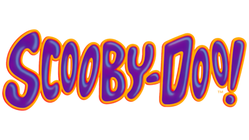
The comical and cartoony Scooby Doo logo is fully consistent with the atmosphere of the animated series. It looks like the designers first wanted to make it scary and then changed their minds. On this principle, the entire plot of the animated series is built.
Scooby Doo: Brand overview
| Founded: | 1969 – present |
| Founder: | Warner Bros. Discovery |
| Headquarters: | United States |
| Website: | wbkidsgo.com |
The animated series Scooby-Doo has influenced the history of pop culture, giving rise to a popular media franchise. Its plot follows the adventures of four friends and their cowardly dog, who together form Mystery Incorporated to investigate mysterious events. It debuted in 1969 and was translated into 15 languages over the following decades. The number of episodes grew continuously, so from 2014 to 2015, this animated project was in the Guinness World Record, beating even The Simpsons. But he did not have a permanent identity: the logo changed in each new season of the animated series Scooby Doo.
Oddly enough, the appearance of the American series about four adventurers and their dogs is directly related to the assassination attempt on Robert F. Kennedy in 1968. Because of this tragic incident, the US government has tightened the requirements for violence in cartoons. So the authorities decided to pay tribute to the deceased politician who advocated censorship of children’s television content. At that time, the animated series was quite dark because they contained scenes of murder and terror. And all because the younger audience liked horror much more than other genres.
The Hanna-Barbera film studio decided to act strategically. She launched a comedy project where the characters do not risk their lives and save the world from monsters because all the monsters that are there are just people in disguise. In the story, four friends and an anthropomorphic dog create Mystery Incorporated to fight monsters. Interestingly, the characters of The Many Loves of Dobie Gillis served as prototypes for teenagers.
Meaning and History
Each episode of the animated series features a monster. The main characters are called to catch him, but in the investigation process, they find out that an ordinary person is hiding behind the mask of a monster. At the same time, cowardly members of the team make the situation comedic. One of them is a dog named Scoobert Doo, who often says his signature phrase, “Scooby-Dooby-Doo!”. By the way, “Do be do be do” is a line from the Frank Sinatra song “Strangers in the Night.” She served as the inspiration for the name of the anthropomorphic character and the title of the series as a whole.
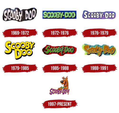
The Scooby-Doo logo changed each season, but all variants were designed in much the same way. We are talking about bright colors and uneven letters, characteristic of the “childish” style. And in the latest version, next to the inscription, one of the main characters of the animated series appeared – a dog of the Great Dane breed.
What is Scooby Doo?
Scooby Doo is a media franchise that combines cartoons, video games, comics, feature films, and theatrical performances. All of them were created based on the animated series about a cowardly dog and four teenagers solving mysteries. The first episode of the original project was released in September 1969. It was broadcast on CBS TV.
1969 – 1972
On the morning of September 13, 1969, television viewers first saw Scooby-Doo, Where Are You? on CBS TV. Ken Spears and Joe Ruby worked on the series, which means they may have been involved in the creation of the cartoon logo. It was a light gray inscription, “SCOOBY-DOO,” against the backdrop of a mystical house. The designers made both words translucent so that the elements of the building could be seen through them. Because of the translucent texture, there was an association with ghosts. The letters were trembling, uneven, as if they had no clear form, hung in the air, and swayed in the wind. The original logo was used in the second season, which debuted in 1970.
1972 – 1976
In 1972, the developers of the series slightly changed the concept. They renamed the children’s TV show The New Scooby-Doo Movies, extended episodes to 60 minutes, and added exclusive celebrity guest characters. At the same time, a wordmark was created with a light green inscription inside a blue rectangle. In this version, as in the previous one, the letters were uneven, but they became compact and uniform in shape. They also have darker contours. The glyphs piled on top of each other as if they didn’t have enough space. Between the words “SCOOBY” and “DOO,” there was a hyphen, which was not there before. This logo graced the opening credits until 1976 when the animated series moved to ABC.
1976 – 1979
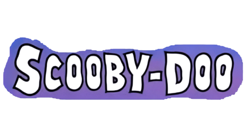
When the ABC television network bought the rights to broadcast Scooby Doo, the show’s format was again changed, and these changes happened gradually – something new in the concept appeared every year. In the 1976-1977 season, the logo began to be used, where the white name of the series was presented on a lilac background with a gradient. There are gaps between the letters. The “S” and “D” were enlarged, although the entire lettering was in the upper case. The shape of the glyphs remained uneven: they looked like children drew them. An individual dark purple line encircled each letter. This emblem remained relevant for three seasons until the end of Scooby’s All-Stars programming block.
1979 – 1985
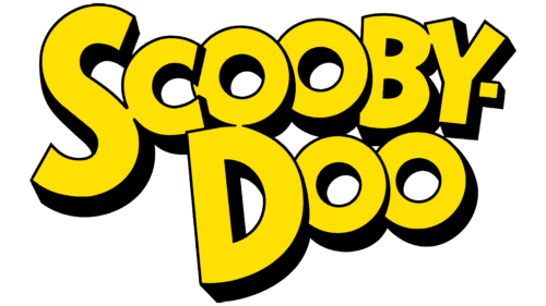
In 1979, a new character was added to the series – the Scrappy-Doo puppy. The episodes then airing used the wordmark yellow in the credits. The inscription “Scooby-Doo” was divided into two lines: at the top was the part with a hyphen, and at the bottom was the second half of the name. Moreover, the designers did not align but deliberately twisted them, placing them at an angle. Visual ordering was created only because all the letters were close and interconnected. And because of the uneven thickness of the black outlines, the text seemed voluminous.
1985 – 1988
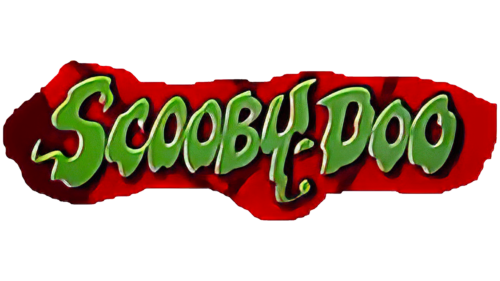
An updated logo for the animated series debuted in 1985 with The 13 Ghosts of Scooby-Doo season. The designers again made the lettering one-line and green, as in 1972. But now they have chosen a darker shade of green and, at the same time, repainted the background in red. The letters became trembling and uneven, which was supposed to create an atmosphere of mystical horror.
1988 – 1991
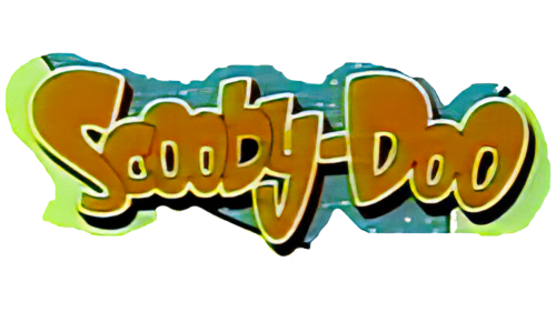
From 1988 to 1991, ABC aired a series called A Pup Named Scooby-Doo. In its logo, the main character’s name was orange and consisted of bold letters, where the first “S” and “D” were uppercase, and all the rest were lowercase. The glyphs still varied in size, but their edges were smoother. The inscription has thin white outlines and black shadows. Intra-letter gaps were also black.
1997 – today
After 1997, the animated series began to use a logo that contained two parts: a wordmark and an image of an anthropomorphic dog. The franchise name now consists of purple letters with orange outlines. They appear three-dimensional due to the gradient and highlights. A dog named Scooby-Doo peeks out over the sign with its paws on “BY” and “DOO.” He is the same as in the cartoon: a happy Great Dane with a green collar.
Font and Colors
If earlier designers tried to catch up with horror, depicting each letter in the style of Halloween horrors, then the modern inscription has a childish design. Nothing is frightening in it, especially when a good-natured dog is drawn next to it.
The custom glyph set used in the Scooby Doo logo is unparalleled. All letters differ in shape and size. The only thing that unites them is the bold style and lack of serifs. Since the animated series is designed for a children’s audience, the designers designed the inscription in bright colors, using rich shades of purple and orange. The character has traditional colors: brown fur, a black nose, a pink tongue, black and white eyes, and a green collar.
Scooby Doo color codes
| Dark Cyan | Hex color: | #128a84 |
|---|---|---|
| RGB: | 18 138 132 | |
| CMYK: | 87 0 4 46 | |
| Pantone: | PMS 3282 C |
| Apple Green | Hex color: | #79af30 |
|---|---|---|
| RGB: | 121 175 48 | |
| CMYK: | 31 0 73 31 | |
| Pantone: | PMS 369 C |
| Dark Coral | Hex color: | #bb5c37 |
|---|---|---|
| RGB: | 187 92 55 | |
| CMYK: | 0 51 71 27 | |
| Pantone: | PMS 7583 C |
| Russian Violet | Hex color: | #4b0055 |
|---|---|---|
| RGB: | 75 0 85 | |
| CMYK: | 12 100 0 67 | |
| Pantone: | PMS 2623 C |
| Burnt Umber | Hex color: | #8e6345 |
|---|---|---|
| RGB: | 142 99 69 | |
| CMYK: | 0 30 51 44 | |
| Pantone: | PMS 4635 C |
