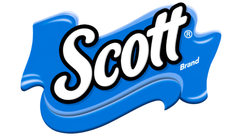
The Scott logo is bright and inspiring. The symbol reeks of vigorous marching, activity, and leadership. The company strives to conquer the top and is proud of its products.
Scott: Brand overview
| Founded: | 1879 |
| Founder: | Kimberly-Clark |
| Headquarters: | United States |
| Website: | scottbrand.com |
Scott is one of the first major U.S. manufacturers of toilet paper. It opened in 1879. He owned its forest land and factories for pulp and paper production. The company was the first to offer sanitary roll towels and paper gowns. Kimberly-Clark has owned him since 1995. Sells products in 175 countries.
Meaning and History
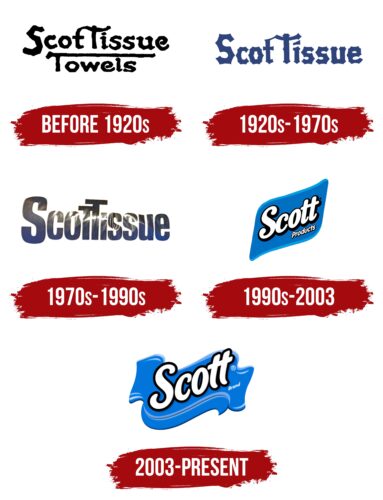
Initially, the company did not have a logo because the topic of intimate hygiene was taboo in the U.S., and people were embarrassed to discuss it. The Scott brothers, after starting production, passed the goods on to dealers, who put the paper on sale under various brands without mentioning the last name of the industrialists. Only after 1903, when the popularity of paper grew, was the trademark Scott Tissue registered, which became the first logo. All subsequent changes revolve around the theme of paper rolls and towels, representing the company’s products on every sign.
What is Scott?
Manufacturer of paper towels, napkins, sanitary pads, window wipes, and toilet paper from Philadelphia. Best-known brands are Waldorf, Tissue, Cottonelle, Weve, and Scott Baby Fresh (now owned by Procter & Gamble). Sales peaked in the 1960s when net quarterly income was more than $9 million, and annual sales were up to $300 million. The next takeoff came in 2006 with sales of $1 billion.
Before 1920s
The first logo was wordy. It is in an angular font, and its individual elements resemble paper ribbons. Thus the last letter t in the word Scott is linked by a ribbon to the first T in Tissue. Below the brand name, there was usually a caption naming the product – for example, towels. The lettering also received an elongated t-bar that emphasized the brand name and resembled a strip of paper.
1920s – 1970s
The popularity of the brand’s merchandise grew. Its brands accounted for 80% of sales of hygiene products in America. The company went public and modernized its facilities. Changes touched the logo as well. The mark gained a clearer font with sharply marked corners of the letters, and the signature explaining what was being offered was often not used at all.
The corners gave the impression that each letter consisted of separate sections joined together. They indicated towel rolls and portioning of the paper when in use.
1970s – 1990s
Fierce competition with Procter & Gamble begins. So the brand expands its product line and produces book paper and furniture. This significantly increases sales, allowing it to outpace all of its competitors. The logo reflected the victory in a smooth and slender font. The last and first t became one capital letter showing growth and exaltation. The hint of toilet paper disappeared from the sign as the product range became much broader.
1990s – 2003
Kimberly-Clark absorbs the brand. The new owners change the concept of the logo, making it more dynamic and vibrant. The name acquires white letters and a blue backing resembling a paper towel. All additional divisions have been sold. The parent company intends to promote only toilet paper and towel brands. Therefore, there is a return of the logo to the image of the main product. The white letters represent the color of the napkins, and their upward movement tells of the expansion of sales.
2003 – today
The company logo looks modern. It is presented in two versions: as a blue cloth towel and as a rectangular base surrounded by a blue ribbon underneath, making the symbol look like a paper cap flapping in the wind. The sign points to:
- Pioneer. The first toilet paper was on sale only in 1857, so the Scott brothers were virtually at the origins of this segment. For a long time, the company was a leader in creating new versions of hygiene products: the company was the first to roll toilet paper, and Irvin Scott’s son, Arthur, invented paper towels.
- Leader. The cap is part of the military uniform and is associated with a willingness to fight for one’s interests. The company used active advertising. By 1910, their brands accounted for 80% of paper sales in America. The firm managed to maintain its position despite very strong competition until the end of the 70s.
- Paper Clothing. The firm invented disposable Dura-Weve paper dresses and began selling them in 1966.
- International expansion. The Pilot is part of a flight attendant’s uniform, which evokes the association with flying, traveling, spreading, and developing. In the 1990s, Scott sold the paper to Europe and Latin America.
The two levels of paper in the hat: high base and low sides, suggest paper towels and toilet paper of different sizes.
On the blue base is the last name of the founding brothers in white capital lettering with dark blue or black trim. Although the company was called Scott Paper Company, only the first word was used in the logo. The letters of the lettering are close together, and t have a common stick. This indicates the multiple layers, the density of the paper, and the close relationship between the tissues on the reel.
The upward rise of the word demonstrates the continuing development and aspiration for the future. The blue backing tells of the support of the new parent company, helping the brand stand out from other brands.
Font and Colors
The main colors of the logo are blue and white. They echo the white paper and starched towels. They hint at the colored rolls the company offered to combat the competition.
- Light blue is the color of dreams. The firm has reached “heaven” in its development and popularity. And the desire to make its customers’ dreams come true led to the appearance of new products such as pads, dresses, kitchen paper towels, and holders for them.
- White represents cleanliness and freshness. Indicates hygiene. Echoes white sheets of paper (the company sold the paper for books and catalogs)—talks about protecting the environment. Since the 2000s, the firm has been working to reduce its environmental impact.
The font is rounded and smooth, like Nabana Outline Bold Italic. Conveys the pleasant tactile feel of paper products.
Scott color codes
| Delft Blue | Hex color: | #142b58 |
|---|---|---|
| RGB: | 20 43 88 | |
| CMYK: | 77 51 0 65 | |
| Pantone: | PMS 655 C |
| Bice Blue | Hex color: | #006ea7 |
|---|---|---|
| RGB: | 0 110 167 | |
| CMYK: | 100 34 0 35 | |
| Pantone: | PMS 7461 C |
| Spanish Sky Blue | Hex color: | #00a5f6 |
|---|---|---|
| RGB: | 0 165 246 | |
| CMYK: | 100 33 0 4 | |
| Pantone: | PMS 299 C |
