The Scream logo is scary and sharp. The emblem takes up all the space, absorbing the importance of the events. The viewer has to fear the sudden prick of a sharp dagger and cautiously watch the suspects on the screen.
Scream: Brand overview
The iconic slasher narrative that captivated audiences throughout the 1990s and early 2000s with its film series found a new home on television when MTV decided to adapt “Scream” into a series in 2014. This move marked a significant shift, as the network opted for a fresh start with a new ensemble of characters and a different backdrop, diverging from the original movie plotlines.
“Scream: The TV Series” made its debut in June 2015, anchoring its suspenseful plot in Lakewood, a fictional setting. The series showcased Willa Fitzgerald in the role of Emma Duval, who, alongside a youthful cast, faces the terror of a new killer donning the Ghostface mask. Harvey Weinstein, known for his production role in the film saga, served as an executive producer for the show.
Despite receiving a mix of positive critiques, the series didn’t immediately resonate with viewers in terms of ratings, leading to uncertainty about its future beyond the inaugural season. Nevertheless, MTV shifted gears by confirming not just a second season but a third one in 2016 and 2017, respectively, giving more screen time to the surviving characters of Lakewood as they unraveled the enigma of Ghostface. Ultimately, the series was discontinued after its exploration of these mysteries.
Fast forward to 2022, the “Scream” saga was poised for a resurgence on television with the announcement of “Scream: Resurrection.” This new installment, airing as a six-episode limited series on VH1, promised to rekindle the essence of the original films, re-introducing the notorious Ghostface mask and classic slasher elements that had initially inspired the adaptation for television.
Meaning and History
The series became part of a franchise from a series of films. All content received a similar logo, consisting of the movie title. The emblem of each part is supplemented with a unique number and an impressive poster. The sign of the series is the only one that repeats the logo of the first film from 1996 almost without changes.
What is Scream?
It is an American horror series from 2015. Filmed in the style of a slasher with a psychopathic killer. The plot is based on the series of films by Kevin Williamson, which have been released since 1996. There are three seasons with ten episodes each. The rights for international broadcasting belong to Netflix.
2015 – today
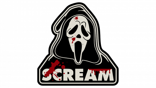
The development of the first season began in 2012 when the idea of linking the series with the franchise through the emblem probably appeared. The film borrowed not only the logo and title but also the phantom image of the killer. MTV purchased the license for Ghostface for the series.
The identity consists of massive black letters. Powerful glyphs form a chilling sense of horror—a loud scream full of fright. The logo acts on a person’s secret fears and instinctively causes vigilance.
The name is chosen in tune with the events, as each victim pursued by the maniac screams in horror. The killer’s face is hidden. He appears suddenly, which also causes screams of fright. Those who find dead friends and acquaintances scream as well.
The edges of the symbols are deliberately sharpened, like a dangerous weapon. Razor-thin lines remind that the characters walk on the edge of the blade. An attack can happen at any moment. Especially notable are C and M. The first resembles a sharpened sickle. M has an elongated middle glyph, forming a sharp blade.
Font and Colors
The black color for the emblem was not chosen by accident. The shade is associated with:
- Everything is dark in a person. The series’ story is inspired by the real person, Gainesville Ripper, who was responsible for the death of 8 people.
- Nighttime. In the picture, murders occur in the darkness.
- Destruction and death. Both characters, Emma Duval in the first two seasons and Deion Elliot in the third, are drawn into a whirlwind of events that destroy their lives.
- Secrecy. The cause of the unfortunate events is a secret from the past.
The font of the inscription resembles Futura Futuris Black but without the transformation of M. The uppercase indicates a large number of deaths and a tense plot that holds attention from beginning to end.


