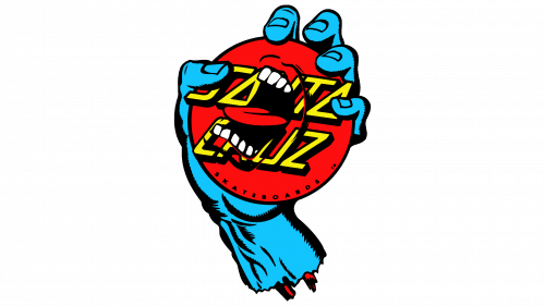
The psycho-emotional logo of Screaming ranks among the world’s top designs, as it has become a cult symbol for skateboarders. Created many years ago to support the extreme spirit, it remains relevant today, being a distinct and well-recognized symbol.
Screaming: Brand overview
Screaming (more precisely Screaming Hand) is a famous drawing by skateboarder-graphic designer Jim Phillips. He introduced it while working on a project for the Santa Cruz brand, the oldest manufacturer of skateboards and bicycles. This artistic skate art appeared in 1985 and instantly became an icon for conquerors of the wheeled boards, perfectly complementing the company’s textual logo.
Jim Phillips, a trailblazing artist within skate culture, teamed up with Santa Cruz Skateboards, a pioneering skateboard company, in the 1970s. This partnership spotlighted skateboarding and its art, capturing the youth’s imagination.
In 1985, Phillips unveiled the Screaming Hand, a design for Santa Cruz skateboards featuring a blue hand with an open, screaming mouth on the index finger. This bold, simple image quickly symbolized skateboarding’s defiance, resonating deeply within the community.
Inspired by 1950s horror comics, the Screaming Hand mirrored the era’s skate culture’s rebellious and anti-authoritarian attitudes. The design expanded beyond skateboards, appearing on T-shirts, hoodies, stickers, and posters, and grew into a broader cultural emblem.
Santa Cruz consistently produced Screaming Hand merchandise, solidifying its position as a skate culture icon. Phillips’ work not only shaped the visual identity of skateboarding but also influenced various skate brands, underscoring his impact on the industry.
The Screaming Hand has sparked numerous adaptations and tributes, stretching its influence into counterculture and personal expression realms.
Years later, the Screaming Hand is still celebrated, a testament to Jim Phillips’ creative genius and skateboarding culture’s vibrant spirit. Its lasting popularity underscores skateboarding’s unique contribution to art and culture.
Meaning and History
The work on the Screaming Hand logo did not start with a call from Santa Cruz, which needed unique prints for T-shirts to advertise innovative skateboards with urethane wheels. It began with a drowned surfer, whose hand sticking out of the water was noticed by the impressionable artist Jim Phillips. At that moment, a lot changed in his mind, and he made a sketch that later served as a prototype for the famous emblem with a convulsively clenched palm, white teeth, and a red tongue.
Having received the order, the designer thought: “Why not draw a mouth on the hand?”. And he did it. Thus, the high-artistic emblem of Screaming Hand appeared, first used to promote the Speed Wheel line. It turned into an eternal symbol of skateboarding, transitioning from the old school to the new, without losing relevance, because it expresses the psycho-emotional peak of extreme. The sign is rough and shocking but, at the same time, bright, daring, and effective, making one believe in oneself. Today, its popularity is so immense that the blue anthropomorphic hand can be seen not only on skateboards but also on mugs, T-shirts, stickers, books, baseball caps, and other everyday items.
What is Screaming?
Screaming (or Screaming Hand) is one of the logos of the Santa Cruz company, which manufactures skateboards and bicycles. This unusual drawing has been adorning its products since 1985 – from the moment it was created by graphic designer Jim Phillips. The author of this emotional sign was also into skateboarding then and felt this extreme sport well.
1985 – today
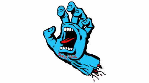
The most recognizable logo in skateboarding today is equated to works of art. Its basis is a left hand, turned palm towards the viewers. It looks like a stump, at the bottom of which bones and tendons stick out. Screaming Hand also has a mouth. It is tense, frozen in a scream of horror.
Rows of white teeth protrude from the gaping blackness at the top and bottom, and a red tongue protrudes from the gaping blackness. Shadows complement all details, making the drawing voluminous. The fingers are convulsively bent and look stiff, like on a lifeless body part. Below the blue lip, in small font, is the name of the Santa Cruz trademark. The chopped, jumping letters add a creepy atmosphere to the logo, although they perform a useful function: they represent the company that manufactures skateboards.
Font and Colors
The inscription in the Screaming Hand logo is set in a thin, grotesque font in uppercase. The glyphs are uneven: some stand lower, others higher, so the phrase seems to be written haphazardly. This ambiguity of the text is related to the relief of the hand that the artist wanted to make realistic.
The emblem’s palette is bright, saturated, and even somewhat provocative, comparable to the peak of extreme emotions. Blue, black, red, white – these are the main components of the color scheme.
FAQ
What is the screaming hand logo?
Created in 1985 by Jim Phillips, a legendary figure in skate art, the Screaming Hand became the defining logo for Santa Cruz Skateboards, the oldest skateboard company globally. This logo, depicting a hand with a screaming mouth on its palm, quickly transcended its initial role as a brand emblem to symbolize skateboarding culture’s rebellious, creative essence. Its design, blending raw energy with punk ethos, perfectly captured the era’s spirit and resonated with skaters and artists alike, making it an iconic symbol within and beyond the skate community.
Phillips’ contribution to skateboarding extended beyond this single design. In 1988, he opened Phillips Studios, continuing to produce art that spoke to the skateboarding world’s vibrant and defiant spirit. The Screaming Hand symbolizes Phillips’ ability to visually articulate the skate culture’s impact on youth and the broader cultural landscape.
Today, the Screaming Hand stands as more than just a logo. It’s a piece of skateboarding heritage, embodying the sport’s creative and rebellious spirit. Its enduring appeal and widespread recognition serve as a testament to the profound influence that art can have in shaping a community’s identity and values.
What does Santa Cruz’s screaming hand mean?
Created by Jim Phillips for Santa Cruz Skateboards, the Screaming Hand logo captures the essence of skate culture and broader artistic expression. Phillips drew inspiration from the hand’s ability to communicate emotion, a theme prevalent in art. He pushed this concept further by adding a screaming mouth to the palm, symbolizing not just any expression but a powerful outcry.
This transition from a simple hand to one that screams is innovative and deeply meaningful. The Screaming Hand represents intense emotions, challenges, and the drive for authenticity. It stands as a symbol of defiance against conformity, resonating with the skateboarding community’s spirit of rebellion and individuality.
Beyond its origins, the Screaming Hand connects with a broader audience, symbolizing the power of expression across various art forms. Its continued popularity and recognition highlight its role as a brand logo and a cultural symbol of the need to express oneself and the power of doing so boldly.
What is the screaming blue hand?
The Screaming Hand is an enduring icon in the skateboarding world celebrated across generations for its unique blend of artistry and message. Crafted by artist Jim Phillips for Santa Cruz Skateboards, this striking design features a blue hand with a screaming mouth on its palm, capturing the essence of skateboarding’s raw emotion and rebellious nature. It symbolizes more than skateboarding; it represents a collective voice against conformity, showcasing the individuality and creativity at the heart of skate culture.
Since its debut, the Screaming Hand has become skateboarding’s most recognizable emblem, symbolizing the sport’s culture and evolution. It adorns skateboards, clothing, and a wide array of merchandise, becoming a ubiquitous sign of skateboarding’s rich legacy and global impact.
The Screaming Hand’s lasting appeal reflects its profound influence within and beyond skate parks. Far from being just a logo, it serves as a cultural milestone, encapsulating skateboarding’s spirited community. It inspires skateboarders worldwide, embodying the sport’s energy, creativity, and enduring pursuit of freedom.
What is the history of the Santa Cruz skateboard logo?
The Santa Cruz skateboard logo, crafted by Jim Phillips in 1978, quickly established itself as a central figure in skate culture. Its original design featured an elliptical red “dot,” echoing the vibrant spirit of skateboarding. This choice mirrored the artistic tendencies and the burgeoning energy of skate culture at the time. Later, this elliptical shape was refined to a circle, enhancing the logo’s visual appeal and cementing its iconic status.
In a pivotal moment for the brand in 1985, Jim Phillips Sr. introduced the “Screaming Hand,” a design that would become synonymous with Santa Cruz Skateboards and the broader skateboarding world. Depicting a blue hand with a screaming mouth on its palm, this design captured the essence of skateboarding’s raw emotion, rebellion, and creativity. It resonated with skaters worldwide, symbolizing their defiance and passion.
This emblem, alongside the original logo, marked Santa Cruz’s identity and embodied the skateboarding culture’s spirit. It transcended being a mere brand symbol to represent a lifestyle and a mode of expression for skateboarders across the globe. The Screaming Hand’s enduring popularity and the original logo’s resilience highlight Jim Phillips’ incredible insight into skate culture and his artistic prowess. Together, they have become symbols of skateboarding’s enduring spirit, pushing the boundaries of creativity and expression.
