On a visual level, the current SDA logo perfectly describes the company. It shows the company’s professionalism and its affiliation with the large Poste Italiane group. The overall style can be described by several characteristics: large size, thick lines, geometric shapes, and expressive coloration. All this makes the emblem particularly memorable, which is important for a transport brand with a leading position in its segment.
SDA: Brand overview
| Founded: | 1984 |
| Founder: | Poste Italiane |
| Headquarters: | Rome, Lazio, Italy |
| Website: | sda.it |
SDA is one of the best transport companies operating in Italy. It provides the fastest delivery of various cargoes anywhere in the country. In addition, the service is connected to the network of other international express delivery operators (including FedEx, UPS, and Eurodis). Due to this, there are also foreign shipments in the turnover.
The SDA is currently in the public sector and is controlled by the relevant authorities. But, unlike other Italian services of this type, it works with renowned international express courier services. Thanks to this, it provides its customers with a wide range of services and is also involved in the international transport of parcels. The cargo is delivered in the shortest possible time in compliance with all established standards.
Meaning and history
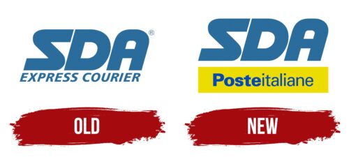
Quality service, customer care, and high speed of delivery have always been SDA priorities. The visual concept of the company also confirms this. The characteristics were reflected both in the early version of the logo and in the current company badge. For this reason, they have a very similar design and layout. The main difference is the change of one part of the lettering due to the transition under the new company.
What is SDA?
SDA is the name of the national express delivery service that operates in Italy. The headquarters are in Rome, and Massimo Rosini is the president. Currently, the company provides transportation within the country and cooperates with international courier services, providing the movement of foreign parcels. The brand’s turnover is quite large. Annually SDA generates about 45 million euros in revenue.
Old
SDA began its operations in 1984. Every year the small postal service increased its activities, and over time it became a large enterprise with a turnover of 300 billion lire. In its early stages, the brand had a powerful, bold logo that demonstrated several major advantages of the company. Among them are reliability, confidence, and high-quality service.
In addition, the emblem demonstrated dynamism and comfort. This is what every customer who turns to the express delivery service wants. The designers were able to embody all of these values in a fairly simple text logo that did not include any decorative symbols. Most of the meaning was contained in the special font format.
For the design of the two-level brand name, a modern sans serif format was used, which can be attributed to the group of new grotesques. Characteristic features of this font are lines of equal thickness, straight cuts, and spaces of equal size. Italics were an additional feature. The chosen design symbolized speed (as a service advantage), confidence, reliability, and excellent reputation. The light blue color scheme was also associated with a sense of trust.
New
Sometime later, SDA was bought out entirely by Poste Italiane. This event was the occasion for a change in corporate identity. In the new logo, only the main element remained unchanged – the name of the service. It was still in large bold font in a capital format. The color did not change either.
This meant that the company’s founding principles were still being followed even after the changeover to another firm. These included customer care, high delivery speed, and attentiveness on the part of the employees. All of this was reflected in the flowing, confident letters, which instilled a sense of reliability and peace of mind. The lower part of the inscription acquired a new look.
Here is the name of the company that bought the SDA assets. The Posteitaliane inscription was placed in a bright rectangle, making it stand out against the larger SDA sign. The design of the lower text included two different fonts, symbolizing Poste Italiane’s participation in the new company and control over its activities.
Font and Colors
SDA has a fairly recognizable bright logo, which is presented in the form of a two-tiered inscription. The upper part is a massive inscription in the form of a brand name. It demonstrates solid status, boldness, dynamism, and leadership. The confident thick lines, absence of serifs, italics, and large size of letters convey this. Spacing is minimal here, visually making the lettering more solid and whole.
For the lower part, another typeface is used. It is distinguished by thinner lines, which are arranged straight in contrast to the first part. In the letter T, the characteristic beveled cut is also noticeable. The color scheme of the logo consists of blue and yellow. They are associated with reliability, care, and responsibility. The SDA provides all this to each of its customers.
SDA color codes
| Medium Persian Blue | Hex color: | #296b9b |
|---|---|---|
| RGB: | 41 107 155 | |
| CMYK: | 74 31 0 39 | |
| Pantone: | PMS 7690 C |
| Absolute Zero | Hex color: | #0048bb |
|---|---|---|
| RGB: | 0 72 187 | |
| CMYK: | 100 61 0 27 | |
| Pantone: | PMS 2728 C |
| Dandelion Yellow | Hex color: | #eddc00 |
|---|---|---|
| RGB: | 237 223 0 | |
| CMYK: | 0 7 100 7 | |
| Pantone: | PMS 3945 C |


