


![]() SeaWorld Logo PNG
SeaWorld Logo PNG
The SeaWorld logo is friendly, cute, customer-oriented, and pleasant. It creates an impression because it is associated with the animal world, representing a marine zoological amusement park. Each of its lines exudes benevolence and a positive attitude towards underwater fauna.
SeaWorld is a network of theme amusement parks located in three U.S. states (Florida, California, and Texas) and abroad (in the United Arab Emirates). They are all managed from the headquarters in Orlando. The park consists of aquariums, marine mammal departments, rehabilitation centers, exhibitions, and zoos with various animals. It also offers recreational fun on roller coasters and many other unique attractions. Additionally, visitors can attend shows featuring dolphins, sea lions, and orcas and see penguins, manatees, and polar bears. The network was opened in 1964. Its founders are George Millay, David Demott, Ken Norris, and Milton Shedd. The current owner is SeaWorld Parks & Entertainment.
SeaWorld, founded in 1964 in San Diego, California, began as a unique marine zoological park that combined attractions with marine animal shows. This innovative idea allowed visitors to see marine life up close, a novel experience at the time.
The expansion continued with new parks in Orlando, Florida, in 1970 and San Antonio, Texas, in 1988, adding exciting rides and animal encounters to their repertoire. During the ’70s and ’80s, SeaWorld was known for its captivating orca shows, especially those featuring the famous orca Shamu, which became a key part of its identity.
Further growth in the ’90s and 2000s saw SeaWorld enter new markets and launch new attractions. However, the 2010 incident in which the orca Tilikum killed a trainer raised serious ethical questions about keeping orcas in captivity. This, along with the 2013 documentary Blackfish, which criticized SeaWorld’s treatment of orcas, led to public backlash and a decline in attendance.
Responding to the criticism, SeaWorld announced significant changes, including ending orca breeding programs and traditional orca shows and working to improve animal habitats. Shifting focus, SeaWorld began to emphasize non-animal attractions such as thrill rides and water parks while committing to ocean conservation and education.
Today, despite past controversies, SeaWorld’s parks in San Diego, Orlando, and San Antonio, along with other locations in the U.S., remain popular destinations. The company has shown resilience and adaptability, striving to balance entertainment with ethical considerations and conservation efforts.
Meaning and History
![]()
The SeaWorld brand initially had a different concept. It was envisioned as an underwater restaurant where visitors would admire views of the ocean floor, observe marine life, and attend shows featuring aquatic creatures. But then George Millay, David Demott, Ken Norris, and Milton Shedd realized their idea was unfeasible, so they focused on an underwater-themed park. The first location appeared in the city of San Diego. It had several sea lions, dolphins, and six attractions, occupying 22 acres. In its first year, the park was visited by over 400,000 people, so its logo quickly became familiar to the public. It still evokes positive emotions, as it is associated with the mysterious and amazing underwater world, which is curious to observe from the outside.
What is SeaWorld?
SeaWorld is an American network of amusement parks focused on nature, the ocean, and aquatic life. It was founded in 1964 and, over the years, has expanded to several grand locations in Orlando, San Diego, San Antonio, and Abu Dhabi. Today, the park offers visitors exciting experiences on various proprietary attractions, roller coasters, the aquarium, and shows featuring sea lions, dolphins, and orcas. Its main center is located in Orlando, Florida, covering 200 acres. The network is owned by SeaWorld Parks & Entertainment.
1964 – 1966
![]()
The SeaWorld logo is positive: a smiling character charges park guests with a positive mood and sets those planning to visit in a festive spirit. The key element of the emblem is a large fish styled under a globe covered with a network of parallels and meridians. Thin lines create a lacy pattern, lending a light atmosphere. The large aquatic inhabitant looks unobtrusive because it contains no bold strokes. The exception is the eye, a large dot outlined by an oval.
Below is the brand name, set in a playful font that mimics handwriting. It is executed in an informal style with bold, sans-serif letters. Only “S” and “W” are uppercase; the other glyphs are lowercase. This design was chosen deliberately, as it repeats the form of waves and resembles constantly moving water. The inscription is black, visible against any background.
1966 – 1979
![]()
The redesign resulted in a radically different logo, strict, official, and businesslike. The only reminder of the relaxed atmosphere and entertainment is the ultramarine dolphin jumping over the waves in a miniature circle. At the same time, this is not just a “medallion” but the letter “O” in the word “World.” In this way, the visual identity developers combined graphics and text, presenting a compact emblem version. The amusement park and aquarium are split into two levels. The lines are aligned in the center. Both parts of the phrase are executed in blue. The background is a black rectangle, hinting at the dark abyss of the aquatic world and its many mysteries inaccessible to human sight.
1979 – 1998
![]()
The SeaWorld logo once again adopted an informal style: the inscription is set in a bold font with uneven letter spacing. Each has outlines with slightly curved lines, especially at the bends and transitions from one edge to another. The right stroke of the capital “W” is shaped like a high wave covering the neighboring glyph from above. Instead of “O,” an orca is drawn: it jumps over two drop-shaped elements, symbolizing the ocean. After the lowercase “d” is a bold dot of the same color as the inscription. Almost all the characters in the second row have small, sharp serifs. The words located above are only on the “S.”
1998 – 1999
![]()
The emblem underwent a complete transformation: the era of abstract aquatic creatures resembling a dolphin and an orca began. They also look like two tall waves crashing onto the shore. One is larger (in the background), the other smaller (in the front). To ensure they stood out and were visible, designers colored them in dark blue and yellow shades. This occurred after another expansion of the amusement park. Below is the name of the network, set in bold font. The letters are antiqua and large, despite most being in lowercase. In this version of the logo, another line appeared with the clarifying phrase “Adventure Parks.” All glyphs in it are small, semi-bold, and grotesque.
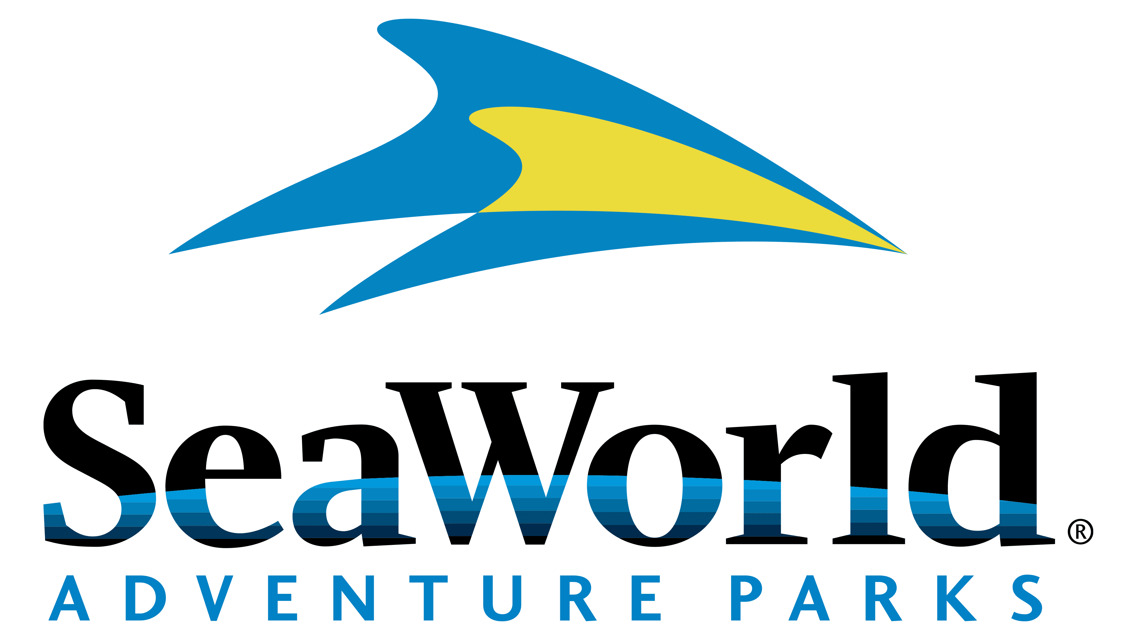
1999 – today
![]()
Designers preserved the general structure of the previous logo, making minimal changes. For example, they lightened the yellow color, added a gradient to the blue, reduced the abstraction of two dolphins, and lowered the top inscription, making it appear flattened.
Font and Colors
Since 1998, the SeaWorld logo has used the Charlotte Serif Bold font, with letters designed with modern Roman serifs, creating an authoritative image. The typeface’s author is designer Michael Gills from Letraset, who developed it in 1992. Along with Charlotte Sans, it was released as part of the digital Fontek line.
The emblem’s palette is associated with the aquatic environment, hence the active use of several shades of blue: neutral, sea wave, ultramarine, and azure. It is effectively complemented by black, white, and yellow in different visual identity variants.
FAQ
How many SeaWorld locations are there in the world?
SeaWorld has parks in key locations in the United States, including Orlando, Florida; San Diego, California; and San Antonio, Texas. These parks are known for their marine life displays, exciting rides, and educational programs. SeaWorld also made its first international expansion with a park in Abu Dhabi, United Arab Emirates. Additionally, there used to be a SeaWorld park in Aurora, Ohio, but it’s no longer operational. The variety of SeaWorld’s locations demonstrates the brand’s broad appeal and commitment to educating the public about marine conservation while offering entertaining experiences.
Is SeaWorld changing their name?
SeaWorld Entertainment is set to become United Parks & Resorts Inc. starting February 12, 2024. This change encompasses the company’s seven brands, spread across 13 parks in the United States and Abu Dhabi. This move aims to reflect the company’s varied theme parks and attractions, signaling a major shift in its branding and corporate identity.
What city is SeaWorld in Florida?
SeaWorld Orlando, in Orlando, Florida, is a top choice for those passionate about marine life and thrill-seekers. This unique theme park offers exciting rides, stunning shows, and close-up encounters with marine animals. Orlando, famous for its numerous theme parks and attractions, is home to SeaWorld Orlando, a distinctive experience. It brings together the excitement of roller coasters with the marvels of the ocean, appealing to families, adventure enthusiasts, and animal fans alike, making it a key destination.
What city is SeaWorld in California?
SeaWorld San Diego, nestled in the vibrant city of San Diego, California, is a renowned attraction for anyone fascinated by marine life. It offers an array of thrilling rides, engaging shows, and opportunities for up-close encounters with marine animals. This park distinguishes itself as a unique adventure, inviting visitors to delve into the marvels of the ocean within its nearly 200 acres in Mission Bay. SeaWorld San Diego has become a must-visit destination, appealing to families, thrill-seekers, and animal lovers looking for an extraordinary experience that combines excitement with educational opportunities to learn about marine ecosystems.
What font is SeaWorld?
The SeaWorld logo features Charlotte Bold font, adding a unique touch to its branding. Michael Gills designed this font for Letraset in 1992, and it’s part of the digital Fontek range, which includes Charlotte and its sans-serif version, Charlotte Sans. Charlotte Bold is known for its elegance and ease of reading, which aligns with SeaWorld’s goal of presenting a welcoming, clear image. This font choice enhances SeaWorld’s identity as a premier marine-themed amusement park, blending sophistication with a friendly appeal to visitors.