


 Sega Logo PNG
The company creates worlds, opens up new paths, and paves the way for hundreds of game users. The Sega logo illustrates the plot lines, step by step, formed by the program code written by the company’s employees.
Meaning and History
The countdown of Sega’s history began much earlier than the officially indicated date, in 1940. Three American entrepreneurs, Irving Bromberg, Martin Bromley, and James Humpert, founded the Standard Games organization in Honolulu (Hawaii). It became the basis for all other structures, which at times appeared, disappeared, were renamed, and united. Businesspeople’s main task was to operate slot machines with coin acceptors. The devices were intended for installation at military bases, as the number of employees there increased significantly after World War II, creating demand for entertainment.
In 1945, the entrepreneurs sold their first company and founded a new one, Service Games. However, the US government declared the gambling business illegal and began to fight it. Then, in 1952, Martin Bromley sent personal representatives, Richard Stewart and Ray LeMaire, to Japan to establish the Service Games of Japan and to equip American military bases there with slot machines.
A year later, all five businessmen registered Service Games Panama to operate their branches worldwide. In seven years, the business grew significantly, expanding into regions such as Vietnam, the Philippines, and South Korea. At the same time (in 1954), the company first used the current brand name, Sega, short for Service Games. It appeared on the Diamond Star slot machine.
In May 1960, the company was disbanded. To avoid losing assets, Bromley simultaneously created two companies that took over all the commercial activities of its predecessor. They were Nihon Goraku Bussan and Nihon Kikai Seizō. The latter focused on producing and selling slot machines and became Sega, Inc. After a series of transformations and reorganizations, the corporation began specializing in video games and platforms. From 1983 to 2001, it also worked on consoles, which it returned to in 2020.
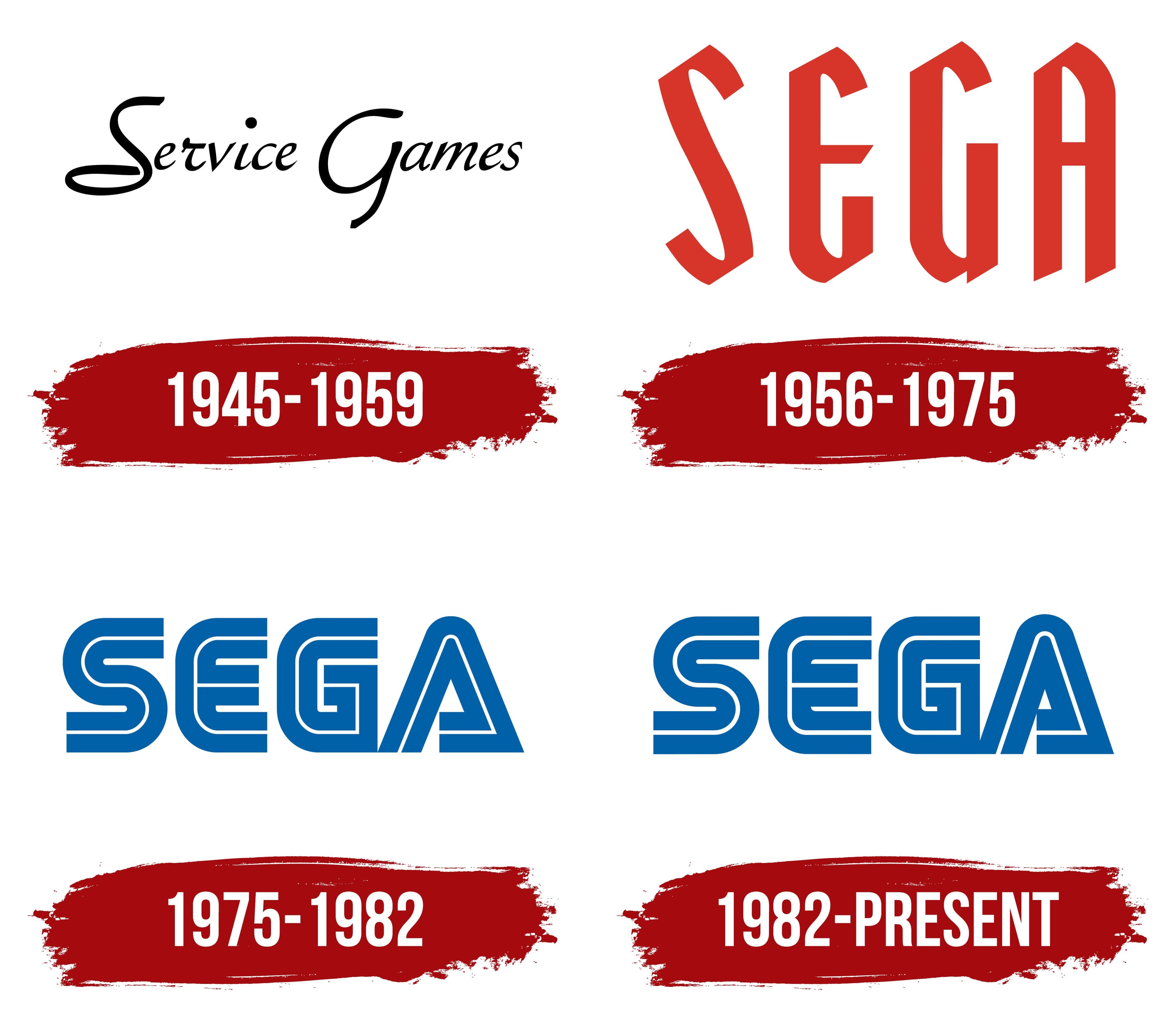
It is now a highly structured company with many divisions and strong consumer demand. She has a well-recognized emblem that she has been experimenting with for many years. Naturally, every major step in the company’s development was reflected in the personal identity. In total, there are five logo options in her arsenal.
1940 – 1954
In the early days, when the prospect of an experimental organization, Standard Games, was not yet fully understood, it operated in the American market. The company supplied slot machines to military locations because it saw significant profit from the increased demand for gambling and entertainment. This continued until the state outlawed this business.
1945 – 1959
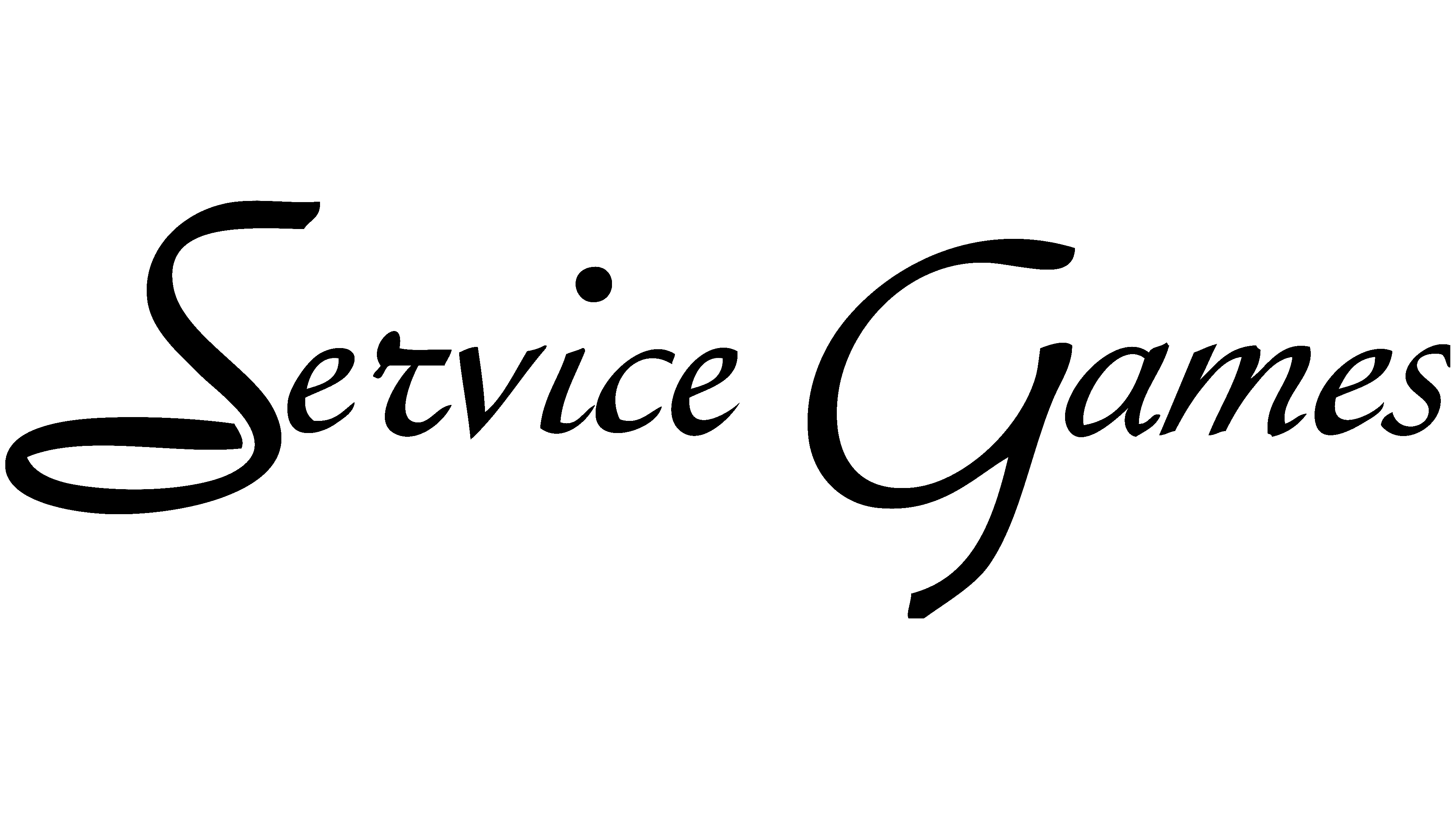
In 1945, the owners sold Standard Games and founded Service Games. In other words, they rebranded without losing their identity. At this time, they adopted the first permanent company logo. It featured handwriting in thin, light, graceful italics. The first letters in words were uppercase; the rest were lowercase.
Moreover, each symbol was located separately from its neighbors, except for “i” and “c”, which were connected. Black text was on a white background. The dot above the “i” was bold and large, the uppercase “S” had a curl at the bottom, and the “G” looked like a cross between uppercase and lowercase letters.
1956 – 1975
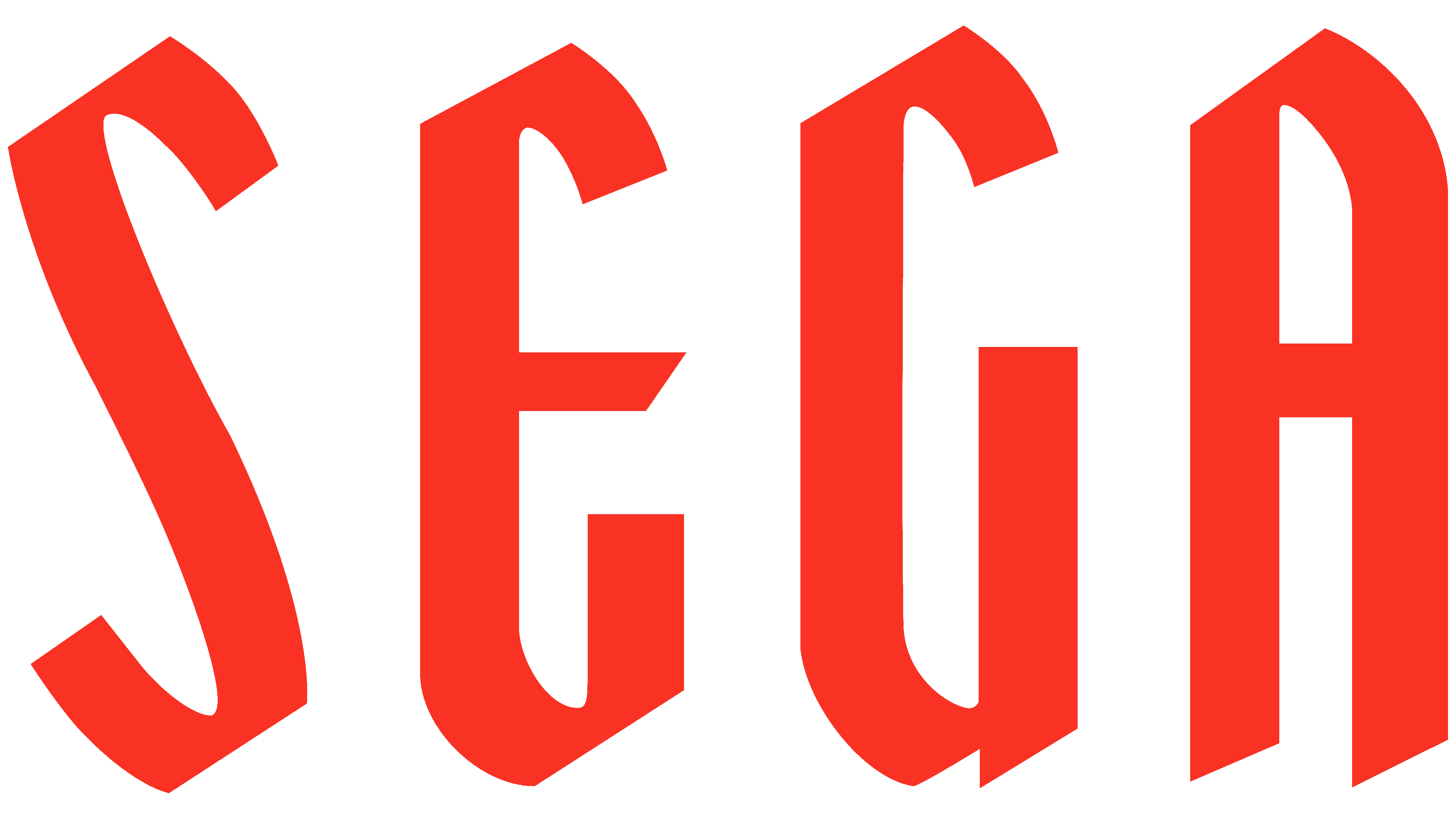
The emblem of the period featured red “Sega” lettering. The company developed the font used. These pretentious letters were tall, bold, sans serif, and filled the entire logo space. The diagonally cut tops made them look unique. The lower part was also beveled from left to right and up, but the thin legs on the “A” and the side protrusion on the “G” did not look as neat as the upper part.
1975 – 1982

In 1975, the company undertook a redesign that radically changed its image. It featured a logo with an inscription in the Yagi Double font. These double letters became fashionable and were widely used in the 70s. KNXT and CNN chose the same typeface. In structure, the text signs resembled a maze, composed of two dark blue stripes with a thin white line between them. The “A” looked like a triangle with a curved right leg forming a lower rib. It resembled the fourth letter of the ancient Greek alphabet, the pyramidal delta.
1982 – today

The changes were minor, so the logo now matches the previous one exactly. The only difference between them is color: the modern version is painted light blue.
Font and Colors
Early versions of Sega’s identity consisted of abrupt transitions, broken lines, and sharp edges. Later versions of the logo contain rounded letters in a streamlined shape. They are smoother.
For its personal identity, the Japanese video game maker chose the Yagi Double typeface. It stands out from the competition because of its double-letter structure. The proprietary palette now consists of blue and white. Previously, it included black and red.