The Setra logo reflects the reverence with which the brand’s buses are perceived: they are so popular among professionals that they rank among the world’s top ten. The emblem has a unique design, shaped to resemble these comfortable buses.
Setra: Brand overview
| Founded: | 1951 |
| Founder: | Daimler Truck |
| Headquarters: | Germany |
| Website: | setra-bus.com |
In 1951, the world was introduced to Setra, birthed by the renowned coachbuilder Karl Kässbohrer. Originally, it was positioned as a subsidiary under the name Kässbohrer Fahrzeugwerke, marking its entry into the bus manufacturing landscape with the Setra S8 model. Just six years later, in 1957, Setra pioneered a significant advancement in European coach design by releasing the Setra S6, a coach featuring a self-supporting structure. This innovation is encapsulated in “Setra,” translating to “self-supporting” in German.
Throughout the 1960s and 70s, Setra solidified its reputation in Germany and Europe as a frontrunner in creating luxury coaches and touring buses. The Setra S140 model, for instance, won many accolades and became a favorite among many. In a testament to their engineering prowess, the 1980s saw Setra unveiling its premier articulated bus model.
However, the mid-90s brought financial turbulence for Kässbohrer, leading to the divestment of Setra to Daimler-Benz, which would later rebrand as Daimler AG. This acquisition proved fortuitous for Setra. By 1999, a milestone was achieved when the 10,000th Setra bus was manufactured, underscoring the brand’s undeniable market presence.
Under the guidance of Daimler in the 2000s, Setra began emphasizing both high-end touring coaches and public transit buses, with new models replete with luxurious features. 2008, an extensive historical exhibition was organized at Setra’s main production plant. The brand’s commitment to luxury, comfort, and style was further exemplified with the 2013 unveiling of the Setra 500, the company’s latest pinnacle coach model.
Meaning and History
What is Setra?
Established in 1951, Setra, the eminent German bus brand birthed by Daimler Truck, has been transforming human transportation. The brand rapidly gained acclaim for its superior quality and reliability within the transport sector and continues to be a trailblazer in the field.
Setra has epitomized superiority for many decades, continuously challenging engineering limitations and fostering innovation. As a proud offshoot of EvoBus GmbH, under the prestigious Daimler Truck AG umbrella, Setra takes pride in furthering the illustrious legacy of its lineage. Staying committed to absolute quality, Setra relentlessly pursues excellence in every facet of its business.
Before 2010
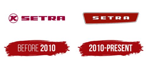
At the beginning of its career, the German company Setra used a very concise logo so potential buyers would simply be aware of its presence in the professional bus transportation market. The main task at that time was popularization. Thanks to its unique visual identity (simple and two-dimensional), supported by innovative developments and high craftsmanship, it gradually gained recognition among the public. Its emblem consists of:
- The name;
- A personal mark.
The inscription is done in a rectangular font: massive glyphs are stretched horizontally and placed at a minimal distance from each other. Thanks to good contrast and large intra-letter spaces, they do not merge, maintaining good readability on any medium.
The font is extra-bold, sans-serif, and in uppercase. Its distinctive features are clear edges, perfect evenness, and pleasant soft rounding of the corners, which demonstrate the comfort of the bus interiors. The most thematic letter is “A”: it resembles a bus—a front or rear view. The intra-letter space acts as a windshield, and the lower parts of the legs are perceived as wide wheels.
The company’s logo is round. This shape is very symbolic, as it is associated with a wheel, a steering wheel, the globe that the Setra bus is ready to travel around, and the brand’s global popularity, as its products are recognized worldwide. Inside the ring is a single “K”—the first letter from the old name Kässbohrer. It is ornate, elegant, and old-fashioned.
2010 – today
The Setra logo is shaped like a bus when viewed from the side. It is long, wide at the back, and narrow at the front. However, these aren’t the only associations the emblem evokes: it also resembles a rearview mirror, highlighting the German manufacturer’s vigilance, increased attention, and desire to control everything related to bus production. This represents Setra as a responsible professional.
The horizontal trapezoid is enclosed in a double frame with two thin stripes—one white and one red. The same colors are used for the inscription and background. This combination symbolizes honesty, confidence, activity, and movement. Additionally, white signifies openness, while red signifies love for customers and those who ride the buses.
The name is written in a soft block font with rounded corners. The corners are now smaller than in the old logo, making the glyphs look more elegant. The spacing between the characters has also changed – it has increased significantly, improving text readability.


