The group knows its purpose and adheres to it with perseverance and strength. The Seventeen logo focuses on the result and the desire to create masterpiece compositions. The elements represent the musicians who work as a unit.
Seventeen: Brand overview
| Founded: | 2015 – present |
| Founder: | Pledis Entertainment |
| Headquarters: | Seoul, South Korea |
| Website: | pledis.co.kr |
Meaning and History
Many wonders why the South Korean boy band is called Seventeen, even though there are only 13 members. It turns out that the number 17 includes artists and three divisions (directions of hip-hop, vocals, and dance). The group itself is also counted as a whole. The total is 13 plus 3 and plus 1.
Another version of the origin of the name concerns the average age of those who joined the composition in 2015: at that time, they were about 17 years old. Seventeen’s debut album broke records, staying on the Billboard World Albums charts for 11 weeks. Several more successful compilations followed, and 13 idols recently embarked on a world tour.
The creative team attracts attention with their music and maintains a close connection with the audience. In 2016, the group conducted a poll to choose a name for their official fan club. Fans could vote for one of six options. The winning title Carat has a deep semantic connection. It is believed that the more carats in a stone, the more valuable it is. In other words, the more fans the Seventeen members have, the brighter they shine on stage.
The boy band often uses the diamond symbol. Its first logo, adopted in 2015, is shaped like a cut diamond. Perhaps this idea originated with the song Shining Diamonds, which the musicians performed shortly before their debut. One of the original graphic sign creators is Mingyu, a member of the group. However, this is only a guess from fans.
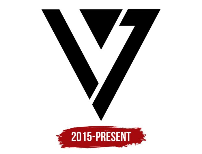
The Seventeen logo comprises several geometric shapes in an abstract triangular composition. Above is a small triangle pointing downwards. On the left is a trapezoidal diagonal strip, and on the right is a complex polygon. Together they form a cut diamond as if hinting at the high value of the group.
Font and Colors
There are many versions of what the Seventeen emblem might mean. One fan believes it contains the “V” symbol formed by negative space between three black geometric shapes. In this case, this is the first letter of the word “victoria.” Others see the numbers “1” and “7” in the diagonal edges – the encrypted name of the group. At the same time, everyone agrees that the logo looks like a diamond in jewelry; the connection with the Carat fan club is obvious. And the triangular shape can reflect the three subunits that makeup Seventeen. We are talking about the directions of hip-hop, vocals, and dance. The team is divided into three teams but exists as one whole.
There are no inscriptions in the logo of the k-pop group. The color combination is also very simple: the designers combined black and white to make the graphic sign minimalistic.
Seventeen color codes
| Black | Hex color: | #000000 |
|---|---|---|
| RGB: | 0 0 0 | |
| CMYK: | 0 0 0 100 | |
| Pantone: | PMS Process Black C |


