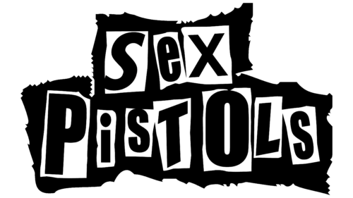
The Sex Pistols logo is grotesque and provocative. It seems like random newspaper clippings pieced together to form a message. This emblem represents a band focused on image and unconventional presentation, catapulting them to fame.
Sex Pistols: Brand overview
| Founded: | 1975 – 1978, 1996, 2002 – 2003, 2007 – 2008 |
| Founder: | Malcolm McLaren |
| Headquarters: | London, England |
| Website: | sexpistolsofficial.com |
Meaning and History
The band’s emblem captures the spirit and views of the group. It portrays young, free, and reckless guys whose beliefs are reflected not only in their songs but also in their appearance. The multi-layered logo embodies a cultural layer and lifestyle from which the band’s creativity emanates. The emblem was designed by the anarchist artist Jamie Reid, who worked in a newspaper clipping style.
What is Sex Pistols?
A controversial musical group is known for its aggressive, anarchic compositions and provocative behavior. No band in history has earned such a scandalous reputation in just three years of existence. The group catalyzed the English punk revolution and globally impacted musical culture. Their most notable creation is the album “Never Mind the Bollocks, Here’s the Sex Pistols,” which achieved platinum status.
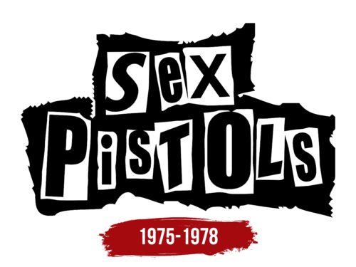
1975 – 1978
The band’s logo is reminiscent of the Cartoon Network animation studio emblem but appeared almost two decades earlier. It might have been the inspiration for Hatmaker Studios.
The black background seems torn from a whole sheet of paper, with jagged edges. This design conveys the idea of anarchy supported by the band. The fragment suggests the lower classes, the band’s background, representing people who don’t adhere to societal norms, “torn” from decent society.
Due to their song themes, the band was ostracized. Their music was often banned from airplay, albums seized, and concerts prohibited. The coarse background of the logo conveys this sense of rejection and aggression.
Each letter of the band’s name is set in a white rectangle with uneven edges. The light tones symbolized novelty. With the band’s emergence, punk culture arrived in England. The artists advocated ideas of freedom, self-expression, and breaking established boundaries. The uneven white rectangles are a symbol of revolution and anarchy. No rules, not even geometric ones.
The band’s name was suggested by manager Malcolm McLaren, who owned the Sex Shop. The primary goal of the name choice was to shock people and introduce a group of sexy, young, and bad boys. The term is a reworked name of the female reproductive part of plants – “pistilla sex.”
The letters in the name are uneven and vary in size. Placing capital elements within the word strengthens its association with anarchic sentiments where ranks cease to matter. The quintessence of these beliefs was the single “God Save the Queen,” which was banned in the UK.
Overall, the symbol is very audacious and punk-showy. The letters were cut out from newspapers and pasted onto the background, forming an overall collage. This concept conveys the theme of sensation and, at the same time, complete disrespect for the press. It’s as if the musicians wrote about themselves using newspaper lines that didn’t want to write about them.
Font and Colors
Black and white are the primary colors of the emblem, just like the main tones in punk attire, which the musicians endorsed. Dark, provocative makeup, black leather pants, and jackets are essential to an anarchist’s image. The color alludes to sharp, provocative music and the protrusion of negative thoughts and desires.
The emblem’s font is free-form, not adhering to any proportions, slants, or sizes, aligning perfectly with the band’s views.
Sex Pistols color codes
| Black | Hex color: | #000000 |
|---|---|---|
| RGB: | 0 0 0 | |
| CMYK: | 0 0 0 100 | |
| Pantone: | PMS Process Black C |
