The SFR logo represents leadership and excellence in its sector. Through the emblem, the owners try to show daily development and love for their work, which allows the company to look confidently into the future and guarantee stability to users.
SFR: Brand overview
Meaning and History
SFR’s full name in French is Société Française du Radiotéléphone, for which only an abbreviation is used. However, the company was created under a different name: in 1987, it was registered as Compagnie Générale des Eaux. Since 2008, the telephone operator has been owned by Neuf Télécom, and since 2011, it has been transferred to the legal subordination of Vivendi.
In 2014, the Altice group bought this service. The new owner included it in Numericable-SFR, which 2016 became the SFR Group—telecommunications, media, and advertising agencies. The Numericable brand was used only for its TV channel package. At the end of 2017, SFR moved forward and entered France’s top 3 profile operators, losing the lead only to the famous giant Orange.
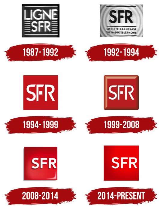
Despite a prolific career, the telecommunications service provider has managed to maintain its identity – both the name and the logo. The renaming to SFR Altice to accustom clients to a different identity did not bring positive results. As a result 2018, the owner abandoned this venture due to a fall in financial performance. SFR still operates as a separate subsidiary of Altice France, which acquired it. He retained not only his name but also his emblem. And there were six of them in total.
What is SFR?
SFR is the abbreviated name of the Société française du radiotéléphone company based in France. Her main specialization is voice and video communication services, as well as Internet delivery. It was founded in 1987 and belonged to Altice Europe.
1987 – 1992
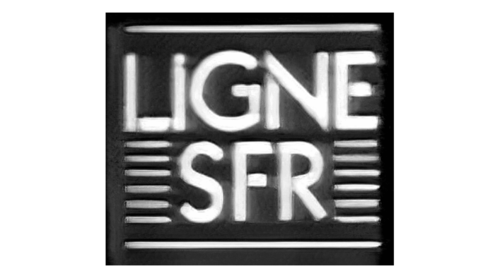
The debut logo looked like a dark gray rectangle with several thin lines inside. Two long ones were located above and below the “LIGNE SFR” inscription, and twelve short ones – to the right and left of “SFR” (six on each side). The text part was done in grotesque – white capital letters on a dark background.
1992 – 1994
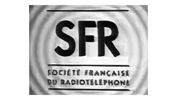
A light emblem was used during this period—white with silvery spherical circles that diverged in waves from the center. In the middle was the dark blue abbreviation “SFR.” The dividing stripes and the French inscription “SOCIÉTÉ FRANÇAISE DU RADIOTÉLÉPHONE” were also painted in the same color. The company’s full name occupied two lines at the bottom of the logo.
1994 – 1999
1994 was a turning point for a telecommunications operator. He first got an emblem with a red square and white capital letters. The word “SFR” was in the center section. At “F,” the middle bar was detached and looked like a miniature square.
1999 – 2008
After the redesign, a new logo was approved, which is almost no different from the previous one. The owner wanted to keep it familiar and recognizable among customers since it is extremely important for telephone operators—otherwise, you can lose the subscriber base. The only change in the emblem was the background: thanks to the shadows, it became three-dimensional.
2008 – 2014
In 2008, Neuf Télécom and then Vivendi took over the company. The new logo also used the 3D effect but in a different design. Due to two blackouts on the left and below, the square seemed to float above the surface. On the contrary, a light flare in the opposite zone was on a red background. The acronym has become the standard font and shifted to the right.
2014 – today
The current version contains the same elements despite the bank’s transfer to a new owner. The merger did not affect him in any way. Everything has been preserved from the previous logo – the writing style, the abbreviation location, and the square background. The exception is color: the designers made it bright red with a slight gradient to make the white letters look even more distinct.
SFR: Interesting Facts
SFR (Société Française du Radiotéléphone) is a big name in the telecom world of France. Since its founding in 1987, it has offered mobile phone services, high-speed internet, and digital innovations.
- Early Days: Started by Compagnie Générale des Eaux, SFR tackled the mobile market before expanding into broadband, making it a one-stop telecom provider.
- Mobile Tech Leader: It was among the first in France to launch a GSM network in 1992, improving how people use mobile phones nationwide.
- Faster Internet: SFR introduced 3G services in 2004 and 4G LTE in 2012, offering customers faster internet and better connectivity.
- Vodafone Partnership: In 2002, SFR partnered with Vodafone, a global telecom giant, to gain international insights and enhance its offerings.
- Into Media and Entertainment: SFR expanded into media, creating SFR Media, which includes TV channels, digital platforms, and sports broadcasting rights.
- Innovations: It has introduced many firsts in France, like mobile TV, VoLTE, and high-speed fiber optic broadband.
- Joining Altice: In 2014, SFR was bought by Altice Group, which led to big network investments and a rebranding of SFR to align with Altice’s identity.
- SFR Foundation: The company is committed to digital inclusion and education through its foundation, supporting projects that tackle the digital divide.
- Future-Focused: Investing in 5G, IoT, and AI, SFR is at the forefront of new tech, aiming to enhance services for its customers and shape the future of telecom in France and beyond.
SFR has always focused on innovation, quality, and satisfying its customers, from a mobile operator to a key telecom and digital services provider. As technology evolves, SFR continues to push the boundaries of connectivity and digital offerings in France.
Font and Colors
Despite the many owners who French telecommunications operators and Internet providers replaced, he always remained with his logo. Its main element is the inscription “SFR,” derived from the full name of the organization Société Française du Radiotéléphone. The background has always been red: first as a rectangle and then as a square.
The SFR logo has always used a grotesque typeface—smooth and straight. In early versions, it was almost Pura NormalCaps from Wiescher-Design. The bank’s font differed from the original by the angled ends and the separated crossbar at the letter “F.” Axiforma Medium writes the modern logo.
The branded palette is stable and includes several shades of red (# c50e16, # ac0006, # ee0000) and white. Older emblems also feature navy blue and gray.
FAQ
Who is SFR FR?
SFR is the largest telecommunications company in France and a leading provider of mobile and fixed-line communications services. The brand offers mobile phone plans, Internet access, TV services, and cloud solutions. Customers can manage accounts, pay bills, and explore different plans and packages.
The brand uses the latest telecommunications technologies. Its strong infrastructure and customer focus provide reliable, high-quality services to individuals and businesses.
Who owns SFR Telecom?
Altice Europe NV, an international telecommunications and media corporation based in the Netherlands, owns the telecommunications service. Founded by Patrick Drahi, Altice operates in different countries and offers various services.
Altice provides telecommunications, media, and content services. Under Altice’s management, the brand benefits from investments in network infrastructure and technological advances, helping it remain competitive and meet customer demands in France.
Is SFR part of Vodafone?
No, it is not part of Vodafone, the main partner network in France. This partnership allows the brand to collaborate with Vodafone on various services and technologies, enhancing its offerings and network capabilities.
The partnership benefits both companies by providing customers better coverage and improved services. Vodafone can use the company’s global experience and resources to strengthen its position in the French telecommunications market. This collaboration helps provide high-quality and innovative services to customers in France.
