The Sharp logo is full of power, boldness, and progress. The emblem speaks of a company that has been a leader for decades. The logo encompasses the theme of innovations and technical developments, the results of which are gifts to customers.
Sharp: Brand overview
| Founded: | 15 September 1912 |
| Founder: | Tokuji Hayakawa |
| Headquarters: | Sakai-ku Sakai, Osaka Prefecture, Japan |
| Website: | global.sharp |
Originating as a Tokyo-based metal workshop in 1912, Sharp Corporation was the brainchild of Tokuji Hayakawa. The company’s first significant creation was a metal fastener called “Tokubijo,” but the Ever-Sharp mechanical pencil, invented in 1915, inspired the corporate name we know today.
Sharp eventually shifted its base to Osaka during the 1920s and began diversifying its offerings. The company created Japan’s commercial microwave ovens and solar cells in the 1950s. A decade later, the firm branched internationally, laying its first overseas marketing roots in the United States by establishing Sharp Electronics Corporation.
Entering the 1970s, Sharp ventured into manufacturing liquid crystal displays (LCDs), a sector it would dominate. As a trendsetter in consumer electronics, the company made headlines for a series of world-firsts: the debut of an LCD calculator in 1973, the launch of a camcorder featuring an LCD viewfinder in 1983, and the introduction of the inaugural camera-equipped phone in the year 2000.
In today’s landscape, Sharp continues to be a global powerhouse in the electronics industry. It specializes in areas ranging from LCDs and solar energy technology to home appliances and various electronic components. The company retains a commanding presence in tech, upheld by its enduring commitment to innovation in diverse technological domains.
Meaning and History
The name “Sharp” and its famous logo came much later than the company’s founding. Originally in 1912, the company was called Hayakawa Keitei Shokai and was founded by two Hayakawa brothers. The first logo featured a right hand holding the letter “T,” the first letter in the name Tokuji (the engineering brother). The symbol meant self-help and self-support.
1923, a massive fire and earthquake struck Tokyo, destroying the factory. Tokuji lost his wife, children, and the company. His new company, founded in 1924 in Osaka, was named Hayakawa Metal Works and focused on receivers.
In 1942, the company became Hayakawa Electric Industry Company. That was when the brand name Sharp was first introduced, along with its famous logo featuring a modified “S.” The red brand sign quickly gained fame, as did the televisions produced under the Sharp name.
As the brand’s popularity went global, the company changed its name to Sharp Corporation, adopting the famous red logo. This happened in 1970.
What is Sharp?
A Japanese company that was the first to introduce televisions to the Japanese market. It produces solar panels, monitors, phones, TVs, microwaves, and calculators. The headquarters is located in Sakai. The company’s net profit amounts to 21 billion yen. In Europe, it distributes products through Skytec UMC and Vestel. It has factories in Mexico, Indonesia, Poland, and Malaysia.
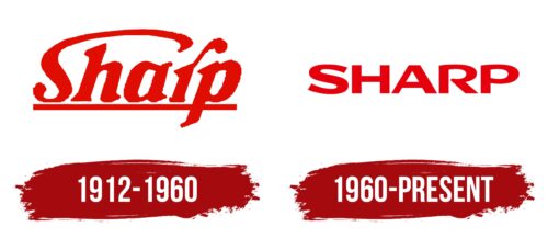
1912 – 1960
The first logo appears somewhat unconventional, even pretentious and cheeky. The name Sharp is placed on a solid red line, signifying the brand’s special status and confident market position.
The company owes its name to founder Tokuji Hayakawa. It comes from the name of the perpetually sharp mechanical pencil Ever-Sharp, Tokuji’s second invention. This pencil kickstarted the company’s prosperity due to its popularity. The name also signifies the firm’s swift action and advanced technology, which keeps it ahead of competitors.
Interestingly, despite the pencil-centric name, Tokuji Hayakawa had to cease the pencil manufacturing business after the Tokyo earthquake and hand over the patent to settle debts with the Nihon Bungu Seizo company. There, Tokuji provided technical support for six months until transferring his knowledge. Thus, 1923 marked the last year Hayakawa produced pencils. Yet, the name persisted and became the primary brand and company name.
The top part of the letter S is significantly enlarged, resembling a rainbow or an umbrella that envelops most of the word. The tail of the R is also enlarged and lifted. These changes make the inscription unique and align well with the company’s modern motto: “Be Original.”
The transformed S represents:
- Belt buckle. Tokuji Hayakawa’s first invention in 1912 was a belt buckle.
- TV antenna. Emerging at the dawn of the 21st century, the company has been at the forefront of nearly all types of consumer electronics. The firm owes its global recognition primarily to the creation and mass production of televisions.
- Global reach. Since 1926, radios have been exported to Asia, South America, and India.
- Assembly line. Hayakawa was the first to introduce an assembly line in production.
The raised part of the letter R hints at the sharp pencil, which featured a brass shaft, a thin hole for lead, and a mechanism for pushing it through.
1960 – today
The opening of several factories and active global product sales triggered a rebranding.
The new emblem is a confident, solid red inscription in capital letters. This symbol signifies flourishing, a rock-solid company position, and global recognition. Each character is a prototype of modern factories, branches, and product types. Together, they make up a corporation that sets future rules for the global industry.
The open glyph of the R signifies that the company is always ready to engage with new developments and bring products that are in sync with the zeitgeist to market.
Font and Colors
Red represents the brand as fashionable and stylish. It accentuates vibrant, appealing design and top-notch technical features. Being original and unique, creating distinct items—this important aspiration of the company is outlined in its slogan. Red fits this concept perfectly.
Red symbolizes the fire that burned in the heart of Tokuji Hayakawa, who led the company for nearly a century. Despite lacking formal education and starting as a jewelry-making apprentice, he designed new technical models independently. He assembled his first receiver with zero prior experience. This thirst for discovery and the desire to grow and make the most out of life are significant traits that changed the company’s destiny.
Red serves as a reminder of the devastating fire that claimed the life of Hayakawa’s beloved wife and his life’s work. Yet, he managed to rise from these ashes and become stronger. This tragic yet memorable experience is embedded in the name Sharp and the red color of its logo. The company became his love, symbolizing strength and triumph over fate.
Sharp color codes
| Lust | Hex color: | #e6000d |
|---|---|---|
| RGB: | 230 0 13 | |
| CMYK: | 0 100 94 10 | |
| Pantone: | PMS Bright Red C |


