


![]()
Shaw-Ross International Importers has introduced a redesigned logo that reflects the company’s evolving role in the beverage alcohol market. Unlike its previous logo, which was detailed and emblem-like, the new look focuses on simplicity and sophistication with a modern approach.
The old logo featured a globe with a wine bottle at the center, symbolizing the company’s international reach and deep connection to the wine industry. A ribbon around the globe carried the company name, giving the design a traditional, heraldic feel. Below it, the tagline “People Building Brands” followed the curve of the emblem, reinforcing its corporate identity. The color scheme used gradient shades of blue and silver, creating a structured and formal appearance.
![]()
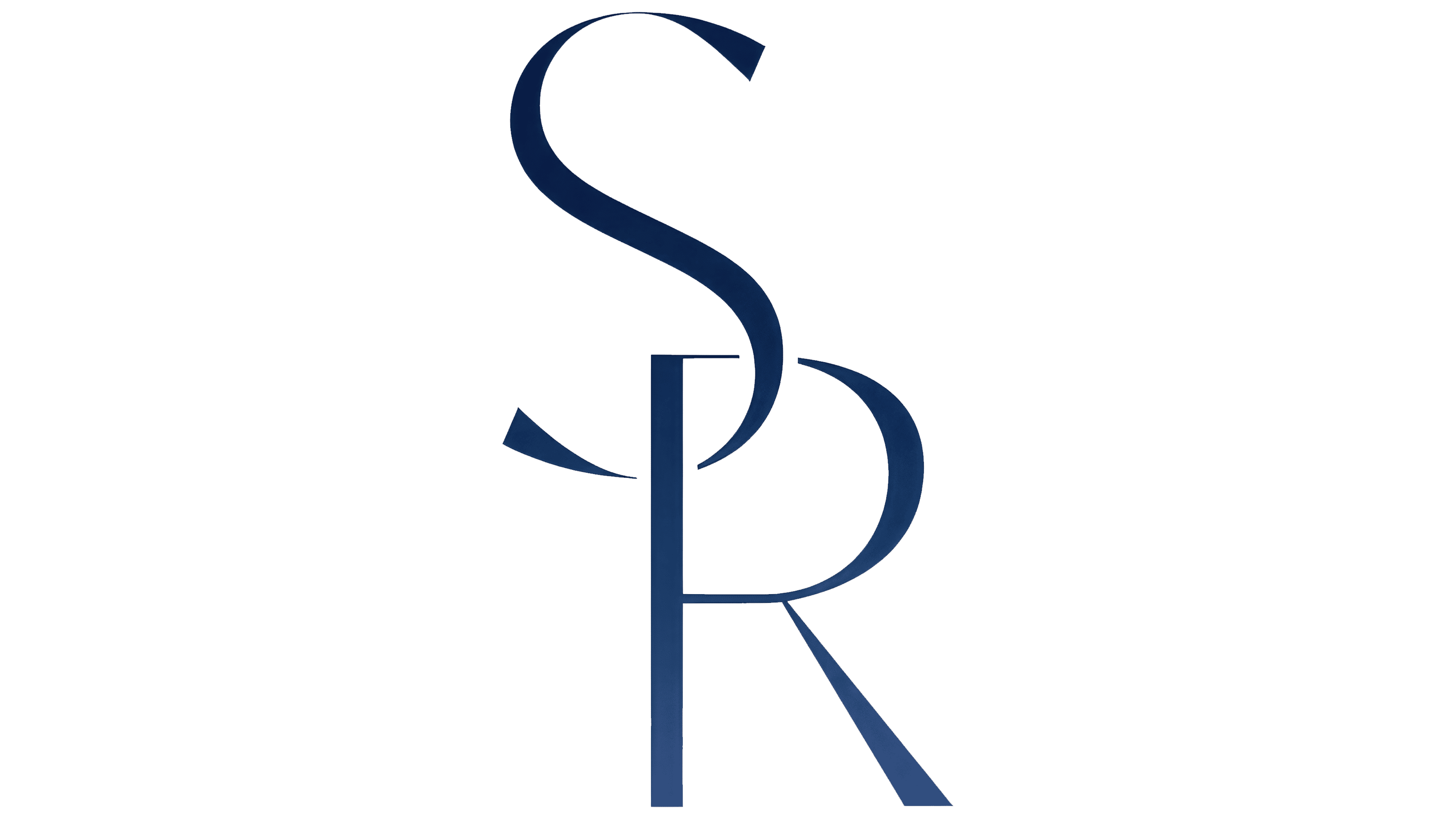
The new design takes a completely different direction. The centerpiece is now a monogram with the letters “SR” seamlessly woven together in a sleek, well-balanced arrangement. This typographic approach creates a modern, elegant brand representation while keeping a strong connection to the company’s name. The way the letters flow into each other gives a sense of unity, reinforcing the company’s presence in wine and spirits.
The company name is now set in a refined, high-end typeface with wider letter spacing, adding to its premium look. Thin, elongated letterforms are polished, replacing the previous version’s heavier, more traditional typography.
The color palette still features deep navy tones but moves away from gradients, opting for a flat, clean finish. The change improves adaptability across different formats while maintaining a strong and recognizable presence. Stripping away decorative elements gives the logo a more versatile and streamlined look, aligning with modern branding trends.
![]()
The rebrand shifts Shaw-Ross International Importers toward a more timeless and adaptable identity. By replacing the globe and ribbon with a refined monogram and elegant typography, the new design presents a fresh image that reflects the company’s expansion beyond wine into a broader selection of premium alcoholic beverages. The updated look strengthens the brand’s presence while staying true to its well-established reputation.