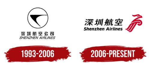
The Shenzhen Airlines logo resembles a stylish, paradisiacal bird soaring upwards. The emblem depicts an airline that is rapidly developing and conquering new markets. Its success is tied to a unique approach to passenger service.
Shenzhen Airlines: Brand overview
Since its founding in 1992, Shenzhen Airlines has been a driving force connecting China’s fast-growing cities and driving economic development. Headquartered at Shenzhen Bao’an International Airport, this prominent Chinese airline is renowned for its exceptional service and unwavering commitment to passenger satisfaction.
Shenzhen Airlines got off to a modest start with just two Boeing 737-300 airplanes.
Shenzhen Airlines strived to achieve outstanding results in its early years: bridging the gap between China’s major cities and capitalizing on its booming economy and growing demand for travel services.
In 2012, Shenzhen Airlines achieved an important milestone by becoming a proud member of the esteemed Star Alliance, an international airline alliance of travelers worldwide.
Shenzhen Airlines prides itself on its modern and diverse fleet of aircraft, including Airbus A320, A319, A330, and Boeing 737 models equipped with state-of-the-art technology.
With an extensive network of 137 domestic airport pairs and 58 airports, the airline provides comprehensive coverage throughout the country, ensuring convenient connections to busy metropolitan areas and remote destinations.
Meaning and History
What is Shenzhen Airlines?
It is a Chinese airline based in Shenzhen, Guangdong. It operates an extensive network of domestic and international flights connecting major cities in China and destinations in Asia and beyond. The company offers various classes of service, including economy and business class. It focuses on providing a comfortable and efficient travel experience, utilizing modern aircraft and a wide range of in-flight amenities. It is a member of Star Alliance.
1993 – 2006
The logo used by Shenzhen Airlines from 1993 to 2006 embodied the airline’s ambitions and aspirations. It featured a symbol resembling a swiftly ascending object interpreted as the tip of an arrow, a space shuttle, or a stylized bird. This image visualized the company’s main mission—aiming for new heights and continual development in the aviation industry. This design highlighted the dynamism and innovative approach of Shenzhen Airlines to flights and customer service.
The central element of the logo, the symbol, was placed within a circle, which in visual culture represents perfection and harmony. The circular design enhances the perception of the logo as a complete, perfectly balanced composition, symbolizing the company’s aim to achieve excellence in every aspect of its operations.
The logo’s black background emphasized Shenzhen Airlines’ strength, confidence, and market dominance. Black is associated with elegance and professionalism, qualities the company aimed to project to its passengers and partners.
Two fonts were chosen for the company name: Chinese and English. This decision was driven by the desire to make the brand highly recognizable and accessible to passengers worldwide. Using two languages in the logo highlighted Shenzhen Airlines’ international status and ensured that the company name would be easily readable and memorable to people across all continents.
2006 – today
The wavy lines in the Shenzhen Airlines logo don’t just add dynamism; they convey the concept of high speeds and fast-paced air travel. Hidden in these curving stripes is the silhouette of an eagle with a powerful beak and downward-pointing wing. Behind this image is the airline’s name in black lowercase letters, except for the capital “S” and “A.” The letters are typed in a sans-serif font but are italicized. The text in the first line consists of Chinese characters, which are slightly italicized. Both above and below, the rounded features on the glyphs harmoniously alternate with straight edges.
The eagle silhouette symbolizes freedom and high aspirations, which echoes the airline’s mission to offer limitless possibilities through air travel. Combining the Chinese and Latin alphabets emphasizes the company’s commitment to serving a diverse clientele on domestic and international routes. Using italics in Chinese and English letters gives the logo a sense of movement, keeping with the overall theme of speed and dynamism.


