


![]() Sherwin Williams Logo PNG
Sherwin Williams Logo PNG
The scope and scale are evident in the manufacturer’s emblem. “The company’s paints can be bought anywhere in the world,” the Sherwin-Williams logo says. “The amount of production is sufficient to color the Earth.” Symbols speak of the stability and durability of the composition.
Sherwin-Williams began in 1866 in Cleveland, Ohio, when Henry Sherwin invested $2,000 in Truman Dunham & Co., a wholesaler of pigments, paints, oils, and glass. After that partnership ended, he founded Sherwin-Williams & Co. in 1870 with Edward Williams and Alanson Osborn.
In 1873, the company bought its first factory on the Cuyahoga River, a former Standard Oil barrel warehouse. The firm produced paste paints, oils, and putty, but its breakthrough came in 1875 with the introduction of ready-mixed paint. At a time when painters still mixed ingredients by hand for each job, Sherwin-Williams helped establish prepared paint as an industry standard. In 1877, it patented a resealable tin can for storing leftover paint.
The company became The Sherwin-Williams Company in 1884 and hired Percy Neyman, the first professional chemist in the U.S. paint industry. In 1888, it opened a plant in Chicago to serve the Pullman Company. Expansion followed in Canada in 1892, and in 1905, the “Cover the Earth” logo appeared. That year, a deal with Lewis Berger & Sons opened access to markets in Britain, Australia, and South Africa.
Sherwin-Williams went public in 1920 and used the proceeds to buy Acme Quality Paint Company. By the early 1920s, it was the largest U.S. paint maker. Later milestones included Kem-Tone in the 1940s, a failed 1970s takeover attempt by Gulf and Western Industries, and major acquisitions in the 2000s. Paint Sundry Brands and Duron joined in 2004, while Valspar Corporation was acquired in 2017 for $11.3 billion. In 2016, the company introduced Paint Shield, which the U.S. Environmental Protection Agency has registered as a bacteria-killing paint.
Meaning and History
![]()
The outstanding company began as a small business opened in 1870 by two associates: Edward Williams and Henry Sherwin. They had a third business partner, but he sold his share of the assets, which allowed them to change the brand name to Sherwin-Williams. The renaming was carried out in 1884. By the way, the company’s official founding date is considered 1866, when Sherwin began investing in Truman Dunham & Co.
All of these events took place during the home decor revolution. People began to ditch wallpaper in favor of other finishes. So the demand for paint was quite high, despite its dangerous lead content, which slowed children’s mental development. The Sherwin-Williams Company was one of the first to abandon the harmful composition. What’s more, there are virtually no VOCs in its modern products.
Remaining a leader in its field, the manufacturer uses the “Cover the Earth” slogan and the corresponding logo. It is widely regarded as one of the most “environmentally unfriendly” graphic symbols because the bucket of red paint pouring over the Earth from space appears threatening to the planet. But the company itself strictly adheres to environmental standards, for which it was awarded the Green Chemistry award. She has no plans to change the provocative emblem because it is a valuable historical legacy. The first version of the drawing appeared in 1893, and two years later, it was accepted as a trademark of Sherwin-Williams.
1885 – 1905
![]()
Henry Sherwin himself designed the chameleon logo. He placed a green lizard on an oval-shaped wooden plank with a black metal frame. The curly finger cutout indicated the artist’s palette. The chameleon image symbolized the fluidity of color, and the paint mixing board represented creative design.
1893 – 1905
![]()
In 1893, George W. Ford created the Sherwin-Williams emblem, which has since become an iconic graphic sign. The first version was in black and white. The artist depicted a globe with a degree grid, a large jar tilted at about 45 degrees, and a stream of white paint flowing down the planet. Drops and splashes have been detailed.
1905 – 1910
![]()
In 1905, the design was simplified. The artists changed the paint’s appearance to show its viscosity and added a shadow on the right side. In addition, they made the Earth lighter and filled it with a coloring matter to the tune of almost half. The can was shrunk, and the label now read “SW” for Sherwin-Williams.
1910 – 1919
![]()
In 1910, the phrase “COVER THE EARTH” appeared globally, which became the company’s motto for the next hundred years. A hand-drawn sans-serif font was used for it. The letters, like the paint, were white; only black outlines separated them.
1919 – 1926
![]()
Following another redesign, the “SW” symbols can be replaced with the “SWP” abbreviation to reflect Sherwin-Williams Paints’ name. At the same time, the logo’s creators signed the continents: “AFRICA” on the left and “EUROPA” on the right. It also turned out that the body of water represented the Atlantic Ocean. The globe had to be lightened slightly to make the additional inscriptions more visible.
1926 – 1974
![]()
In the mid-1920s, the emblem had lost detail. For the first time, artists made the paint bright red, so many have compared it to blood. The abbreviation on the can was painted the same color as the can. All continents on the globe have turned blue. At the same time, the bank itself, the ocean, and the slogan “COVER THE EARTH” were white. The signatures on the map have disappeared.
1974 – 1999
![]()
After a flurry of criticism, the company was forced to completely change the logo, abandoning the “ominous” image of the planet drowning in paint. To adapt to environmentally conscious consumers, Sherwin-Williams approved the trademark in the form of harmless lettering.
The first word of the company name was blue and was at the top. As for the second part, it was white and took place at the bottom. The negative space inside the blue rectangle formed it. At the same time, lowercase and uppercase letters were mixed. From the two “l” s in “Williams,” wavy lines stretched downward, similar to brush strokes.
1982 – 1999
![]()
The company’s customers have longed for the conceptual logo depicting a paint-drenched planet. So in 1982, it was decided to combine it with the word mark created in 1974. The blue-and-white inscription was at the bottom. And the Earth, covered with paint, and the giant “space” bank were at the top. The designers made them brighter than usual, outlined them in white, and placed them inside a large blue rectangle.
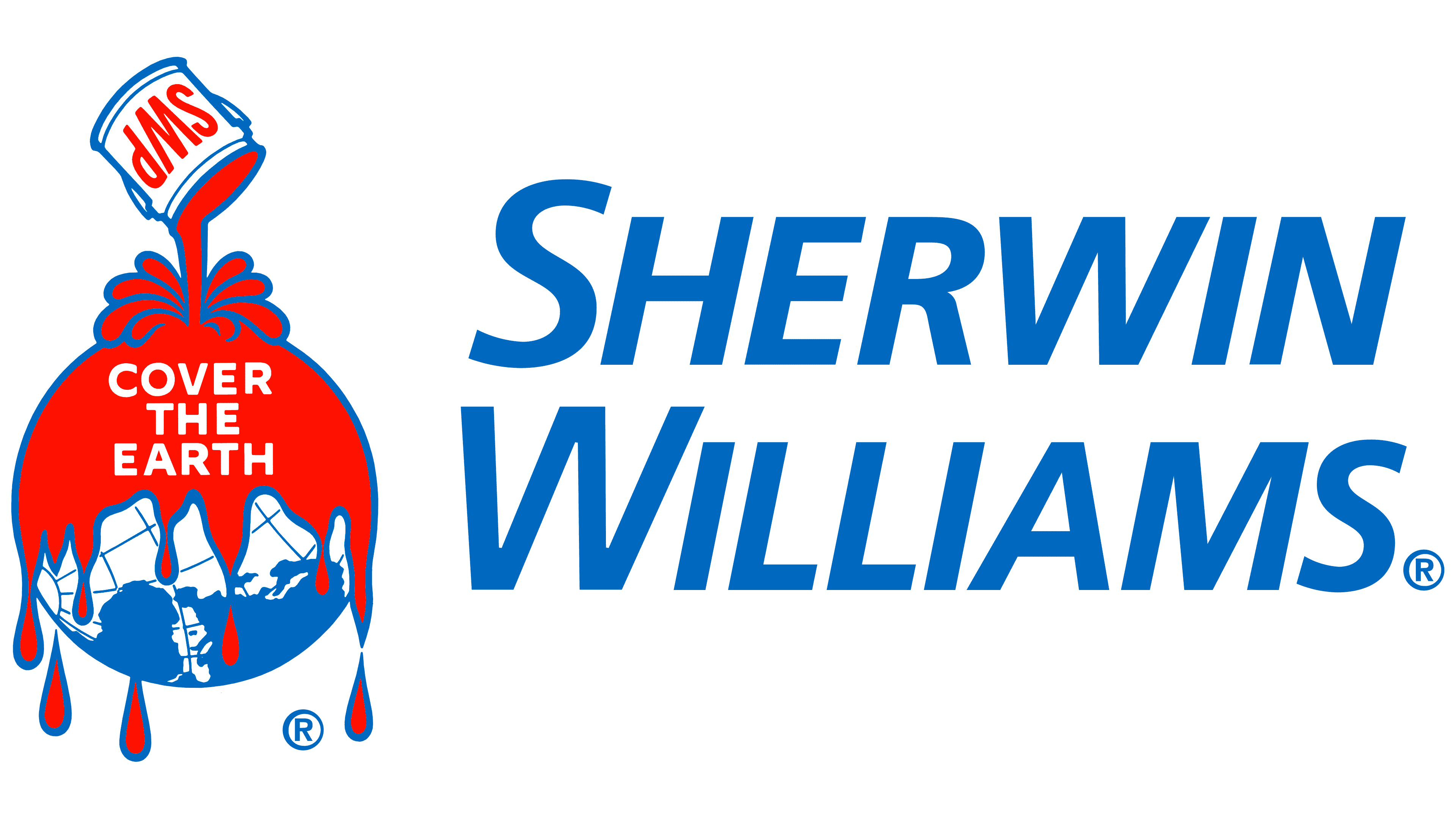
1999 – today
![]()
On the eve of the new millennium, the paints and painting tools manufacturer has once again redesigned its iconic logo. As a result, the symbol returned in 1926. The text below has been simplified. The blue word “SHERWIN WILLIAMS” is split into two lines. The same italic font is used for both parts of the title. Although all letters are in uppercase, the first “S” and “W” in words are enlarged.
Font and Colors
Many consider the company’s emblem to be very ominous, a harbinger of an impending environmental catastrophe and the death of all life on Earth. Coating the planet with a sticky liquid reminds them of the oil being poured from ships into the world’s oceans. According to critics, this is not the best way for a paints-and-varnishes manufacturer to stand out from the competition. In addition, red is associated with blood, which also does not inspire confidence.
The continents are shifted as if they are trying to escape from the pouring stream. But upon closer examination, it is noticeable that the globe is slightly shifted: the paint flows not to the Arctic but North America. Bloggers also note numerous splashes flying in all directions. They believe this speaks of negligence, inattention, and carelessness on the part of the one who pours a sticky liquid onto the drowning Earth. By the way, initially, George W. Ford gave the emblem a different meaning. The author wanted the paint to symbolize Sherwin-Williams, which is gradually taking over the planet and selling its products worldwide.
The logo has three text elements in different sans-serif fonts. The brand name is written in a typeface very similar to Open Sans Bold Italic. The letters are colored blue. The same goes for the main contours and the globe. The paint and abbreviation on the can are blood red. The slogan and the inner parts of the picture are white.