


 Shimano Logo PNG
The Shimano logo is powerful and confident. The emblem demonstrates the manufacturer’s strong position. The values and beliefs that are the company’s foundation have helped it grow and develop for many years.
Shimano began in February 1921, when 26-year-old Shozaburo Shimano rented a 40-square-meter site in Higashi-Minato, Sakai, near Osaka. The rent was five yen a month, and the workshop had one borrowed lathe. Under the name Shimano Iron Works, he chose a difficult product for a small maker: the bicycle freewheel.
Japan’s postwar recession had left many workers unemployed, including Shimano. Freewheels required precise metalworking and heat treatment, while imported parts, including those from Britain’s BSA, dominated the market. Shimano aimed to match and surpass them. His parts carried a mark of three halberds and the number “3,” taken from his name. Within ten years, Shimano products were used outside Japan.
In 1940, the workshop became Shimano Iron Works Co., Ltd., with about 300 employees. In 1956, the company began making derailleurs, moving toward full bicycle transmission systems. A US office opened in 1970, and the first overseas factory began work in Singapore in 1973. That same year, Shimano introduced Dura-Ace, a professional road groupset aimed at Campagnolo’s long-held position.
The 1984 Shimano Index System changed gear shifting by moving indexing into the lever, while rival SunTour struggled. By 1985, Shimano controlled the professional components market. In 1990, Shimano Inc. was listed on the Tokyo Stock Exchange and introduced STI, combining shifting and braking on a single lever, as well as the SPD pedal system. Fishing tackle became its second major business, the golf division was sold in 2005, and Di2 electronic shifting appeared in 2009.
Meaning and History
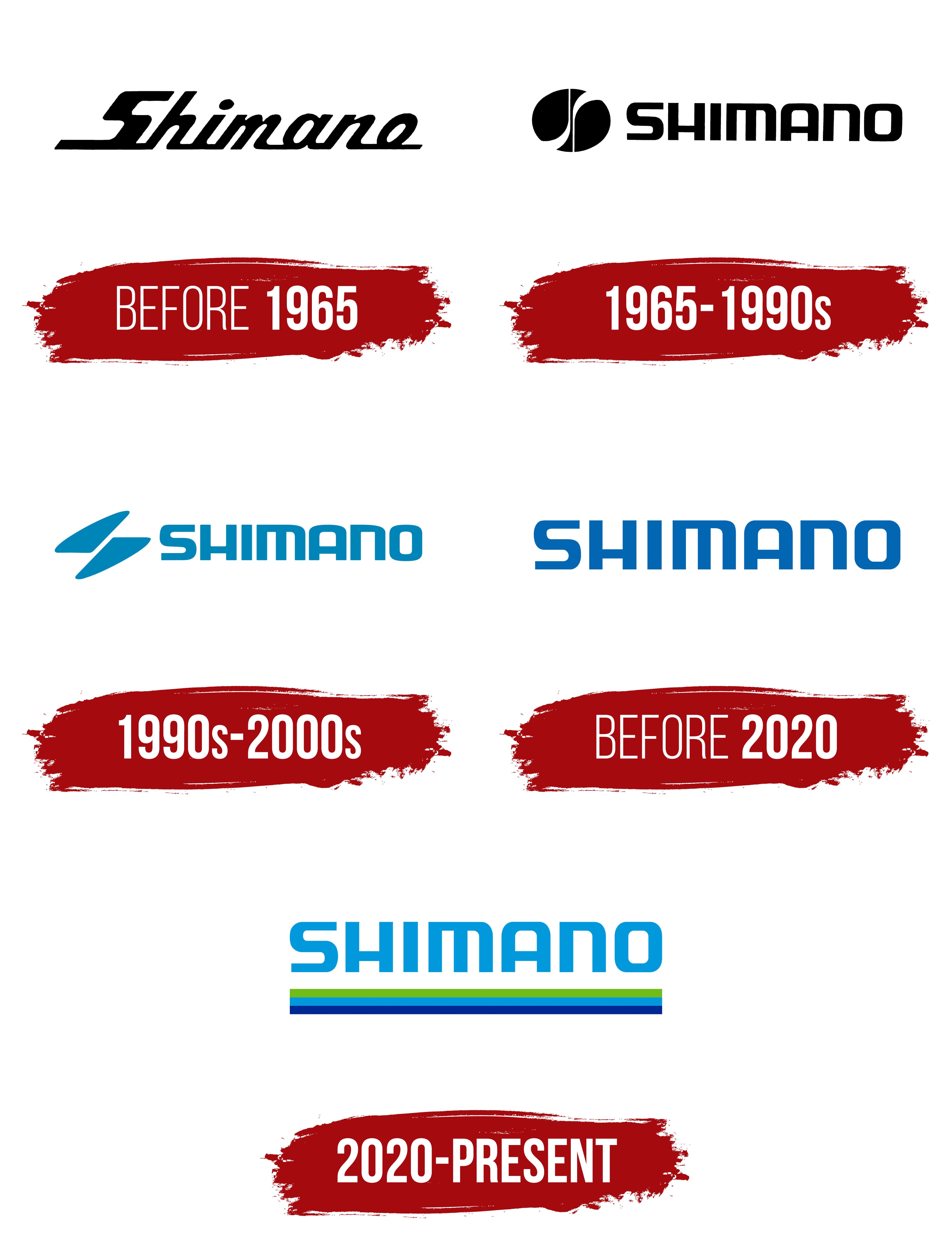
The company’s visual symbol has undergone several transformations to emphasize its unique approach and growth in scale. However, the logo has always been associated with the Shimano name. Interestingly, the writing style and font of the name were chosen immediately after the first rebranding in 1965, and all subsequent emblem updates kept the same style and font.
What is Shimano?
A large Japanese conglomerate with representatives in 30 countries and dealers in 100. The company develops and sells bicycle parts, fishing accessories, and rowing gear under 20 brands. The corporation’s turnover is $3.5 billion.
before 1965

The company’s first known logo consisted of the name written in cursive, connected through lowercase letter connections.
The emblem resembled a bicycle chain, for which the manufacturer made sprockets with speed-shifting and a hub (ratchet). Production began with this complex part.
The corporation’s name comes from the founder’s surname. It was Shozaburo Shimano who helped the company grow from a small room with a single machine to the Shimano Iron Works factory, which employed 300 workers in the 1940s. He dedicated his life to it and died, leaving behind a thriving firm.
The black color of the emblem symbolizes bicycle parts lubricant.
1965 – 1990s
1990s – 2000s
before 2020
2020 – present
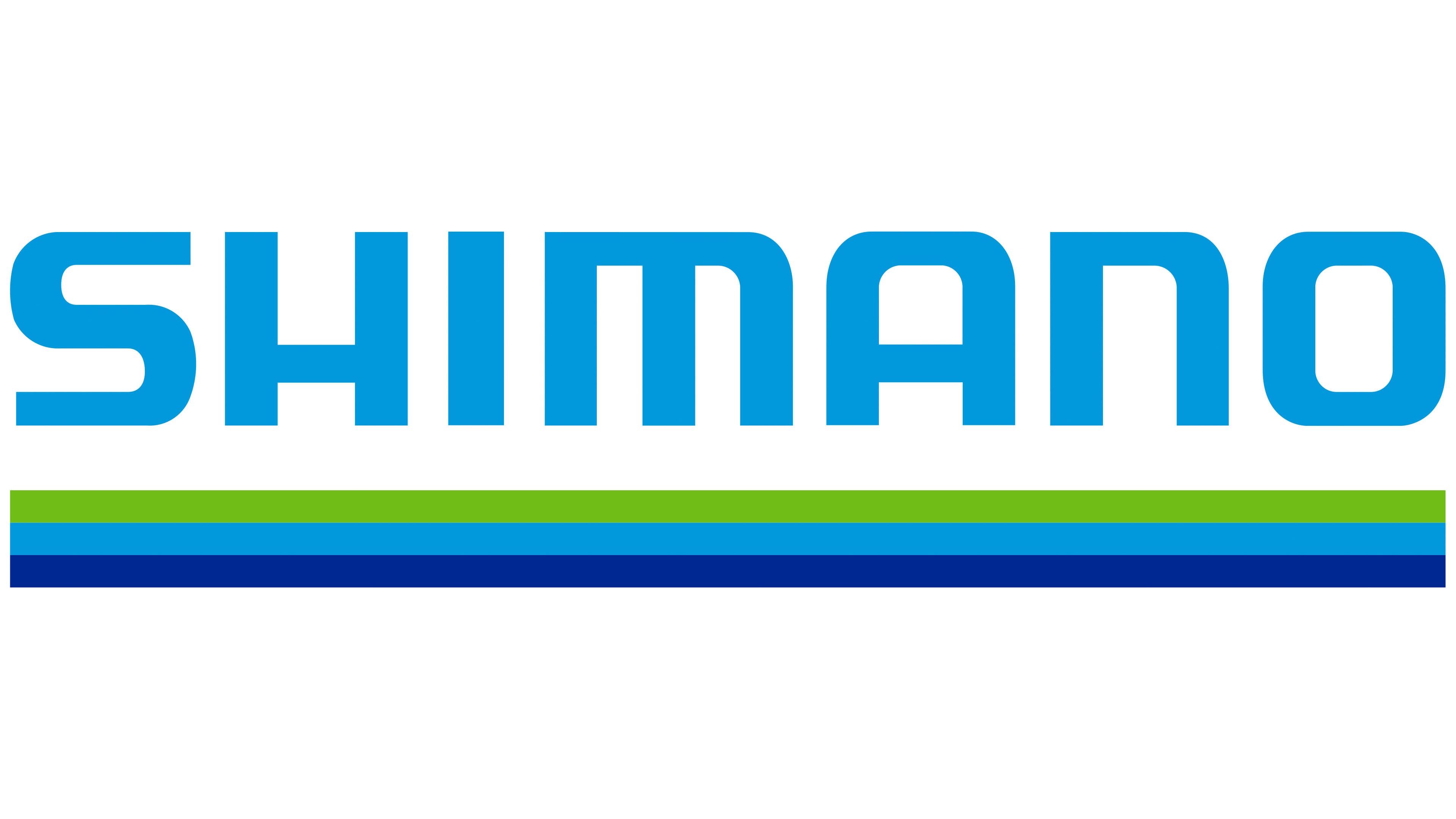
In addition to numerous branches in various countries, a technology innovation center was opened in 2020. The corporation’s progress was marked by rebranding. The modern symbol consists of the name’s separate capital letters, underlined by three merged lines: green, blue, and dark blue.
The name is still associated with the surname. However, the logo now pays tribute to both the founder and the current director, Yozo Shimano, who plays a key role in the modern conglomerate’s operations. The emblem also represents previous family members, as Yozo is the fifth in the family to hold the presidency. Despite the public listing of shares, the company’s management is practically handed down through inheritance.
The triple underline symbolizes:
- Three areas of activity. Green bicycle components, blue fishing products, and dark blue canoeing gear.
- Values that underpin the corporation’s development: eco-friendliness, innovation, and professionalism.
- Nature. The green color in the logo symbolizes grass and leaves, as well as active pursuits amid greenery and beauty. Blue represents fresh air, socializing, gatherings, and shared outdoor activities. Dark blue is associated with water. The company aims to improve people’s health and bring happiness to their lives through contact with nature and interaction with others.
Three components allow the corporation to grow and develop.
Font and Colors
The logo uses various shades of blue and light green. Each carries a deep semantic meaning.
- Blue: professional execution of work, thoughtfulness, and logic.
- Light blue: development, research, innovation. Striving to reach a high bar.
- Green: growth, strength, life energy. The company, like a living organism, constantly changes.
The font used for the inscription is FF Motel Gothic Std Regular with smooth, rounded letters.