


![]() Siemens Logo PNG
Siemens Logo PNG
Simplicity and globality are read in the elements of the emblem. The Siemens logo speaks of a company that strives for research, the study of scientific secrets. The company successfully manifests itself in various directions thanks to the knowledge it has acquired.
Siemens was founded in October 1847 in Berlin by Werner von Siemens and Johann Georg Halske as Telegraphen-Bauanstalt von Siemens & Halske. Its first major contract was a Prussian telegraph line from Berlin to Frankfurt, completed in 1848–1849. Expansion followed quickly. By 1851, Siemens laid a submarine cable across the English Channel for the British government. In 1853, it managed a Russian network from St. Petersburg, with support from Carl Siemens. In 1857, a line was laid connecting Britain with India via the Persian Gulf.
In 1866, Siemens formulated the dynamo principle, enabling the industrial generation of electricity. This led to the first electric tram, demonstrated in 1879, and to the launch of a regular line in Berlin-Lichterfelde in 1881. By the late 19th century, Siemens operated factories in Berlin, London, and St. Petersburg. In 1897, it became a joint-stock company, while Siemens-Schuckertwerke was created for energy systems.
In the early 1900s, the company built power plants. It supplied equipment for London’s underground, competing with Guglielmo Marconi in wireless telegraphy. World War I shifted production to military needs. After Germany’s defeat, Siemens lost foreign assets and patents. Hyperinflation in 1923 forced restructuring, leading to the formation of Siemens AG in 1925.
During the Nazi period, Siemens used forced labor, which was later confirmed in postwar investigations. After 1945, the headquarters moved to Munich. In 1966, Siemens unified its core entities. In 1969, it partnered with Philips on semiconductors. In 1988, it acquired Rolm from IBM.
In 1999, Siemens listed on the NYSE. In 2008, it settled a global bribery case, paying about $1.6 billion. Siemens Healthineers became public in 2018, and Siemens Energy was spun off in 2020.
Meaning and History
![]()
The emblem of Siemens has changed several times over its long history, reflecting the evolution of the brand and its values. The emblem was created in 1899 and has since undergone many changes while maintaining its minimalist, modern design. Each logo was developed with consideration for the fashion trends of its time and the changes occurring within the company.
What is Siemens?
Siemens is an international company based in Germany that manufactures electronic, medical, transportation, energy, and electrical equipment. It has been operating since 1847 and has two offices – in Berlin and Munich.
Before 1914
![]()
The logo of the Telegraphen-Bauanstalt von Siemens & Halske, perhaps one of the company’s earliest, was used on product details before the First World War. It consists of the letters S and H, which are adjacent. The letter S is centered within the letter H, which was specially expanded so that the left and right sides are outside the inner letter S but do not intersect it. The left and right sides of the letter H are curved, recalling the mathematical signs “more” and “less.” In telegraphic communication, the symbol “more” was used to indicate the end of a message or line, and the symbol “less” to indicate the beginning of a new message or line. These symbols were important for accurate information transmission in the telegraphic communication system of that time. Each symbol was coded and transmitted as a sequence of dots and dashes. The logo is made in black and white and has a simple, minimalist design.
This symbol illustrates the connection between the Siemens & Halske brand and its historical heritage in telegraphy and communications. It reflects the quality and reliability of the company’s products and serves as a reminder of its historical roots. The logo is a simple yet effective design that remains recognizable as part of the Siemens brand and its products.
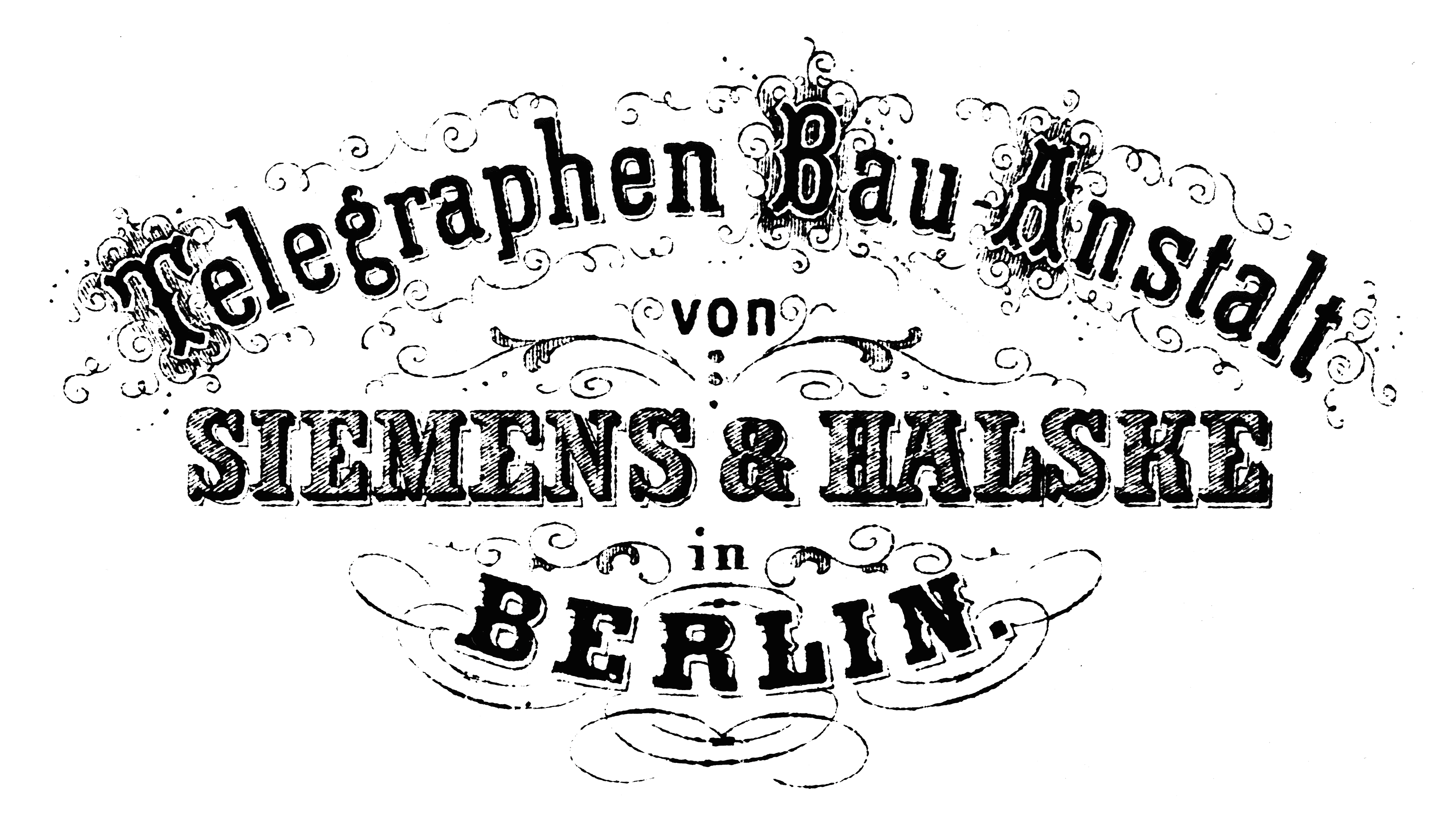
The concern was founded in 1847 and, until 1903, was known as the Telegraph-Bauanstalt Siemens & Halske. This was reflected in its first emblem, which was in use until 1899. It contained a three-line inscription that indicated the company’s full name and the headquarters’ location: “BERLIN.”
1899 – 1973
![]()
In 1899, the company listed its shares on the stock exchange for the first time. In honor of this event, its owners changed their logo. So, this version of the symbol appeared as a monogram of the intersecting letters “S” and “H” (Siemens & Halske). Although this information cannot be verified, it is believed that the emblem first appeared during this period.
1925 – 1936
![]()
In the 1920s, the head of the company, Carl Heinrich von Siemens, decided to form the House of Siemens, a large holding consisting of several firms. The monogram was set in a circle, which was meant to symbolize unity.
In parallel, there was a version of the emblem with two intersecting letters “S.” It was intended for Siemens-Schuckertwerke, which appeared in 1903 after the Elektrizitäts-Aktiengesellschaft vorm. Schuckert & Co. became part of Siemens & Halske.
1928 – 1936
![]()
In 1928, designers placed a monogrammed circle in the center of a diamond-shaped hexagon with an elongated top. They also placed the inscription “SIEMENS” there. Another variation of the logo is combining several companies under the “roof” of the House of Siemens.
1936 – 1973
![]()
In 1935, the company established an advertising department. It was headed by Hans Wilhelm Karl Gustav Domizlaff, who proposed using the Siemens trademark common to all departments and developed a new logo. He removed the circle and hexagon, leaving only the monogram and lettering. Also, the marketer changed the font to make the lines thinner and smoother.
1936 – 1991
![]()
In addition to the previous logo, a version without a monogram was used.
1991 – today
![]()
The modern trademark differs from the 1936-1991 version in font and color. The strokes are unevenly thick, with a cut corner at the center of the M. The word is colored blue-green.
Font and Colors
Siemens logos have always been the same. They reflected the brand name, a fact that became especially noticeable in 1936. Hans Wilhelm Karl Gustav Domizlaff played an important role in forming the corporate identity, abandoning the classic monogram and focusing on minimalist lettering.
The main font is reminiscent of Collaborate Bold and Frutiger Black. For the slogans “Global network of innovation” and “Ingenuity for Life,” which sometimes complement the word “SIEMENS,” the designers used different writing styles. In the first case, this is a standard sans-serif typeface; in the second, an imitation of handwritten text.
As for the palette, it is represented in blue-green. But there are also alternative versions: with black or light gray lettering.
FAQ
What is Logo Siemens?
The logo is simple and elegant. Using a clean, geometric sans-serif font, it features the company’s name in uppercase letters.
The logo’s color is emerald blue. This modern and professional color makes the logo visually appealing and conveys a sense of reliability and innovation. The emerald blue stands out without being flashy, making it suitable for a range of applications, from corporate documents to advertisements.
The logo’s minimalist design ensures that it is easily recognizable and memorable. Its simplicity makes it versatile and timeless. The font’s clean lines and geometric shapes reflect the precision engineering and advanced technology that Siemens is known for.
What font is the Siemens logo?
The logo features a unique font that strengthens its brand identity. While the exact typeface is proprietary, similar fonts include Frutiger Black and Colaborate Bold.
Frutiger Black, created by Adrian Frutiger, is known for its clarity and readability. Its clean lines and modern look make it popular for corporate identities. The bold weight gives the logo a strong and authoritative feel.
Colaborate Bold is another typeface that resembles the logo. It has a bold, modern design with clean, geometric shapes. This font conveys a sense of reliability and precision, matching the brand’s reputation for quality and innovation in engineering and technology.
The Siemens wordmark uses uppercase letters and geometric precision. Its simplicity and boldness reflect the company’s dedication to innovation and reliability.
What is the Siemens company known for?
The company is known for its technological innovations and solutions across several key areas, specializing in power generation and distribution, and providing advanced systems for an efficient, reliable energy supply. The brand excels at creating intelligent infrastructure for buildings and distributed energy systems that improve energy efficiency and sustainability.
In transportation, the company offers smart mobility solutions for rail and road transport. These technologies enhance the safety, efficiency, and reliability of transportation systems. It is a leader in medical technology and digital healthcare services. The company develops advanced medical imaging and diagnostic equipment, as well as digital health solutions that improve patient care and streamline healthcare processes.
Is Siemens a German company?
Yes, it is a German company. She was created by merging three companies: Siemens & Halske AG, Siemens-Schuckertwerke, and Siemens-Reiniger-Werke AG.
This merger created a strong company that has become a global leader in energy technology, manufacturing, and other sectors. Siemens’ German roots have been key to its growth and success as a multinational corporation. The company is headquartered in Munich, Germany, and is a major player in the global technology and manufacturing industries.
Is Siemens a tech company?
Yes, it is a technology company. The brand focuses on industry, infrastructure, transport, and healthcare. In the industrial sector, Siemens creates advanced automation and digitalization solutions to boost manufacturing efficiency and productivity. Their infrastructure technologies enhance urban environments by making buildings smarter and energy systems more efficient.
In transport, it offers smart mobility solutions for rail and road, ensuring safe, reliable, and efficient transportation. Healthcare is known for its medical technologies, including advanced imaging and diagnostic equipment, as well as digital health solutions that improve patient care and streamline healthcare processes.